The 32 Soup Cans in Campbell's Soup Cans
A closer look at this element in Andy Warhol's 1962 masterpiece
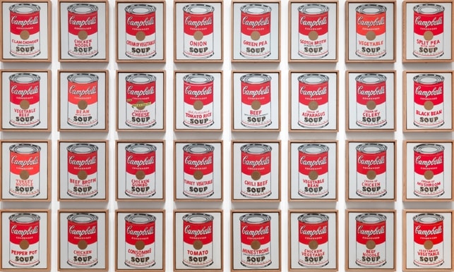
The 32 Soup Cans form the serial engine of Andy Warhol’s Campbell’s Soup Cans (1962): a complete run of flavors, each granted its own small, nearly identical canvas. By treating a mass-market label like a suite of portraits and arranging them like a store display, Warhol turned consumer choice and industrial repetition into the subject of painting.
Historical Context
In 1962, as Pop Art coalesced around mass culture, Warhol shifted decisively to branded commodities and produced a set of 32 canvases, each depicting the front label of a different Campbell’s flavor. When the group debuted that July at the Ferus Gallery in Los Angeles, the pictures sat in a single row on a narrow shelf so they read like a grocery aisle. Asked why 32, Warhol replied: 'There are 32 varieties'—underscoring that the ensemble was conceived as a complete product line rather than a single motif 2.
MoMA’s collection record confirms the work’s structure and scale—32 hand-painted panels that function as one unit—establishing the piece as a deliberately serial work whose impact emerges from the total set. The museum typically installs the panels as a tight grid, further consolidating them into a single optical field and reinforcing the idea that repetition, not uniqueness, is the point of origin for the work’s meaning 12.
Symbolic Meaning
Warhol’s 32-can suite makes seriality itself the subject. By repeating an everyday commodity with minimal variation, he collapses the hierarchy between unique fine art and mass-produced goods, echoing his oft-cited desire to 'be a machine' and challenging the Romantic ideal of originality 4. The decision to represent every flavor turns a grocery label into a shared cultural denominator—what art historian Kirk Varnedoe called a zone of commerce where time seems to stand still—reframing brand imagery as a common visual language of postwar America 5.
At the same time, Warhol’s deadpan frontality and disciplined repetition give the cans a quasi-devotional aura, as if the product were transfigured into an icon through ritual display. Curator Starr Figura, drawing on Benjamin H. D. Buchloh, links this effect to Warhol’s broader strategy of serial consumer images; Warhol himself joked to Walter Hopps that the soup cans are 'portraits,' inviting us to see a brand’s family of flavors as sitters in a portrait series 3. Whether shown as a single shelf or as a grid, the set toggles between sameness and token difference (only the flavor text changes), laying bare how modern desire is organized by standardized forms promising small, manageable choices 21.
Artistic Technique
Although they mimic printed packaging, the 32 cans are handmade: acrylic with metallic enamel on 20 × 16 in. canvases, typically spaced three inches apart when gridded at MoMA 1. Warhol projected the can image to trace contours and lettering, filled areas with flat commercial color, and stamped the gold fleur-de-lis band—methods that impart a mechanical look while preserving telltale irregularities 3. Seen together, viewers catch slight shifts in red hue, wobbles in the fleur-de-lis rows, a softer or darker lid shadow, even a canvas where a gold band drops out—micro-variations that expose the hand within an industrial idiom 2. Constant brand markers—the red/white split, script logo, medallion, 'CONDENSED' and 'SOUP'—stabilize the image, while one panel’s 'NEW!' banner nods to promotion amid sameness 7.
Connection to the Whole
The 32-can element is the work’s armature: repetition at retail scale. As a tight grid, the suite reads almost like wallpaper, fusing 32 units into a single visual field; as a single shelf-line, it implies endless extension, like a supermarket aisle. Both formats translate mass production into pictorial experience and make the viewer confront the logic of standardized choice 2. The near-interchangeability of the canvases—differing primarily by flavor—embodies branded variety, while the handmade slippages subtly resist total uniformity, keeping authorship and originality in play 4. Historically, the insistence on keeping the set intact—from Ferus to MoMA’s later acquisition—cements that the piece is a single organism whose meaning depends on serial presentation 62.
Explore More from This Painting
This detail is one part of Campbell's Soup Cans. Use the links below to return to the full interpretation, browse the full set of details, or view the painting's valuation if available.
Sources
- MoMA Collection entry for Campbell’s Soup Cans (medium, dimensions, installation notes)
- MoMA Inside/Out: Serial & Singular: Andy Warhol’s Campbell’s Soup Cans
- MoMA Magazine, Starr Figura: The Assembly-Line Effect: Andy Warhol’s Campbell’s Soup Cans
- National Gallery of Art: What Is Art? (Warhol, seriality, 'be a machine')
- Anthony E. Grudin, Oxford Art Journal: 'A Sign of Good Taste': Andy Warhol and the Rise of Brand Image Advertising
- MoMA Press Release (2015): Reinstating the single-line, shelf-like display
- Whitney Museum verbal description: label anatomy and 'NEW!' banner