Campbell's Soup Cans
by Andy Warhol
Study Print Studio
Create a personal study print
Build a companion study sheet around the part of this painting that speaks to you most. Choose a detail, shape an interpretation, and walk away with something personal and display-worthy.
Fast Facts
- Year
- 1962
- Medium
- Acrylic with metallic enamel paint on canvas; 32 separate canvases
- Dimensions
- Each 20 x 16 in. (50.8 x 40.6 cm)
- Location
- The Museum of Modern Art, New York

Click on any numbered symbol to learn more about its meaning
Meaning & Symbolism
Explore Deeper with AI
Ask questions about Campbell's Soup Cans
Popular questions:
Powered by AI • Get instant insights about this artwork
Interpretations
Institutional Critique & Display
Source: MoMA (curatorial essay); Smithsonian Archives of American Art (Irving Blum); Arthur C. Danto
Materiality & Trace
Source: MoMA (Serial & Singular essay); Thomas Crow (October Files: Andy Warhol)
Secular Iconography (Halo and Fleur‑de‑lis)
Source: MoMA (audio description); History.com (context of the medallion)
Ideology & Affective Register
Source: MoMA (Ann Temkin audio); Hal Foster (October Files: Andy Warhol)
Labor, Deskilling, and Repetition
Source: MoMA (Serial & Singular essay); The Andy Warhol Museum (biography)
Explore Specific Elements
Dive deeper into individual scenes and details within Campbell's Soup Cans.
The 32 Soup Cans
The 32 Soup Cans form the serial engine of Andy Warhol’s Campbell’s Soup Cans (1962): a complete run of flavors, each granted its own small, nearly identical canvas. By treating a mass-market label like a suite of portraits and arranging them like a store display, Warhol turned consumer choice and industrial repetition into the subject of painting.
The Red and White Labels
Warhol’s red-and-white Campbell’s label turns the most legible face of a supermarket product into the face of Pop Art. Repeated across 32 canvases, the label becomes both an icon of American consumer life and a coolly graphic “portrait” whose power lies in serial display.
The Repeated Grid
Warhol’s repeated grid turns thirty-two soup-can paintings into a single, commanding field—part supermarket aisle, part modernist matrix. By organizing near-identical panels in four rows of eight, he stages mass production on the museum wall while coaxing viewers to notice tiny, handmade differences. The grid is both the image and the argument: sameness, seriality, and brand become the artwork’s subject.
The Flavor Names
In Campbell’s Soup Cans, the flavor names are the lone variable across 32 nearly identical labels, converting a supermarket inventory into the logic of a painting series. Warhol turns typography into image, making consumer ‘choice’ reside in a few red letters and, in one case, a pair of yellow banners.
Related Themes
About Andy Warhol
More by Andy Warhol
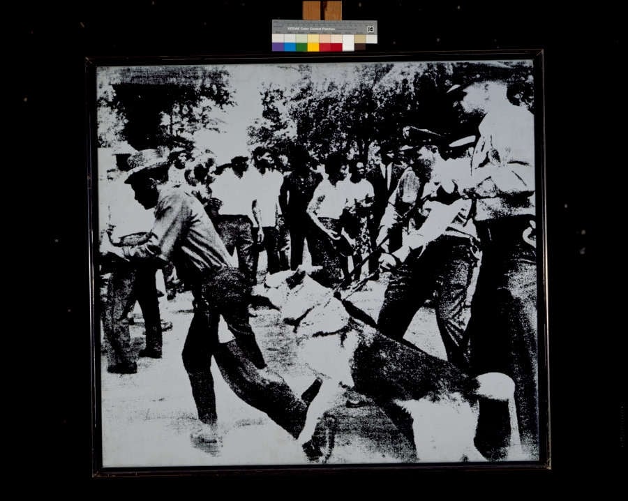
Race Riot
Andy Warhol (1964)
Race Riot crystallizes a split-second of state force: a police dog lunges while officers with batons surge and a ring of onlookers compresses the scene into a <strong>claustrophobic frieze</strong>. Warhol’s stark, high-contrast silkscreen translates a LIFE wire-photo into a <strong>mechanized emblem</strong> of American racial violence and its mass-media circulation <sup>[1]</sup><sup>[2]</sup>.
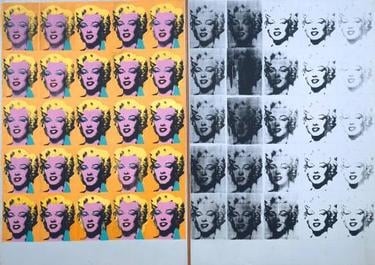
Marilyn Diptych
Andy Warhol (1962)
Marilyn Diptych crystallizes the paradox of fame: <strong>dazzling allure</strong> and <strong>inevitable decay</strong>. Warhol’s 50 repeated silkscreens—color at left, fading grayscale at right—turn a movie-star headshot into a mass-produced <strong>icon</strong> and a memento of mortality <sup>[1]</sup><sup>[2]</sup>.
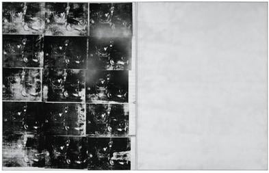
Silver Car Crash (Double Disaster)
Andy Warhol (1963)
Silver Car Crash (Double Disaster) pairs a grid of uneven, black‑and‑white silkscreened crash images with a vast, nearly blank field of metallic silver, staging a battle between <strong>relentless spectacle</strong> and <strong>mute void</strong>. Warhol’s industrial repetition converts tragedy into a consumable pattern while the reflective panel withholds detail, forcing viewers to face the limits of representation and the cold afterglow of modern media <sup>[1]</sup><sup>[2]</sup>.
![Triple Elvis [Ferus Type] by Andy Warhol](/_next/image?url=https%3A%2F%2Fstorage.googleapis.com%2Fsite-images-programmatic%2Fpaintings%2F1771915343451-6gzg8m.jpg&w=3840&q=85&dpl=dpl_47ZAc2d7uUTwfdnYZmQJV2jUGLYg)
Triple Elvis [Ferus Type]
Andy Warhol (1963)
In Triple Elvis [Ferus Type] (1963), Andy Warhol multiplies a gunslinging movie idol across a cool, metallic field, turning a singular persona into a <strong>serial commodity</strong>. The sharply printed figure at center flanked by fading, <strong>ghosted</strong> doubles collapses still image, filmic motion, and mass reproduction into one charged surface <sup>[1]</sup><sup>[2]</sup>.
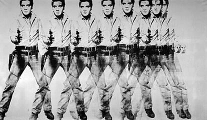
Eight Elvises
Andy Warhol (1963)
A sweeping frieze of eight overlapping, gun‑drawn cowboys marches across a silver field, their forms slipping and ghosting as if frames of a film. Warhol converts a singular star into a <strong>serial commodity</strong>, where <strong>mechanical misregistration</strong> and life‑size scale turn bravado into spectacle <sup>[1]</sup><sup>[2]</sup>.
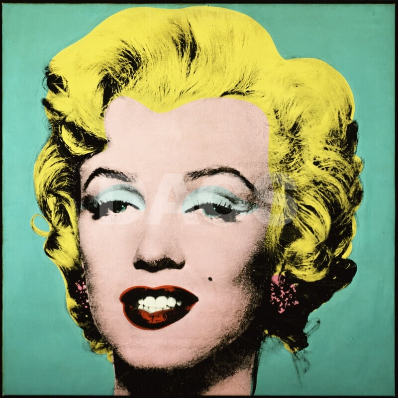
Turquoise Marilyn
Andy Warhol (1964)
In Turquoise Marilyn, Andy Warhol converts a movie star’s face into a <strong>modern icon</strong>: a tightly cropped head floating in a flat <strong>turquoise</strong> field, its <strong>acidic yellow hair</strong>, turquoise eye shadow, and <strong>lipstick-red</strong> mouth stamped by silkscreen’s mechanical bite. The slight <strong>misregistration</strong> around eyes and hair produces a halo-like tremor, fusing <strong>glamour and ghostliness</strong> to expose celebrity as a manufactured surface <sup>[1]</sup><sup>[2]</sup>.