The Flavor Names in Campbell's Soup Cans
A closer look at this element in Andy Warhol's 1962 masterpiece
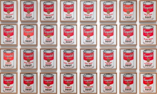
In Campbell’s Soup Cans, the flavor names are the lone variable across 32 nearly identical labels, converting a supermarket inventory into the logic of a painting series. Warhol turns typography into image, making consumer ‘choice’ reside in a few red letters and, in one case, a pair of yellow banners.
Historical Context
In 1962 Campbell’s marketed 32 condensed soup varieties, and Warhol answered with 32 canvases, keeping the can’s red-and-white label constant while changing only the variety name on each canvas. By mirroring the company’s product line and isolating the flavor text as the variable, he translated a grocery list into a gallery installation that looked as standardized as the goods on which it was based 1.
MoMA curator Carolyn Lanchner characterizes the ensemble as a familiar package re-presented en masse—its everyday design becoming totemic when arrayed like shelves in a store. Within this system, the flavor name functions as the sanctioned site of difference against a field of sameness, aligning Warhol’s move from commercial illustration to Pop with postwar advertising and branding. The element thus announces his shift from unique, expressive brushwork to a cool, serial approach that treats the retail template as subject and structure at once 2.
Symbolic Meaning
The flavor names embody difference within sameness. Art historians read the series as a distillation of mid-century consumer choice: indistinguishable commodities distinguished primarily by language. By fixing the package and letting only the variety words change, Warhol makes branding’s promise of choice feel typographic rather than substantive, and he turns reading into looking—language into image 52.
Lanchner calls the series an invariant routine of monotony tempered by variety; in that frame, the flavor text is the token of ‘variety’ that keeps the system moving while underscoring its sameness 2. Warhol also likened the cans to portraits, a cue many scholars have extended: each flavor name operates like a portrait caption for a product, shifting the mechanics of identity from people to things and from presence to packaging 3. Smarthistory highlights how repetition flattens uniqueness so that meaning migrates to the smallest textual differences; viewers scan the labels for Beef, Tomato, or Clam Chowder as if decoding a grid, discovering that choice has been serialized and branded 8.
Artistic Technique
Despite their commercial polish, the 1962 canvases are meticulously hand-painted. Warhol projected the label typography onto canvas and traced it, while other motifs—such as the gold fleurs-de-lis band—were hand-stamped, producing a look that mimics mechanical reproduction without actually using it 1. The label is split into a red upper field and a white lower field; the flavor name appears in uppercase red block letters within the white band, often on two lines 46. One deliberate exception, Cheddar Cheese, swaps the standard treatment for two bright yellow banners with black lettering, sharpening the viewer’s awareness that the variety text is the operative variable across the set 4.
Connection to the Whole
The series derives its charge from seriality: 32 uniform objects that differ only in their flavor names. This discipline forces viewers to read the paintings as they look, scanning labels to locate the minimal change that structures the entire work 18. MoMA’s analysis of the hand-painted inconsistencies and can-by-can differences underscores how the named variety becomes the hinge between sameness and difference—the point where meaning is registered 5. Even the outlier Cheddar Cheese, with its yellow banners, dramatizes the rule: the brand’s template reigns, and variation is a matter of typography and packaging, not form. In this way, the flavor names tie the ensemble’s visual repetition to its cultural argument about consumer systems and the manufacture of choice 4.
Explore More from This Painting
This detail is one part of Campbell's Soup Cans. Use the links below to return to the full interpretation, browse the full set of details, or view the painting's valuation if available.
Sources
- MoMA object page: Andy Warhol, Campbell’s Soup Cans (1962)
- Carolyn Lanchner, Warhol (MoMA course text)
- MoMA Magazine: The Assembly-Line Effect (Warhol’s Campbell’s Soup Cans)
- MoMA audio guide: Campbell’s Soup Cans (label/typography description)
- MoMA blog: Serial & Singular (installation and differences)
- Whitney Museum verbal description (typography and composition)
- Smarthistory: Why is this art? Warhol’s Campbell’s Soup Cans