The Red and White Labels in Campbell's Soup Cans
A closer look at this element in Andy Warhol's 1962 masterpiece
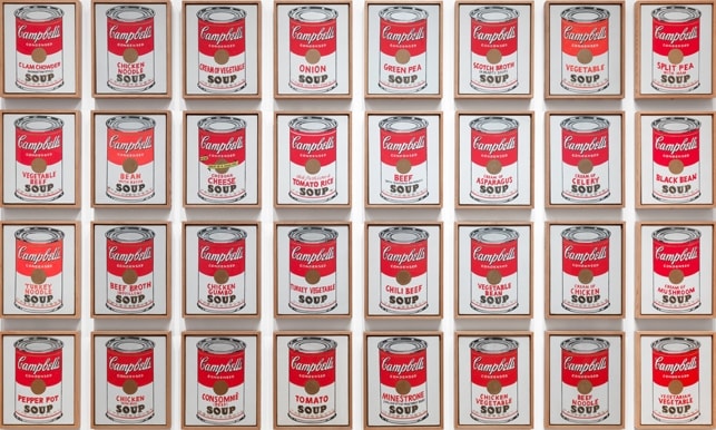
Warhol’s red-and-white Campbell’s label turns the most legible face of a supermarket product into the face of Pop Art. Repeated across 32 canvases, the label becomes both an icon of American consumer life and a coolly graphic “portrait” whose power lies in serial display.
Historical Context
In 1962, amid the rise of American Pop Art, Andy Warhol shifted decisively from hand-drawn editorial illustration to images taken straight from mass culture. He chose Campbell’s Soup because everyone recognized it—an everyday staple whose unmistakable red-over-white label functioned like a ready-made sign on the grocery shelf. Contemporary accounts trace the prompt to friends’ advice to pick something universally familiar, a move that aligned perfectly with Pop’s embrace of advertising and commodities 2.
Warhol produced 32 canvases—one for each variety then offered—fixing on the label as the most efficient, high-impact identifier of the product. The work’s cool, serial presentation and mechanical look marked a break with gestural painting and announced a new, image-savvy strategy: appropriate the brand’s own graphic language and repeat it until it reads as art. MoMA’s record situates the series at the forefront of Pop, noting its standardized, front-facing cans and its embrace of seriality as subject matter 1.
Symbolic Meaning
The red-and-white label operates as a distilled emblem of U.S. mass consumer culture. By lifting the logo wholesale and repeating it, Warhol collapses the distance between commodity and canvas, testing how a branded sign behaves when relocated from aisle to gallery. MoMA frames the serial label as a meditation on uniformity and mechanical reproduction—an art of sameness that mirrors the look and logic of the assembly line 13.
Warhol and curators have called the soup cans “portraits,” suggesting that the label functions like a face—flat, frontal, immediately legible—and that repetition creates a quasi-devotional encounter with a consumer icon 3. LACMA connects the label’s unvarying front to the “illusion of choice”: many flavors, one brand image 4. Educational resources stress that meaning here hinges on context and repetition rather than painterly invention; the logo remains perfectly readable even as it becomes art, which is precisely Pop’s charge 5. Even the label’s color scheme carries corporate memory: Campbell’s adopted red and white in 1898, long before Warhol, embedding the palette so deeply in public consciousness that it could bear an entire artwork’s conceptual weight 10.
Artistic Technique
Warhol rendered the label in acrylic with metallic enamel on canvas, opting for flat, saturated color blocks that mimic printed packaging rather than expressive brushwork 1. He projected the can and lettering, traced the outlines, and filled them with even fields of red and white to cultivate a semi-mechanical appearance; rows of gold fleurs-de-lis were applied with a rubber stamp, reinforcing the rhythmic, repeatable feel 3.
The label’s central gold emblem—sometimes reduced to a simplified disk—bridges the red and white halves and adds a metallic glint that recalls the can’s commercial sheen 7. The Whitney notes crisp divisions and slight line variations that simulate a cylindrical glint while quietly betraying the hand, a tension that keeps the industrial look from becoming purely photographic 6.
Connection to the Whole
The red-and-white label is the series’ basic module—the repeating unit that structures the entire work. Whether installed in a single line on shelves, recalling a supermarket, or arrayed in a wall grid, the uniform label turns the gallery into a simulated retail display and trains viewers to scan for brand cues rather than individual painterly nuance 81.
That design logic concentrates attention on graphic identity: the looping “Campbell’s,” the word “CONDENSED,” the flavor name, and the small gold roundel anchoring the midpoint. The emblem itself echoes the company’s 1900 award, importing a whisper of corporate prestige into the artwork’s center line 9. In short, the label does not decorate the cans; it is the work’s engine—making seriality, sameness, and consumer recognition the content of the painting.
Explore More from This Painting
This detail is one part of Campbell's Soup Cans. Use the links below to return to the full interpretation, browse the full set of details, or view the painting's valuation if available.
Sources
- MoMA collection record for Campbell’s Soup Cans
- Smithsonian Magazine – Why Warhol chose Campbell’s Soup
- MoMA Magazine – The Assembly-Line Effect
- LACMA – Small Campbell’s Soup Can (Tomato), 1962
- Smarthistory/Khan Academy – Why is this art? Warhol’s Campbell’s Soup Cans
- Whitney Museum – Verbal description of Campbell’s Soup imagery
- History.com – Process and display context
- MoMA – Ferus-style installation materials
- Smithsonian NMAH archives – 1900 Paris Exposition medal on label
- Campbell Soup Company – Origin of the red-and-white label