The Repeated Grid in Campbell's Soup Cans
A closer look at this element in Andy Warhol's 1962 masterpiece
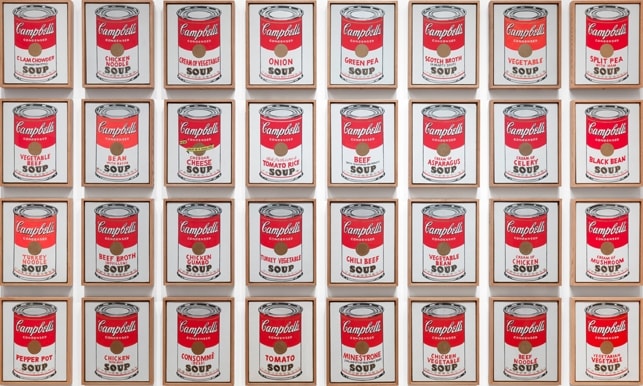
Warhol’s repeated grid turns thirty-two soup-can paintings into a single, commanding field—part supermarket aisle, part modernist matrix. By organizing near-identical panels in four rows of eight, he stages mass production on the museum wall while coaxing viewers to notice tiny, handmade differences. The grid is both the image and the argument: sameness, seriality, and brand become the artwork’s subject.
Historical Context
In 1962, Andy Warhol moved decisively from commercial illustration to Pop art, exchanging expressive brushwork for images drawn from mass culture. Campbell’s Soup Cans comprises thirty-two canvases—one for each flavor then sold—hung in a tight four-by-eight grid that fuses the parts into a single field. When first shown at the Ferus Gallery in Los Angeles, the canvases sat on narrow shelves that echoed a grocery aisle; in the museum, the grid has become the prevailing format because it lets audiences absorb the entire set at once, like wallpaper or a retail display 1.
This arrangement made repetition itself the subject. The grid channels the look of standardized production and consumer display while suppressing hierarchy among the canvases; every panel is equivalent, like interchangeable goods. MoMA’s collection record codifies this serial logic: thirty-two panels, each 20 × 16 inches, spaced evenly and typically shown together as a complete unit 2. In 1962’s culture of assembly lines and brand ubiquity, Warhol’s grid offered a cool, unmistakably contemporary image of American consumption 12.
Symbolic Meaning
The grid in Campbell’s Soup Cans operates as a symbolic hinge between modernist form and commercial culture. In twentieth‑century art theory, the grid denotes order, neutrality, and a bracketing of narrative—an emblem of autonomy famously analyzed by Rosalind Krauss 3. Warhol adopts that authoritative format yet fills it with a ubiquitous brand, collapsing distinctions between high art’s formal rigor and the marketplace’s standardized goods.
Seen en masse, the thirty‑two panels read like an icon wall: a liturgical procession of labels whose regularity confers a quasi‑sacral aura on an ordinary product. MoMA’s scholarship characterizes this as a profoundly ironic transfiguration—the commodity elevated while “uniqueness” is displaced by serial sameness 4. At the same time, the grid invites a contrary experience: minute differences in outline, color, and stamp emerge on close looking, restoring a sliver of singularity within the mass. This tension became central to Pop’s critique. As the National Gallery notes, Warhol’s serial multiplication directly challenged the ideal of the unique artwork and the romantic artist’s hand 5. By making the grid itself the carrier of brand repetition, Warhol converts the museum wall into a proxy for commercial display and reframes consumer goods as portraits of American life 14.
Artistic Technique
Each panel is painted with acrylic and metallic enamel on canvas, 20 × 16 inches, and installed with consistent spacing as a unified set 2. Warhol plotted the forms with pencil guides, applied flat commercial reds and whites, and used a rubber stamp to print the gold fleur‑de‑lis band—procedures that standardize appearance while leaving small, legible variations in line weight and registration 4.
The grid composition repeats an identical label architecture across thirty‑two canvases—red/white bands, script logo, “CONDENSED,” medallion, and the SOUP line—so that sameness registers first. Only after the eye acclimates does it parse differences of variety name, edge handling, and paint density, turning the grid into a machine for comparing near‑duplicates 124.
Connection to the Whole
The repeated grid is the work’s organizing principle and its meaning. It consolidates thirty‑two separate paintings into a single visual system that can be scanned “at once,” mimicking store displays and brand uniformity 1. Yet the format also slows looking: against the field of sameness, viewers detect the work’s handmade edges and subtle misalignments, revealing a friction between industrial image and painterly fact 24.
Whether shown in MoMA’s four‑by‑eight grid or in a continuous line recalling Ferus’s shelves, the display underscores that repetition is the subject and the spectacle 1. The grid turns the soup varieties into a collective portrait—products arrayed like a crowd—so that the gallery wall becomes an aisle of American consumer identity, and the “picture” is the system that orders it 124.
Explore More from This Painting
This detail is one part of Campbell's Soup Cans. Use the links below to return to the full interpretation, browse the full set of details, or view the painting's valuation if available.
Sources
- MoMA, “Serial & Singular: Andy Warhol’s Campbell’s Soup Cans” (installation modes; viewing effects)
- MoMA Collection Record: Campbell’s Soup Cans (medium, format, dimensions, display practice)
- Rosalind E. Krauss, “Grids” (theory of the grid in modern art)
- MoMA Magazine, “The Assembly‑Line Effect: Andy Warhol’s Campbell’s Soup Cans” (technique; interpretive framing)
- National Gallery of Art, Education: Modern Art—Warhol and Serial Multiplication