The Color Marilyns in Marilyn Diptych
A closer look at this element in Andy Warhol's 1962 masterpiece
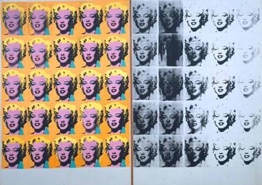
The Color Marilyns—the 25 hotly saturated faces on the left of Andy Warhol’s Marilyn Diptych—package a movie star’s image with the punch and clarity of consumer goods. Dazzling and repeatable, they crystalize how modern media manufactures allure while hinting at a cult of celebrity that borders on the devotional.
Historical Context
Warhol launched his Marilyn series immediately after the star’s death on August 5, 1962, appropriating a single publicity still from the 1953 film Niagara. In the diptych’s left panel—the Color Marilyns—he multiplied that image twenty‑five times over vivid fields of paint, creating an instantly legible, mass‑media icon. The timing is crucial: Warhol seized a moment when a living celebrity became a circulating memorial, and he cast that shift in the language of advertising, seriality, and print. The result is a work that looks like the newsstand and the department store as much as the museum wall 12.
Curatorial accounts also record that the two canvases—one in color, one in black‑and‑white—may first have existed separately before being shown together, a pairing that sharpened the contrast between vivid presence and fading afterimage. That history matters for reading the Color Marilyns: they function powerfully on their own as media spectacle, yet their historical presentation within a diptych frame locked in the work’s now‑canonical tension between glamour and disappearance 2.
Symbolic Meaning
The term “diptych” invokes a sacred format from Christian art, encouraging viewers to read the colored panel as a kind of modern icon. Bathed in high‑chroma hues and repeated into a ritual surface, the Color Marilyns stage a secular altarpiece in which mass culture becomes a site of veneration. Related Warhol works such as Gold Marilyn Monroe reinforce this icon analogy, swapping the gold ground of Byzantine painting for the glossy allure of postwar media 158.
At the same time, Warhol treats the star like a product. The saturated palette, flat planes, and modular grid simulate packaging—branding an identity through color blocks and repetition. As Michael Lobel argues, Warhol frames celebrities as commodities assembled by the studio system; the Color Marilyns visualize that manufacture with clinical clarity 4.
Within the larger composition, the color panel often reads as life—the marketable, camera‑ready persona—set against the right panel’s monochrome erosion, or death. Yet the repetition also deadens feeling: the more we see, the less we feel. Smarthistory’s analysis underscores this double edge—both worship and desensitization—while museum labels point to the split between a public façade and its inexorable fade into memory 13.
Artistic Technique
Warhol hand‑applied broad zones of acrylic in hot, artificial hues, then pulled silkscreens of the same publicity photograph across those fields. Deliberate misregistration, uneven inking, and occasional smears keep the image slightly off—advertising’s polish tinged with mechanical failure 29.
The faces lock into a strict 5×5 grid, producing an all‑over surface without a privileged center. Flat, unmodulated color and the screen’s halftone grain collapse depth, turning the portrait into a graphic sign rather than a modeled likeness. The panel’s punchy contrasts—yellow hair, cyan eye shadow, fuchsia lips—deliver billboard immediacy while exposing the means of reproduction that made the image ubiquitous 12.
Connection to the Whole
As the left wing of the diptych, the Color Marilyns supply the work’s seductive charge: they are the market image at full volume. Their high‑key glamour intensifies the right panel’s grayscale drift and blotting, so that the pair reads as a single system toggling between allure and erasure. Together they model how media confers a kind of afterlife even as it strips away specificity through endless reuse 13.
The colored grid also echoes Warhol’s stand‑alone serial Marilyn canvases, clarifying how this panel could function independently yet achieves its fullest meaning when paired with the fading half. The diptych’s dialectic—commodity spectacle versus mortal image—hinges on the contrast the Color Marilyns so forcefully establish 61.
Explore More from This Painting
This detail is one part of Marilyn Diptych. Use the links below to return to the full interpretation, browse the full set of details, or view the painting's valuation if available.
Sources
- Smarthistory: Andy Warhol, Marilyn Diptych (Tina Rivers Ryan)
- Art Gallery of Ontario: Warhol large‑print exhibition text
- National Galleries of Scotland: Marilyn Monroe (1962) label
- Whitney Museum of American Art: Audio Guide (Michael Lobel) on Marilyn Diptych
- MoMA: Gold Marilyn Monroe
- Modern Art Museum of Fort Worth: Twenty‑Five Colored Marilyns (1962)
- Tate: Marilyn Diptych (collection entry)
- Princeton University Art Museum: Blue Marilyn
- Krannert Art Museum: Marilyn (on silkscreen misregistration and inking)