The Fading Black-and-White Marilyns in Marilyn Diptych
A closer look at this element in Andy Warhol's 1962 masterpiece
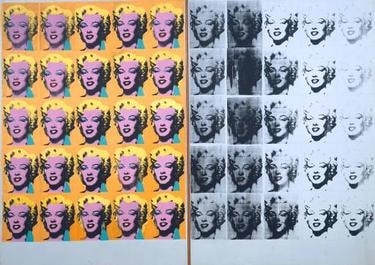
The fading black‑and‑white panel of Andy Warhol’s Marilyn Diptych stages a slow disappearance: 25 grayscale impressions of the same Niagara publicity still drift from crisp legibility to ghosted blur. By letting the image decay across the surface, Warhol turns mechanical failure into meaning—mourning a star while exposing how mass media makes and unmakes icons.
Historical Context
Warhol created Marilyn Diptych in late 1962, immediately following Marilyn Monroe’s death that August. He had just adopted photo‑silkscreen, a mass‑media technique that allowed him to transfer a single press image—Monroe’s 1953 Niagara publicity still—onto canvas repeatedly. The right‑hand panel’s monochrome register and visible degradation echo the flood of posthumous newspaper photographs, linking the work to a moment of public mourning and media saturation 1.
Positioning the image in a diptych—a format with roots in devotional art—Warhol split the work into a bright color field and a somber black‑and‑white grid. Getty’s cataloging highlights how the fading, grayscale impressions on the right suggest a movement from presence to disappearance, a meditation on mortality made legible through the very mechanics of reproduction 2. In 1962, as Warhol turned from hand‑painted commercial motifs to industrial printing, this panel became a decisive statement: the age of the camera and the press would be the age of repetition, breakdown, and loss—rendered at mural scale for collective contemplation 12.
Symbolic Meaning
The right panel operates as a pictorial memento mori. As the serial impressions pale and blot out, they chart a passage from celebrity presence to spectral absence, a reading affirmed by museum cataloging that links the fade to Monroe’s mortality 2. The panel’s newsprint tonality evokes obituary pages and wire‑service images, aligning grief with the textures of mass reproduction rather than with private sentiment 1.
Within the diptych tradition, the pairing reads as a secular altarpiece: the left, an icon of veneration; the right, a relic‑like remainder that confronts viewers with the fragility of images and bodies 1. Warhol’s larger early‑1960s preoccupation with Stars/Deaths/Disasters frames this side as the death register of fame, where repetition doubles as remembrance and erasure 3. Critics and curators have also emphasized how Warhol treats stars as consumer goods; drained of color and degraded in print, Monroe’s face becomes a consumable sign that can exhaust itself through circulation 56. Recent scholarship casts this fade through a Gothic lens—celebrity as ruin—where the image decays before our eyes, turning glamour into a haunting after‑image 7.
Artistic Technique
Warhol assembled two abutted canvases, each a 5×5 grid built from the same photo‑silkscreen. On the right, he printed in black ink onto a white ground, allowing slippages, uneven squeegee pressure, and ink depletion to accumulate from left to right. These purposeful "failures"—loss of detail around the eyes, patchy lips, veils of gray wash—produce a legible gradient from crisp to ghosted impression 1. The panel courts the look of degraded mechanical reproduction, a quality that critics have noted as central to its affect and meaning 6. By refusing to correct the process, Warhol makes the breakdown itself the subject.
Connection to the Whole
The diptych’s power depends on the dialogue between halves: saturated color versus draining monochrome, durable icon versus disappearing person. The right panel completes this life/death dialectic, its fade reading as the image’s—and the star’s—vanishing 2. At the same time, it exposes the commodity logic animating the left: what shines can be stamped, sold, and spent. That economy of worship and waste is encoded in the format of a secular altarpiece and in the visible mechanics of silkscreen itself 15. By letting reproduction falter, Warhol fuses process and content, turning the act of printing into an elegy that anchors the entire work 16.
Explore More from This Painting
This detail is one part of Marilyn Diptych. Use the links below to return to the full interpretation, browse the full set of details, or view the painting's valuation if available.
Sources
- Smarthistory – Andy Warhol, Marilyn Diptych (analysis, technique, diptych context)
- Getty Research Institute – CONA record (mortality reading of the fading panel)
- Walker Art Center – Warhol’s Stars/Deaths/Disasters framing
- MoMA – Gold Marilyn Monroe (1962) audio (death‑year context, modern iconography)
- Whitney Museum of American Art – audio on celebrities as consumer objects
- The Guardian – Review noting “degraded mechanical reproduction”
- Celebrity Studies (2022) – Gothic reading of celebrity decay in Warhol
- Intellect – Film, Fashion & Consumption article on publicity and pathos