The Split Between Color and Black-and-White in Marilyn Diptych
A closer look at this element in Andy Warhol's 1962 masterpiece
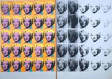
Warhol’s vertical split—color at left, black‑and‑white at right—turns Marilyn Diptych into a two‑part drama of glamour and disappearance. It reads like a secular altarpiece to a modern icon, showing how media saturates an image until it fades to a ghost of itself.
Historical Context
Made in late summer 1962, just after the star’s death, Marilyn Diptych coincided with Warhol’s embrace of photo‑silkscreen and serial imagery. The work is physically two panels placed side by side: twenty‑five vibrantly colored impressions on the left and twenty‑five black‑and‑white impressions on the right, which progressively lighten and break down. The split captures a moment when grief and media coverage collided, translating a widely circulated publicity still into a doubled meditation on presence and loss. 12
The title’s invocation of a diptych—a format with deep roots in Christian art—recasts celebrity as a modern form of veneration, with color functioning as worshipful glamour and monochrome as elegiac withdrawal. Early accounts of its presentation underscore this pairing as intentional. Historically, the split also tracks Warhol’s 1962 pivot: celebrities as subjects, silkscreen as method, and the mass image as source—condensed into a two‑panel structure that binds memorial and media at the dawn of his Pop vocabulary. 12
Symbolic Meaning
The color/black‑and‑white divide is a life–death dialectic staged through cosmetics and corrosion. On the left, saturated hues cosmetically amplify the made‑for‑public persona; on the right, the same face, drained of color and increasingly faint, evokes mortality and the posthumous decay of the image. Read as a secular altarpiece, the pairing crowns a media‑made icon while simultaneously mourning her disappearance, a tension Warhol explored alongside related works like Gold Marilyn Monroe. 12
The split is also a critique of mass culture’s image economy. Warhol’s serial repetition enacts how the press manufactures and exhausts a face: each pass of ink at right erodes presence, mirroring how repetition can desensitize viewers even as it keeps the subject relentlessly visible. Smarthistory describes the right panel as the image “disappearing before our eyes,” while the Whitney frames the two halves as rival modes of cultural packaging—cosmetic color versus newsprint grayscale. Recent scholarship extends this reading, treating the spectral right side as a Gothic inflection of celebrity’s end. 1582
Artistic Technique
Warhol screens a single publicity still in a strict 5×5 grid on each panel, exploiting photo‑silkscreen’s capacity for mechanical uniformity. On the left, he overpaints hair, lips, eyelids, and skin in high‑key hues and often re‑screens the black halftone slightly off‑register, heightening the artificial, cosmetic veneer. On the right, he prints the same matrix in black ink only; as impressions accumulate, clogging and uneven deposition cause progressive fading, breakup, and loss of detail—an engineered disappearance. The method leverages silkscreen’s “commercial” look to yoke repetition, accident, and breakdown into the very structure of the split. 361
Connection to the Whole
The vertical divide is the painting’s organizing device: it fuses glamour, death, and mass reproduction into a single image‑system. The left panel’s cosmetic seduction and the right’s anesthetizing repetition model how culture makes, circulates, and finally exhausts an image. In doing so, the work functions less as portrait than as cultural x‑ray, anticipating Warhol’s Death and Disaster series while consolidating his 1962 turn to seriality and media‑sourced imagery. The diptych format stabilizes this argument formally, letting two incompatible truths—iconic allure and spectral erasure—coexist on one field. 145
Explore More from This Painting
This detail is one part of Marilyn Diptych. Use the links below to return to the full interpretation, browse the full set of details, or view the painting's valuation if available.
Sources
- Smarthistory (Tina Rivers Ryan), “Andy Warhol, Marilyn Diptych”
- National Galleries of Scotland (ARTIST ROOMS), “Marilyn Monroe”
- Supreme Court of the United States, Warhol v. Goldsmith Joint Appendix (process/analysis)
- MoMA Magazine, on Warhol’s 1962–63 program and seriality
- Whitney Museum audio guide, “Marilyn Diptych, 1962” (Michael Lobel)
- MoMA, “Andy Warhol: A Retrospective” brochure (silkscreen/seriality context)
- Celebrity Studies (2022), on Gothic spectrality and decay in Marilyn Diptych