Stability or Sensation?
Ingres builds vision on line: form is stabilized, distance is maintained, ideals are made legible. Delacroix builds vision on color and touch: sensation is organized, motion is felt, events are made present. Both redefine grand painting after the Revolution, but they part at the eye—what makes an image convincing.
Comparison frame: What does each painter think seeing in painting should be—conceptual clarity or orchestrated sensation?
Quick Comparison
| Topic | Eugene Delacroix | Jean-Auguste-Dominique Ingres |
|---|---|---|
| What painting should do in the eye | Orchestrate sensation—color and touch produce meaning | Stabilize form—line clarifies the ideal |
| Core maxim | A declared colorist; contrasts ignite perception | “Drawing is the probity of art”; color attends line |
| Surface and touch | Visible, mobile brushwork; open contours | Enamel-smooth finish; suppressed stroke |
| Typical composition | Diagonals, vortex movement, warm/cool shocks | Symmetry, hierarchy, sovereign arabesque |
| History painting | Modern events fused with allegory (Liberty) | Timeless canon staged as order (Homer) |
| Orientalist imagery | 1832 North Africa travel; color/light inquiry | Studio fantasy from texts and props |
| Public face-offs | 1824 Chios; 1827 Sardanapalus | 1824 Vow of Louis XIII; 1827 Apotheosis of Homer |
| Institutional platform | Independent, Louvre old-master study | Director, French Academy in Rome (1835–41) |
Shared Ground
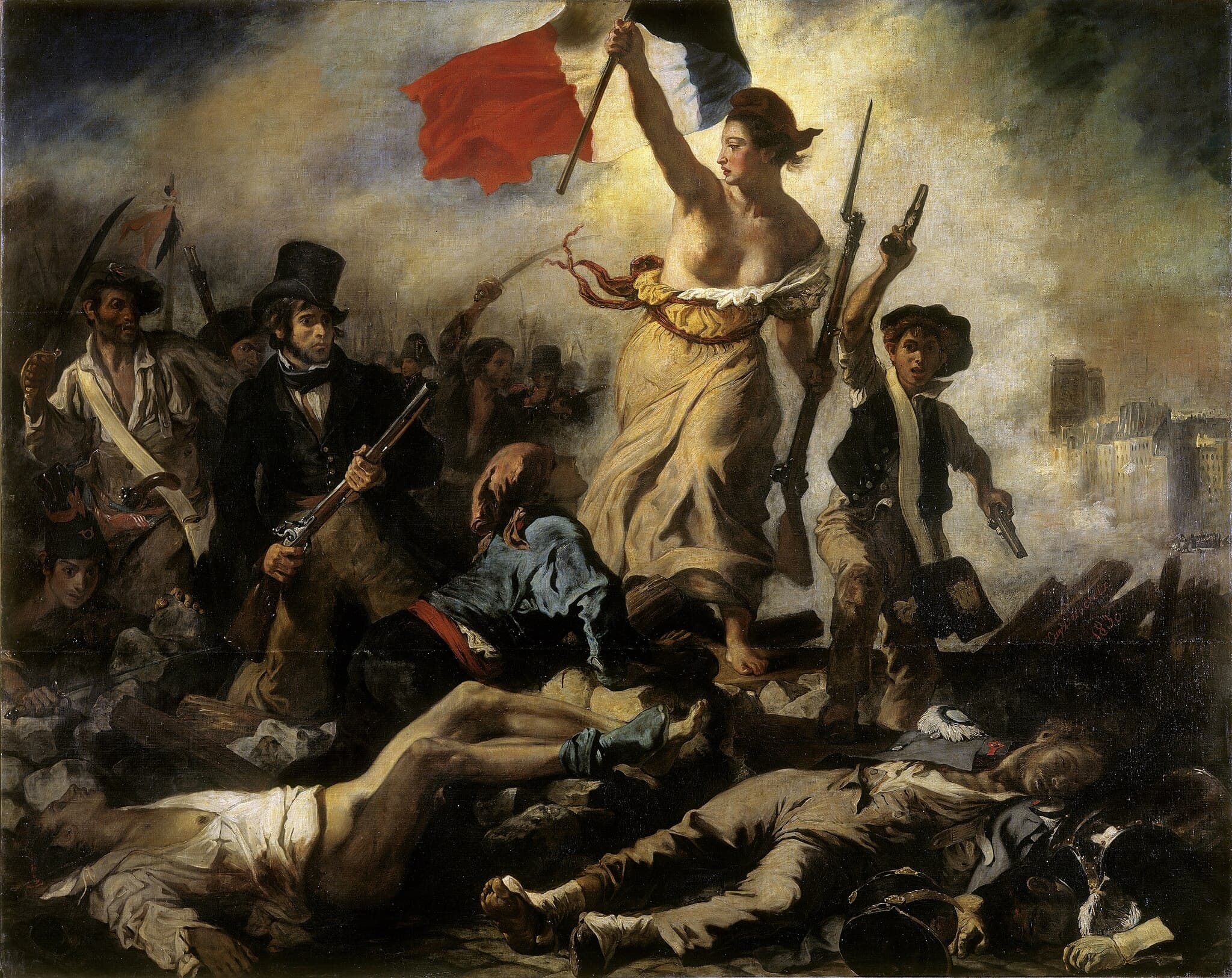
Ingres and Delacroix share a serious problem: what should grand painting be for a post-revolutionary public? Both use the Paris Salon to answer. Ingres offers a timeless canon in The Apotheosis of Homer (1827), while Delacroix tests whether current events can bear allegorical weight in Liberty Leading the People (1830). In different registers, each restores ambition to history painting: large scale, public address, ethical stakes.
They also draw from the same academic inheritance. Ingres is formed in David’s orbit and later runs the French Academy in Rome; Delacroix trains with Pierre‑Narcisse Guérin and studies Rubens and the Venetians in the Louvre. Both are positioned inside the long French debate over line versus color—whether clarity of drawing or chromatic force leads a painting. Their reputations grew along this very axis.
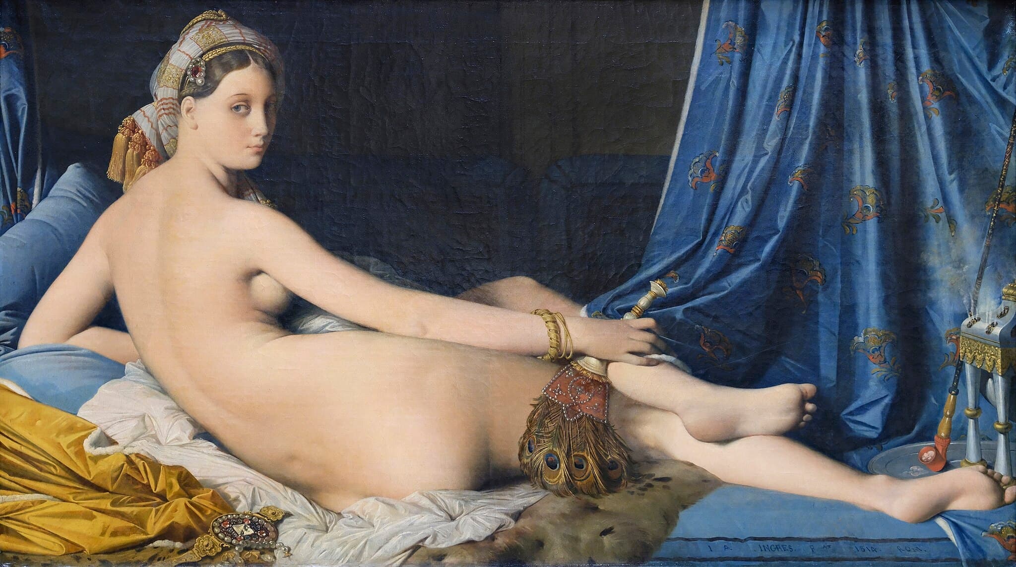
Even where their worlds diverge, the stage is shared. Each painter turns to the so‑called Orient as a way to look. Ingres’s odalisques are carefully composed fantasies built in the studio; Delacroix’s Women of Algiers (1834) transforms observations from his 1832 North African trip into a color laboratory. The point of contact is not subject matter itself but the use of subject to test seeing—how contour, surface, and light make desire, power, or history legible. This is the ground on which their decisive difference stands.
Decisive Difference
Their split is not a matter of taste but of what makes vision trustworthy. For Ingres, painting persuades by stabilizing form. Line is the ethical armature—drawing first, color in service. Hence the crystalline order of The Vow of Louis XIII (1824) and the hieratic balance of The Apotheosis of Homer (1827): contour governs, distance is kept, the ideal is clarified. Even his erotic inventions obey this logic. In Grande Odalisque, anatomical liberties protect the arabesque; the body becomes a perfected diagram rather than a breathing person.
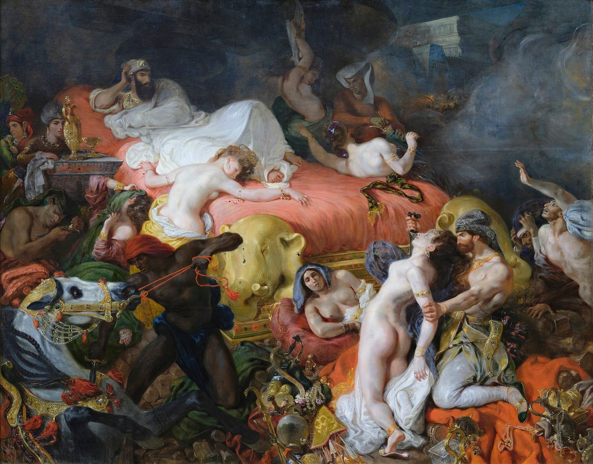
For Delacroix, painting persuades by orchestrating sensation. He weights color and brushwork as the engine of thought. The Massacre at Chios (1824) builds pathos through chromatic temperature and broken edges; The Death of Sardanapalus (1827) spins a diagonal vortex whose meaning is inseparable from its heat and motion. Liberty Leading the People (1830) fuses allegory with street smoke: the tricolor’s hot/cold clash cuts through haze to make history feel newly made. When their answers hung side‑by‑side in 1824 and 1827–28, the public could see the fork: a law of line that idealizes, or a theater of color that makes immediacy legible. Each is a complete optics and an ethics of looking.
Paired Works
Two manifestos in one Salon
Focus question: What counts as order in a history painting—hierarchy of forms or directed sensation?
The Death of Sardanapalus vs The Apotheosis of Homer
Salon 1824: devotion versus catastrophe
Focus question: How do ideal line and chromatic pathos carry public meaning?
The Massacre at Chios vs The Vow of Louis XIII
Oriental interiors as laboratories of looking
Focus question: Is the "Orient" a field report in color or a studio ideal of contour?
Women of Algiers in their Apartment vs Grande Odalisque
Public image: timeless canon or present-tense myth
Focus question: How should a nation see itself—through perfected lineage or a charged event?
Liberty Leading the People vs The Apotheosis of Homer
Why This Comparison Matters
This pairing fixes a durable hinge in modern art. Ingres and Delacroix do not simply disagree about style; they propose rival contracts with the viewer. If seeing is secured by line, painting models thought as clarity and measure. If seeing is sparked by color and touch, painting models thought as felt coherence. Later artists navigate between these poles—Degas and Matisse drawing strength from Ingres’s contour; Manet, the Impressionists, and beyond from Delacroix’s chroma and facture. The distinction also sharpens how we read images now. In museums, note whether conviction arrives at the edge (Ingres) or in the interval between colors (Delacroix). In media, ask whether an image persuades by diagram or by atmosphere. Understanding this split lets a viewer move past labels like “classical” and “romantic” to the operative question both painters force: what structure of looking makes meaning?
Related Links
Sources
- Britannica: The Apotheosis of Homer
- Louvre feature: Delacroix et la couleur
- Wikipedia: The Vow of Louis XIII (1824 Salon context)
- Britannica: Liberty Leading the People
- Harvard Art Museums: Odalisque with Slave (Ingres; studio-built Orientalism)
- Smarthistory: Delacroix, Women of Algiers in their Apartment
- Britannica: Poussinists vs. Rubenists (line/color frame)
- Universalis: La Mort de Sardanapale
- Louvre news: Sardanapalus restoration (2023)
- Louvre collection: Liberty Leading the People (object entry; 2023–24 cleaning)
- Louvre Ingres mini-site: maxims on drawing and color
- Villa Medici: Ingres, Director of the French Academy in Rome (1835–41)