Icon of zero vs. score of forces
Both artists sought a new “realism” after depiction—one built from color, geometry, and relations rather than objects. Malevich subtracts until an absolute is signaled; Kandinsky composes until inner necessity is audible. Seen together, they define two durable models of nonobjective art.
Comparison frame: How does painting work: as Malevich’s “icon of zero” or Kandinsky’s “score of forces”?
Quick Comparison
| Topic | Kazimir Malevich | Wassily Kandinsky |
|---|---|---|
| Core model of painting | Icon of nonobjectivity (a signal of the absolute) | Score of forces (a composed, readable system) |
| Procedure | Subtractive: pass through the “zero of form” | Additive: build a grammar of tensions |
| Key texts | The Non‑Objective World; From Cubism and Futurism to Suprematism | Concerning the Spiritual in Art; Point and Line to Plane |
| Display/Institution | 0,10 exhibition; Black Square in the icon corner | Bauhaus pedagogy; classroom diagrams and exercises |
| Form semantics | Square = feeling; white field = the void beyond feeling | Point–line–plane carry measurable tensions; circle tends to rest |
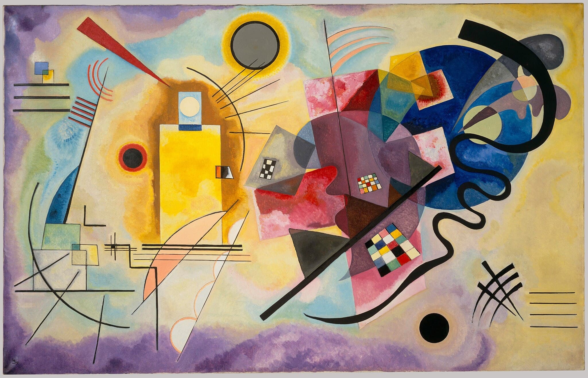
| Color behavior | Restricted palette; white as metaphysical space | Chromatic actors (yellow advances, blue recedes, red stabilizes) |
| Spatial idea | Boundless white “cosmos”; gravity suspended | Relational plane calibrated by vectors, grids, and arcs |
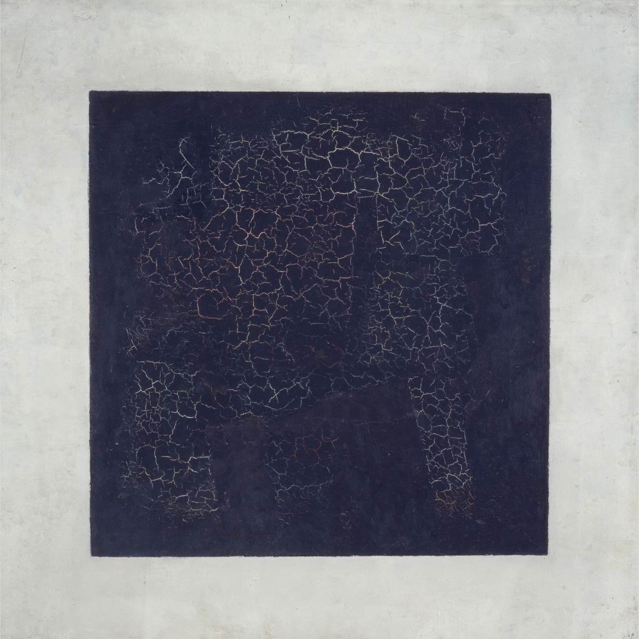
| Material signature | Handmade wobble, craquelure, emblematic fronts | Drafted clarity, compasses, measured intervals |
Shared Ground
Malevich and Kandinsky meet on the same ground: the conviction that painting can bypass depiction and act directly on perception. Each proposes a nonobjective art in which color, form, and placement operate like forces—capable of carrying sensation, thought, and spiritual charge without reference to visible things. Kandinsky argues that pictorial elements can move us as music does, and he codifies their behavior into a teachable syntax. Malevich insists that painting achieves a truer realism once it leaves the “circle of things,” treating the canvas as an arena where absolute feeling can appear.
Both artists are not only painters but builders of systems. Kandinsky publishes Concerning the Spiritual in Art (1911/12) and, later at the Bauhaus, Point and Line to Plane (1926), which turn color, point, line, and plane into a working vocabulary. Malevich publishes From Cubism and Futurism to Suprematism (1915/16) and The Non‑Objective World (1927), defining a Suprematist program anchored by the square, cross, and circle. Each stages these ideas institutionally: Malevich through the 0,10 exhibition in Petrograd, and Kandinsky through Bauhaus classrooms where geometry becomes a common tongue.
On the wall, their canvases replace stories with relations. White fields become active space rather than background; diagonals read as vectors; circles register as reservoirs of rest or depth. Whether the result is a single emblematic form or a polyphonic field, the shared ambition is consistent: a new way to see that treats painting not as a window on the world but as a conductor of inner states.
Decisive Difference
Their split is decisive. Malevich treats a painting as an icon of nonobjectivity, in the near‑liturgical sense: an image that negates depiction to signal the absolute. At the 0,10 exhibition he hung Black Square in the room’s icon corner, recoding the canvas as a modern sacred sign. In The Non‑Objective World he writes that “the square = feeling” and “the white field = the void beyond this feeling,” describing Suprematism as a passage through the “zero of form.” His method is apophatic: by subtraction—of motif, gravity, and color variety—he opens a white, free space in which pure sensation may appear. The slight irregularities and craquelure of Black Square do not weaken this claim; they bind the metaphysical sign to material time.
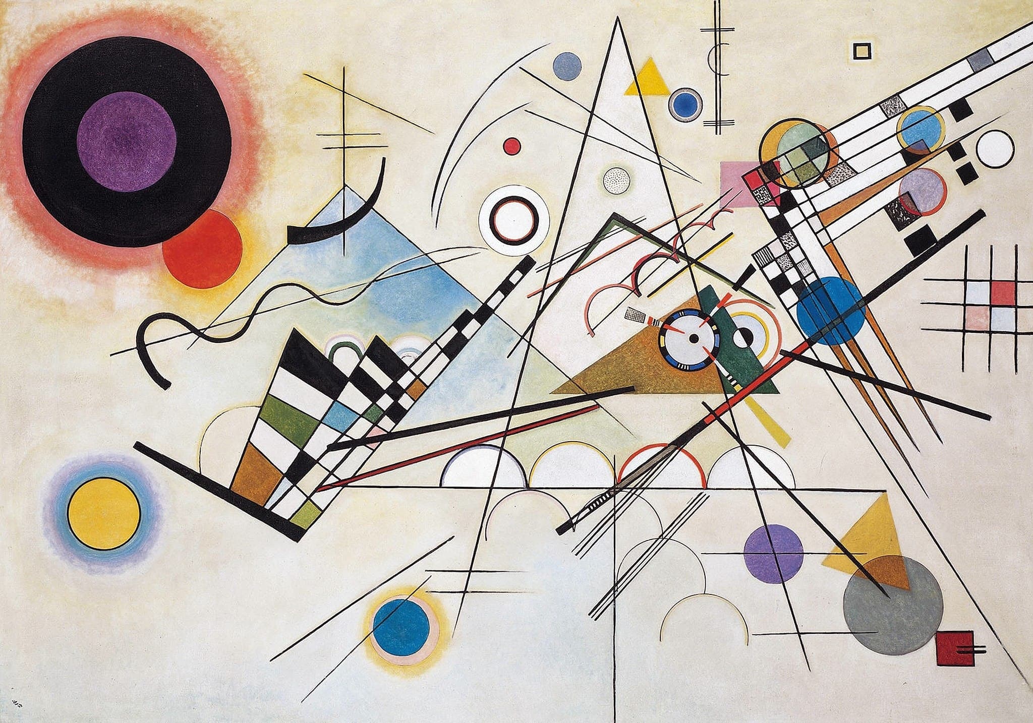
Kandinsky, by contrast, treats a painting as a score for spiritual resonance. He builds a compositional language where points, lines, planes, and colors have directional tensions and timbres that can be orchestrated. In Concerning the Spiritual in Art, yellow pushes like a trumpet while blue withdraws like an organ; in Point and Line to Plane, diagonals carry maximum tension and circles tend toward rest. Composition VIII and Several Circles show this additive logic: calibrated modules, metrical devices, and chromatic intervals arranged for maximum relational clarity. If Malevich centers negation and the ontological “zero,” Kandinsky centers composition and a repeatable syntax. The difference is not cosmetic but ontological: Malevich’s canvas is an icon that points beyond itself; Kandinsky’s is a score that teaches how its effects are made.
Paired Works
Zero vs. Score
Focus question: What changes when a canvas is staged as an icon versus composed as a score?
Black Square vs Composition VIII
White Field, Inner Orbit
Focus question: Does abstraction aim at wordless ontology or calibrated harmony?
Suprematist Composition: White on White vs Several Circles
Weightless Bars vs. Primary Drama
Focus question: How do titles and color theories steer nonobjective reading?
Suprematist Composition: Airplane Flying vs Yellow-Red-Blue
Why This Comparison Matters
“Abstract art” is not one thing. Malevich and Kandinsky define two routes that still organize how we look: negation toward an absolute, and composition toward a readable system. If you respond to minimal, emblematic images—monochromes, crosses, voids—you are in Malevich’s wake, where the canvas becomes an icon that signals beyond itself. If you respond to calibrated relations—grids, vectors, intervals—you are in Kandinsky’s, where the canvas is a grammar that conducts inner states.
Understanding this split clarifies later art. Malevich’s zero helps explain the stakes of monochrome painting, conceptual reduction, and the ritual staging of works in space. Kandinsky’s score helps explain design pedagogy, information graphics, and the enduring appeal of Bauhaus clarity. Reading their works with their own terms—“square/void” and “point‑line‑plane”—lets a general viewer see not just shapes but purposeful operations. The reward is practical: once you can tell icon from score, many abstract paintings stop being puzzles and start being legible.
Related Links
Sources
- Wassily Kandinsky, Concerning the Spiritual in Art (1911/12), trans. Project Gutenberg
- Wassily Kandinsky, Point and Line to Plane (Bauhausbuch 9), PDF
- Kazimir Malevich, The Non‑Objective World (1927; Eng. 1959), Open Library
- 0,10: The Last Futurist Exhibition of Paintings
- State Russian Museum entry for Black Square (context and display)
- Factum Foundation: Technical studies of Malevich’s Black Square
- MoMA: Suprematist Composition: White on White
- MoMA: Suprematist Composition: Airplane Flying
- Guggenheim: Kandinsky at the Bauhaus, 1922–1933
- Guggenheim Bilbao education guide: Composition 8
- Centre Pompidou: Yellow-Red-Blue