Circulation vs Creed
Both artists turn instantly legible American images into icons, then use design to teach viewers how those images work. Warhol stages publicity stills and products as serial displays that model image circulation. Wood compresses Midwestern life and national myths into singular, meticulously staged tableaux where order becomes meaning.
Comparison frame: How do Warhol’s serial screens and Wood’s singular precision train the eye to see American icons—one as circulation, the other as creed?
Quick Comparison
| Topic | Andy Warhol | Grant Wood |
|---|---|---|
| What the image models | A system of repetition and circulation | A creed compressed into one tableau |
| Viewer’s motion | Lateral scan across grids/rows | Fixed scrutiny of a centered scene |
| Source pipeline | Publicity photos, newswire images, logos, Old Master reproductions | Staged types and props; history/myths pictured within the scene |
| Surface/technique | Photographic silkscreen; misregistration; flat, billboard color | Northern Renaissance–like finish; crisp contours; shallow stage |
| Installation logic | Serial arrays that read like shelves, contact sheets, or monitors | Singular, frontal pictures calibrated for one authoritative view |
| Icon focus | Brands and celebrities as modern icons | Citizens, architecture, and emblems of national story |
| Ambivalence | Homage to design while draining aura by repetition | Respect for virtue while edging into dry satire |
Shared Ground
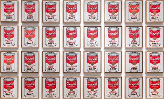
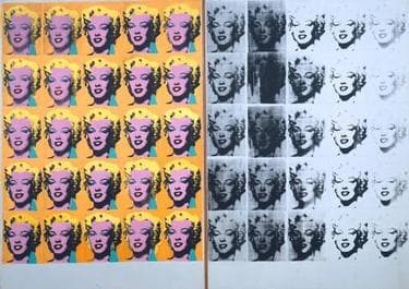
Warhol and Wood both start with recognizability, then make design the argument. Warhol lifts images already optimized for circulation—product labels, publicity stills, press photos, and even reproductions of Old Masters—and installs them as paintings that behave like shelves, contact sheets, or a wall of screens. Campbell’s Soup Cans presents a complete run of flavors as a museum-scale display; Marilyn Diptych stacks a studio headshot into a secular iconostasis; Sixty Last Suppers multiplies Leonardo until the sacred reads as broadcast.
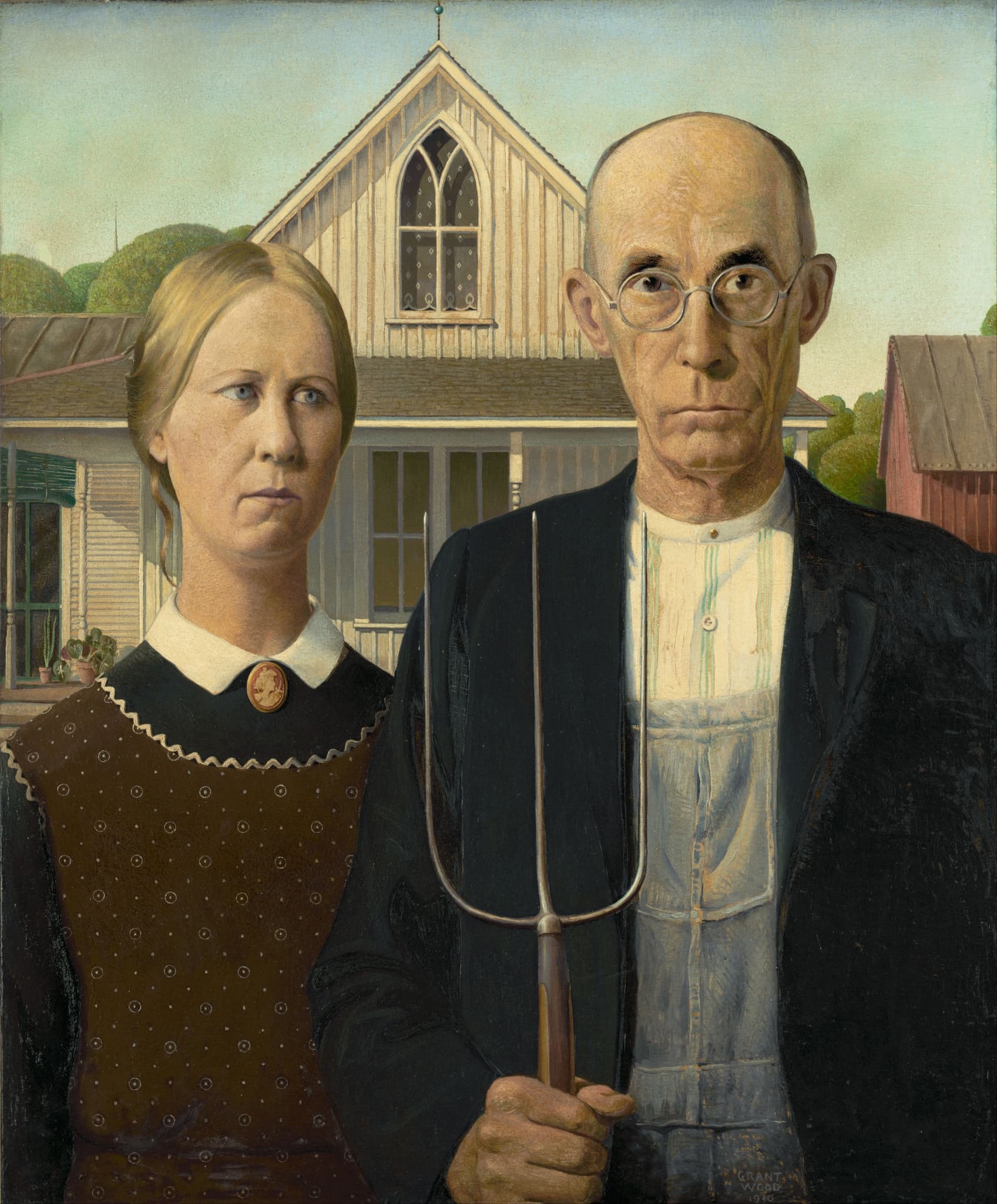
Wood, by contrast, fabricates recognizability through staging. American Gothic fuses two figures to a Carpenter Gothic gable and a pitchfork, turning farm life into emblem. Daughters of Revolution seats three DAR members before a reproduction of Leutze’s Washington Crossing the Delaware, an image about images of patriotism. Parson Weems’ Fable literally pulls a curtain to show the storyteller inserting Gilbert Stuart’s Washington face onto a boy. In each case, the picture acknowledges that belief travels via props, reproductions, and scripts.
Both artists keep homage and critique open at once. Warhol’s formats honor the power of packaging and celebrity while exposing how aura is manufactured by repetition; Wood’s exactitude honors restraint and civic ideals while letting severity and secondhand myth feel uncomfortable. Their shared ground is clear: turn ordinary American signs into icons, and let viewers relearn how images persuade by design.
Decisive Difference
The decisive split is how each treats painting’s job. For Warhol, a painting is a machine-age display that models how images circulate. He adopts photographic transfer and silkscreen misregistration, then hangs works serially so you scan laterally like a shopper or channel-surfer. In Campbell’s Soup Cans, difference collapses to flavor names inside a fixed template; in Marilyn Diptych, color allure decays into ghostly black-and-white as screens wear out; in Sixty Last Suppers, Leonardo becomes a bank of monitors. Repetition doesn’t kill aura so much as manufacture it—again, and again—making process itself the content.
For Wood, a painting is a singular craft object that compresses an ethic into form. He adapts Northern Renaissance clarity and New Objectivity precision to build frontal, stable, scrutinized tableaux. American Gothic’s vertical rhymes—pitchfork, window muntins, garment seams—legislate order; Daughters of Revolution’s seated trio before Leutze’s reproduction renders patriotism as a still life of guardianship; Parson Weems’ Fable stages myth as didactic theater. Meaning crystallizes in one carefully balanced view, where symmetry, surface, and emblematic props fix the story.
Put simply: Warhol’s monument is the system that repeats; Wood’s monument is the order that holds. One teaches you to read images as inventories in motion; the other asks you to read a creed from a single, exacting face-on encounter.
Paired Works
Ordinary into Emblem
Focus question: How does each artist turn a common sight into a national icon?
Campbell's Soup Cans vs American Gothic
Modern Devotion
Focus question: When pictures command belief, what is each artist’s engine of devotion?
Marilyn Diptych vs Daughters of Revolution
Manufacturing Truth
Focus question: How do repetition and reenactment shape what counts as historical truth?
Sixty Last Suppers vs Parson Weems' Fable

Modernity’s Crash
Focus question: What happens to violence when it becomes an image?
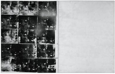
Silver Car Crash (Double Disaster) vs Death on the Ridge Road
Why This Comparison Matters
Warhol versus Wood is not simply Pop versus Regionalism; it is a clear fork in how American art thinks images work. Warhol treats images as units in a system—the way brands, faces, and even sacred scenes gain and lose power as they repeat. His grids and misregistrations make circulation visible, which is crucial for understanding today’s screen culture. Wood treats images as carefully built containers of ethic and story—how order, symmetry, and emblematic props encode a social ideal. His finish and frontality clarify how belief can be staged in a single, decisive view.
Seeing them together steadies two habits of looking: scanning and scrutinizing. The pairings show how the same subjects—icons, devotion, myth, disaster—change when multiplied versus when compressed. For readers and museum-goers, this comparison becomes a toolkit: when a powerful image appears, ask whether its force comes from the system that repeats it or from the order that holds it still. Often, it is both—and knowing where the weight lies is the beginning of understanding what the image wants from us.
Related Links
Sources
- MoMA, Campbell’s Soup Cans (1962) collection entry
- MoMA, Serial/Singular: Andy Warhol's Campbell’s Soup Cans
- Smarthistory, Warhol, Marilyn Diptych
- Guggenheim, Andy Warhol: The Last Supper
- Art Institute of Chicago, American Gothic object page and FAQs
- Cincinnati Art Museum, Daughters of Revolution
- Amon Carter Museum of American Art, Parson Weems’ Fable
- Whitney Museum, Grant Wood: Death on the Ridge Road
- National Gallery of Art, Grant Wood artist entry
- The Warhol, Silkscreen Printing (process overview)