Sixty Last Suppers
by Andy Warhol
Study Print Studio
Create a personal study print
Build a companion study sheet around the part of this painting that speaks to you most. Choose a detail, shape an interpretation, and walk away with something personal and display-worthy.
Fast Facts
- Year
- 1986
- Medium
- Acrylic and silkscreen ink on linen/canvas
- Dimensions
- 116 × 393 in (294.6 × 998.2 cm)
- Location
- Private collection

Click on any numbered symbol to learn more about its meaning
Meaning & Symbolism
Explore Deeper with AI
Ask questions about Sixty Last Suppers
Popular questions:
Powered by AI • Get instant insights about this artwork
Interpretations
Historical Context
Source: Gagosian Quarterly (Jessica Beck); UPI Obituary
Formal Analysis (Media Wall and Silkscreen ‘Noise’)
Source: Gagosian Quarterly (Jessica Beck); Whitney Museum (Donna De Salvo)
Theological Reading (Devotion in Pop Form)
Source: The Andy Warhol Museum; Brooklyn Museum (Revelation); Jane D. Dillenberger
Mediation & Reproduction (After the Engraving)
Source: Gagosian Quarterly (Jessica Beck); MoMA Collection (The Last Supper, 1986)
Restoration, Patina, and Time
Source: Whitney Museum (Donna De Salvo); Gagosian Quarterly (Jessica Beck)
Market, Sanctity, and the Commodity Image
Source: Christie’s (lot record and press); Gagosian Quarterly (Jessica Beck)
Related Themes
About Andy Warhol
More by Andy Warhol
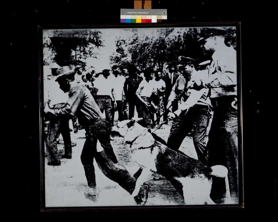
Race Riot
Andy Warhol (1964)
Race Riot crystallizes a split-second of state force: a police dog lunges while officers with batons surge and a ring of onlookers compresses the scene into a <strong>claustrophobic frieze</strong>. Warhol’s stark, high-contrast silkscreen translates a LIFE wire-photo into a <strong>mechanized emblem</strong> of American racial violence and its mass-media circulation <sup>[1]</sup><sup>[2]</sup>.
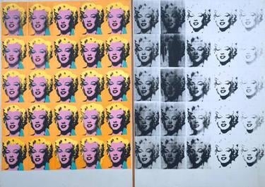
Marilyn Diptych
Andy Warhol (1962)
Marilyn Diptych crystallizes the paradox of fame: <strong>dazzling allure</strong> and <strong>inevitable decay</strong>. Warhol’s 50 repeated silkscreens—color at left, fading grayscale at right—turn a movie-star headshot into a mass-produced <strong>icon</strong> and a memento of mortality <sup>[1]</sup><sup>[2]</sup>.
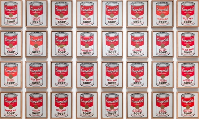
Campbell's Soup Cans
Andy Warhol (1962)
Warhol’s Campbell’s Soup Cans turns a shelf-staple into <strong>art</strong>, using a gridded array of near-identical red-and-white cans to fuse <strong>branding</strong> with <strong>painting</strong>. By repeating 32 flavors—Tomato, Clam Chowder, Chicken Noodle, and more—the work stages a clash between <strong>mass production</strong> and the artist’s hand <sup>[1]</sup><sup>[3]</sup>.
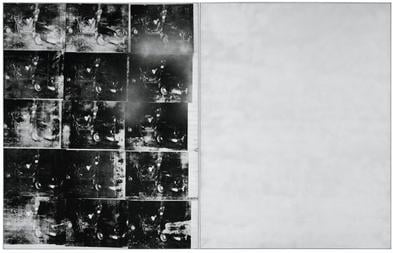
Silver Car Crash (Double Disaster)
Andy Warhol (1963)
Silver Car Crash (Double Disaster) pairs a grid of uneven, black‑and‑white silkscreened crash images with a vast, nearly blank field of metallic silver, staging a battle between <strong>relentless spectacle</strong> and <strong>mute void</strong>. Warhol’s industrial repetition converts tragedy into a consumable pattern while the reflective panel withholds detail, forcing viewers to face the limits of representation and the cold afterglow of modern media <sup>[1]</sup><sup>[2]</sup>.
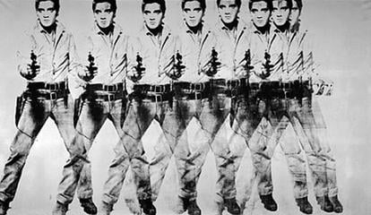
![Triple Elvis [Ferus Type] by Andy Warhol](/_next/image?url=https%3A%2F%2Fstorage.googleapis.com%2Fsite-images-programmatic%2Fpaintings%2F1771915343451-6gzg8m.jpg&w=3840&q=85&dpl=dpl_ASiQPiqukSad84i91Tcm2dUShHhL)
Triple Elvis [Ferus Type]
Andy Warhol (1963)
In Triple Elvis [Ferus Type] (1963), Andy Warhol multiplies a gunslinging movie idol across a cool, metallic field, turning a singular persona into a <strong>serial commodity</strong>. The sharply printed figure at center flanked by fading, <strong>ghosted</strong> doubles collapses still image, filmic motion, and mass reproduction into one charged surface <sup>[1]</sup><sup>[2]</sup>.
Eight Elvises
Andy Warhol (1963)
A sweeping frieze of eight overlapping, gun‑drawn cowboys marches across a silver field, their forms slipping and ghosting as if frames of a film. Warhol converts a singular star into a <strong>serial commodity</strong>, where <strong>mechanical misregistration</strong> and life‑size scale turn bravado into spectacle <sup>[1]</sup><sup>[2]</sup>.