Optical order vs expressive contact
Both painters turned the 1880s into a laboratory for color. Seurat built viewing systems where tiny, calibrated touches cohere into measured light and social order. Van Gogh made color and stroke transmit feeling directly, so space reads as pressure and mood rather than a neutral container.
Comparison frame: How do Seurat’s optical order and Van Gogh’s expressive color each remake what “seeing” in painting can be?
Quick Comparison
| Topic | Georges Seurat | Vincent van Gogh |
|---|---|---|
| Core proposition | Regulate vision: a stable, legible order built from optical mixture | Charge vision: color and touch convert scene into felt experience |
| Color method | Divisionism/chromoluminarism (optical mixture per Chevreul/Rood) | Complementary contrasts as expressive syntax; “night without black” |
| Stroke & surface | Small, even touches; low impasto; a hum at mid‑distance | Loaded, directional strokes; thick impasto; tactile energy up close |
| Composition & spacing | Frontal bands, profiles, frieze effects; painted borders unify | Cropped views, emphatic contour (Japonisme), compressed horizons |
| Night treatment | Gaslight as calibrated halos and pulses, repeatable effects | Gas/starlight as color argument that radiates without black |
| Viewer’s role | Step back to complete mixture; vision clarifies into order | Move in to ride facture; vision intensifies with affect |
| Social staging | Crowds as organized types at a threshold | Public space opened to participation; figures carry mood |
| Exemplary works | Circus Sideshow; A Sunday on La Grande Jatte—1884 | Café Terrace at Night; Wheatfield with Crows |
Shared Ground
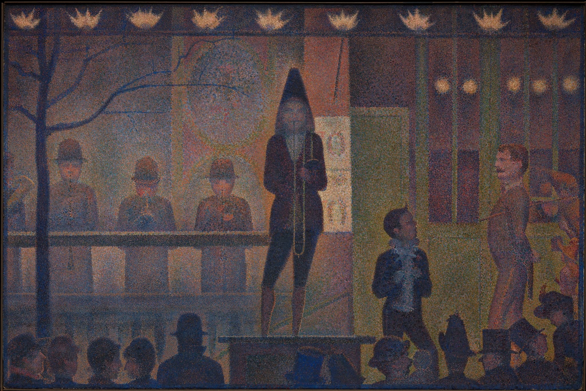
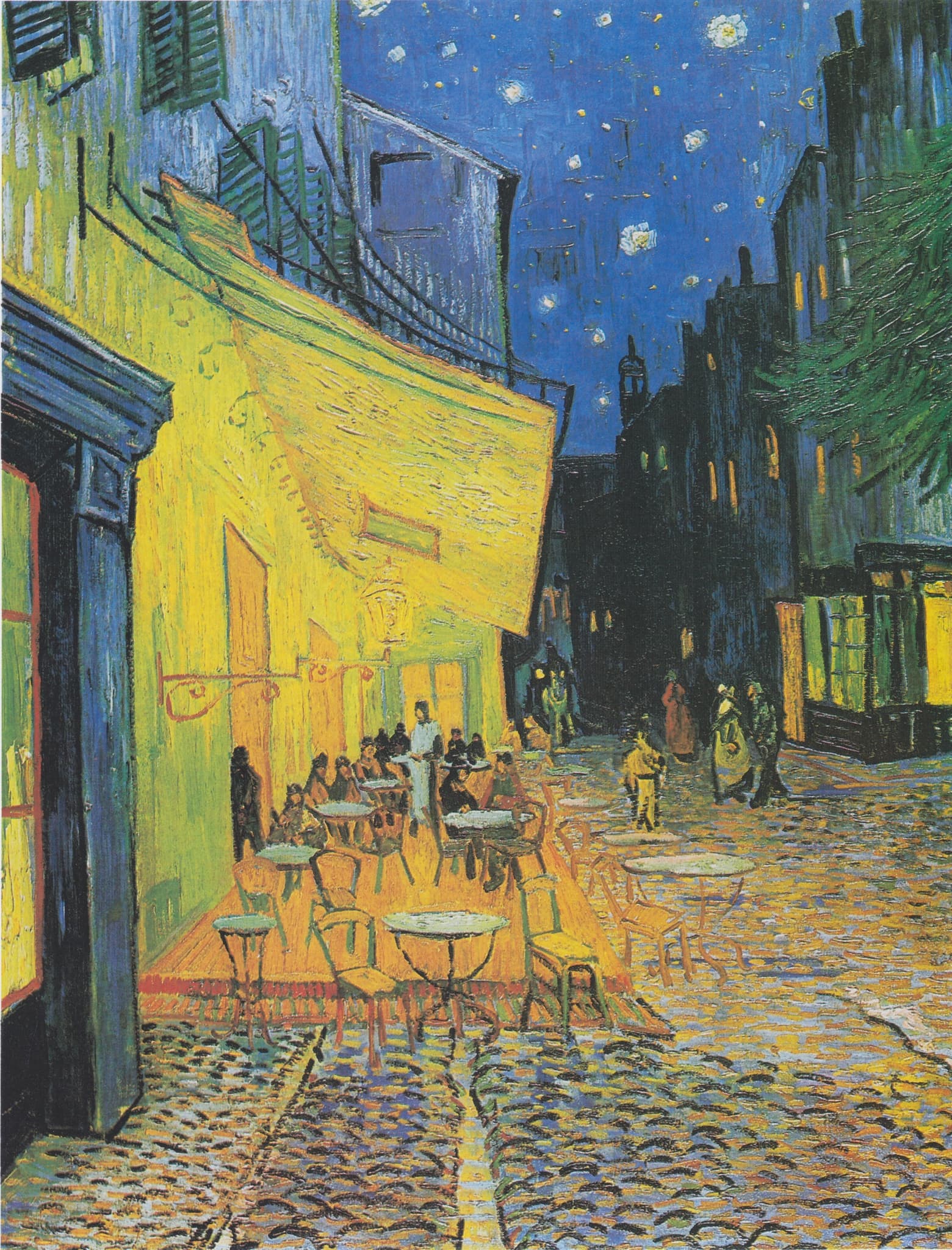
Seurat and Van Gogh share a radical premise: color should drive how a painting builds light, mood, and meaning. Working within a few years of each other, they both used complements not as garnish but as engines—Seurat by separating small touches that mix in the eye, Van Gogh by setting blue/orange, red/green, yellow/violet into deliberate collision. Each treated modern life as the proving ground for this new seeing. Seurat distilled the fairground threshold of Circus Sideshow into a ritual of gaslight and measured spacing; Van Gogh, painting outdoors in Arles, turned Café Terrace at Night into a manifesto for a luminous night without black. In both cases, artificial illumination becomes a structural tool: it reorganizes public space and color registers so that crowds, streets, and tables read as zones of sensation.
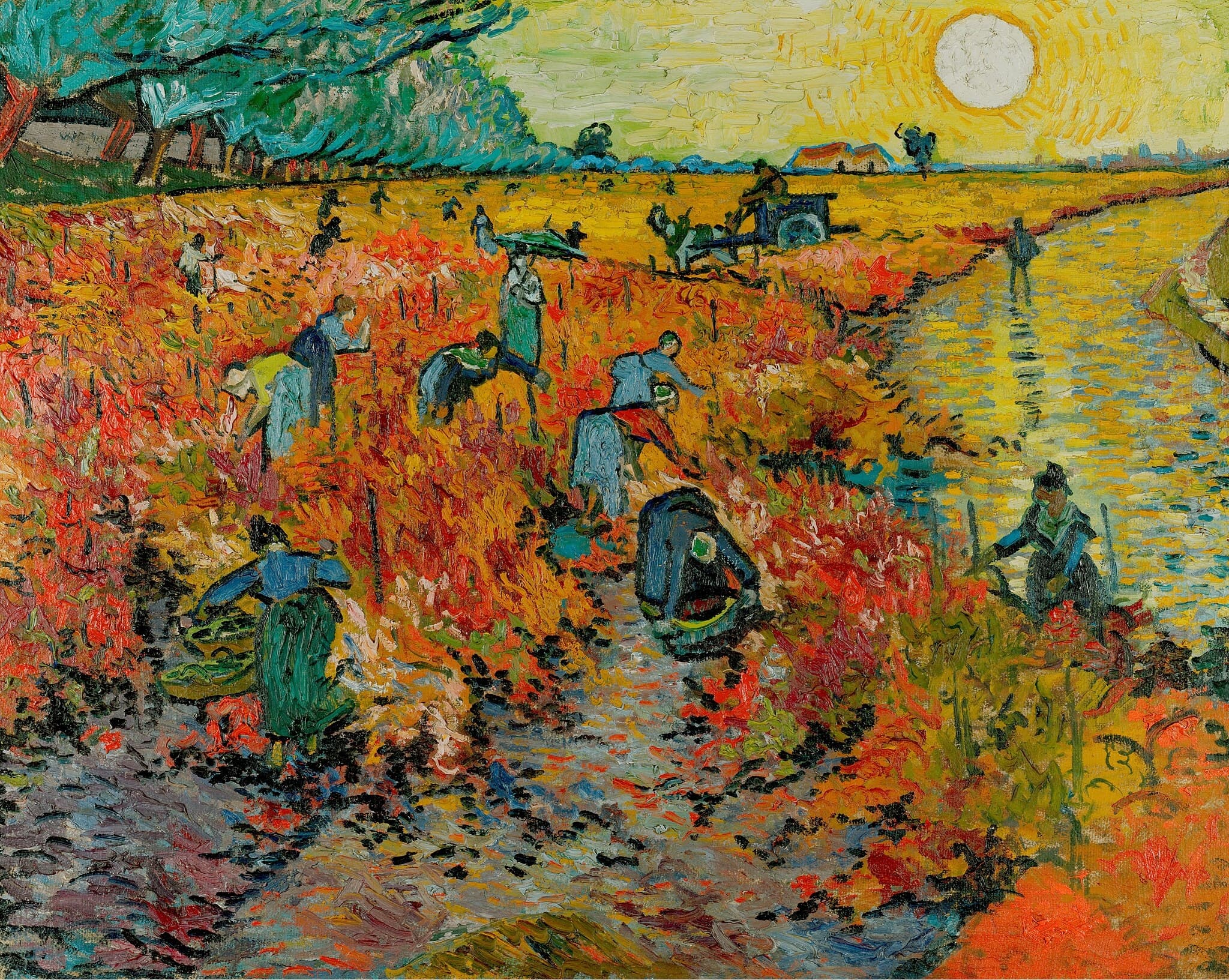
Their subjects overlap beyond night. Seurat’s Bathers at Asnières and A Sunday on La Grande Jatte—1884 and Van Gogh’s The Red Vineyard and Wheatfield with Crows situate bodies and fields inside modern rhythms—leisure, labor, and seasonal pressure—translated into chromatic systems. Both artists were deeply informed: Seurat by contemporary color science and compositional theory; Van Gogh by letters that spell out his program for complementary contrasts and by Japanese print design. The shared ground is not stylistic resemblance but a common wager: if you reconstruct color, you can remake how viewers see and feel modernity unfolding.
Decisive Difference
The decisive split lies in what painting is asked to do to seeing. For Seurat, painting is a calibrated optical-social instrument. He composes in measured bands and profiles, choreographing access and spacing so that small, discrete touches interact in the viewer’s eye. As you step back, Circus Sideshow’s nine gas jets settle into an even crown; Bathers at Asnières resolves into a silvery order where types are legible and time seems held. His nocturnes turn gaslight into controlled halos and pulses. The viewer’s compliance—distance, duration—stabilizes the image; vision is regulated into clarity. Socially, this order is part of the message: modern crowds appear as arrays you can read.
For Van Gogh, painting is a converter of feeling. Saturated complements, impasto, and directional stroke make rooms, streets, and fields carry inner tenor. Café Terrace at Night proves night can blaze without black; The Night Café uses red/green to push human passions; Wheatfield with Crows compresses horizon and drives paint like weather to register loneliness and force. Up close the surface is urgent; from middistance it still hums with energy. The viewer’s nearness increases intensity rather than order. Consequence: Seurat positions us at a lucid threshold that clarifies with retreat; Van Gogh places us inside the pressure of a moment that amplifies with approach.
Paired Works
Night under modern light
Focus question: How does each artist turn gaslit night into a structure for seeing?
Circus Sideshow (Parade de cirque) vs Café Terrace at Night
Seurat meters night. In Circus Sideshow, nine milky gas jets string across the top like a visual metronome, fixing the platform below into a frieze of barker and band while the public remains a silhouetted band at the edge. Blue‑violet atmosphere is pricked by small orange and green touches that fuse at distance into a cool, even hum. The effect is a system: light, spacing, and profile align to regulate access and attention. You witness a threshold—order first, spectacle later.
Van Gogh lets night radiate. In Café Terrace at Night, a single lantern saturates the yellow awning and spills across violet cobblestones while the ultramarine sky holds crisp stars. He paints outdoors and refuses black, layering blues and greens to build darkness as presence. The terrace opens toward us; empty chairs and the raked street invite entry. Where Seurat’s gaslight crowns and contains, Van Gogh’s lamp enlarges and welcomes. Both use complementaries, but one stabilizes seeing into rhythm, the other heightens contact and warmth.
Social modernity: order vs effort
Focus question: What do these canvases say about how a modern crowd is organized?
Bathers at Asnières vs The Red Vineyard
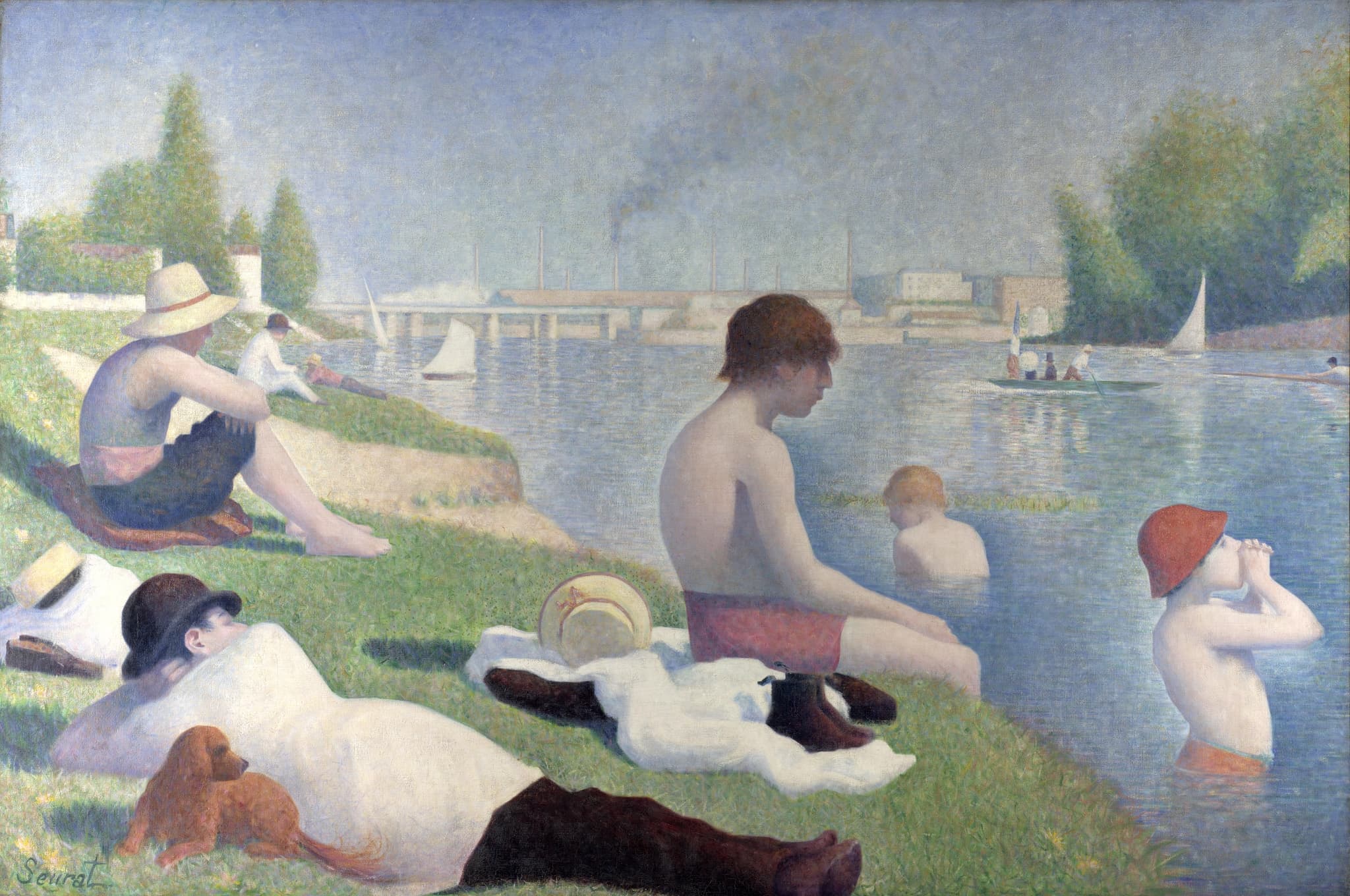
Seurat’s Bathers arranges workers-at-leisure into a still procession under a unified haze. Figures sit in profile like sculpture; distances between bodies are measured; the river’s bands and the bridges’ horizontals knit the field. Industry—chimneys, boats, bridges—enters as calm counterpoint, not disruption. Color is calibrated to cohere at range, so leisure reads as a legible civic state: modern, ordinary, and composed.
Van Gogh’s Red Vineyard turns harvest into a diagonal current. Anonymous pickers flow through scarlet vines toward a cart as a sun pressed from the tube beats down; along the right, a yellow road throws back the light. Red and green, blue clothing against orange ground—complements dramatize temperature and exertion. Space is a corridor of work rather than a stage of types. Put together, the pair clarifies a core split: Seurat proposes restful order made visible; Van Gogh proposes rhythmic toil made palpable.
The public frieze vs personal weather
Focus question: What changes when a picture is built to resolve at distance versus to confront you up close?
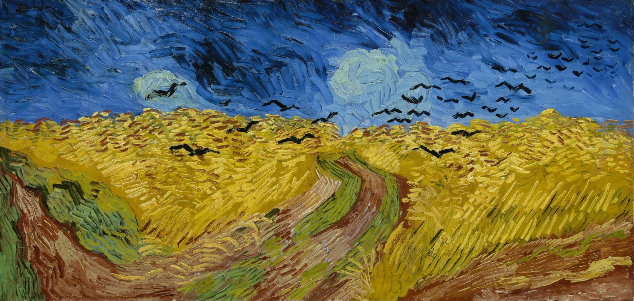
A Sunday on La Grande Jatte—1884 vs Wheatfield with Crows
La Grande Jatte is engineered for resolution. Divisionist touches, painted borders, and a frieze of profiles and intervals cohere as you step back; the crowd reads as a social diagram—leisure organized into legible spacing. The field is systemic: color hums evenly, time feels held, and the viewer completes the image by granting it distance and duration.
Wheatfield with Crows is engineered for impact. The double‑square format compresses the horizon; three paths lunge forward and stall; crows slice the storm‑blue band. Thick, directional strokes turn grain and sky into weather under pressure. Nearness amplifies meaning: the paint itself carries loneliness and force. Together the works stage two viewer contracts—submit to a system and gain clarity, or enter a charged surface and share its intensity.
Why This Comparison Matters
This comparison isolates two durable models for modern painting. Seurat shows how a picture can be a lucid instrument: color built from parts, composition measured, social life legible. His strategy anticipates later design-driven modernisms and abstraction that ask viewers to stabilize a system and read relations. Van Gogh shows how a picture can be a conduit: complements as emotional voltage, touch as weather, night as radiance. His path leads toward Expressionism and any practice that treats facture as feeling rather than finish.
For viewers, the distinction clarifies how to look. With Seurat, step back; watch dots, spacing, and halos settle into an ordered world. With Van Gogh, move in; let the brush and saturated oppositions transmit pressure and warmth. Both make seeing active, but they assign it different work—synthesis versus empathy. Knowing that difference makes the canvases not just beautiful episodes but instruments that teach how vision can be structured or charged.
Related Links
Sources
- The Met: Neo‑Impressionism overview (Seurat’s method, color science, viewer distance)
- The Met object page: Seurat, Circus Sideshow (Parade de cirque)
- National Gallery, London: Seurat, Bathers at Asnières
- Art Institute of Chicago: La Grande Jatte—frame and painted borders
- Van Gogh Letters: 9–14 Sept 1888 (Café Terrace: night without black)
- Van Gogh Letters: 8 Sept 1888 (The Night Café: red/green for terrible passions)
- Van Gogh Letters: 10 July 1890 (wheatfields under turbulent skies)
- HueValueChroma: Optical vs. physical color mixture and viewing distance
- Light into Darkness: Gaslight in Nineteenth‑Century Paris (context for urban nocturnes)
- Musée d’Orsay: Van Gogh in Auvers (double‑square panoramas)