Engineered Clarity vs Chromatic Intensity
Both artists turn everyday nature into a system for seeing. Hokusai builds lucid, repeatable images—serial views keyed to Mount Fuji and sharpened by Prussian-blue printing—so forces become legible. Van Gogh charges the paint surface itself—complements, impasto, and formats like the double‑square—so weather and mood are felt through color and touch. The result is a shared project with opposite means: see through the world (Hokusai); feel within it (Van Gogh).
Comparison frame: How do Hokusai’s engineered clarity and Van Gogh’s chromatic intensity each remake what a landscape lets us see and feel?
Quick Comparison
| Topic | Hokusai | Vincent van Gogh |
|---|---|---|
| Core aim | Stabilize the world’s forces into a readable system anchored by Fuji. | Turn feeling into visible structure on the paint surface. |
| Medium and circulation | Collaborative, editioned woodblock prints; effects repeatable and comparable. | Singular oil canvases and letters; each surface uniquely charged. |
| Series logic | Thirty‑Six Views of Mount Fuji: one motif across weather, labor, and vantage. | Sunflowers, wheatfields, skies: color/touch tested across canvases and formats. |
| Space | Engineered depth: low horizons, scale shifts, Western‑inflected perspective. | Compressed or near‑flat space: high horizons, close crops, double‑square breadth. |
| Color/technology | Prussian blue layered with indigo; flat tones stepped for legibility. | Complementary clashes; “night without black”; thick impasto as weather. |
| Human presence | Small crews and travelers lock into a measured landscape. | Figures sparse; mood borne by field, sky, and brushwork. |
| Guiding sentence | See through the world. | Feel within the world. |
Shared Ground
Hokusai and Van Gogh share a practical ambition: turn nature into a system for seeing. Both work in series so a motif becomes a laboratory—Fuji under shifting weather and labor across Hokusai’s Thirty‑Six Views; fields, skies, and flowers across Van Gogh’s Arles and Auvers campaigns. In each case, the subject is ordinary and repeatable, but the image is engineered so viewers register pattern, force, and cycle rather than scenery. That serial method converts looking into comparison: prints and canvases teach you to read difference—between a clear morning and a storm front, between a fresh bloom and a seed head—inside a stable framework.
New materials are not background; they drive perception. Hokusai’s early adoption of Prussian blue in woodblock editions allows durable, stepped blues that model volume and distance without sacrificing clarity. Van Gogh commits to gas‑lit nocturnes and high‑chroma daylight—his “night without black” program—so darkness becomes color and weather becomes touch. Both also stage nature as pressure and consolation. In The Great Wave, peril gathers while Fuji steadies the scene; in Van Gogh’s wheatfield panoramas, storm mass bears down while the cropped grain surges as a counter‑force. Human presence is purposeful but scaled: oarsmen and travelers in Hokusai remain legible within a measured space; Van Gogh often drops figures so the field itself carries feeling. Across different media, each artist asks how images can make natural forces graspable—psychologically, spatially, and materially.
Decisive Difference
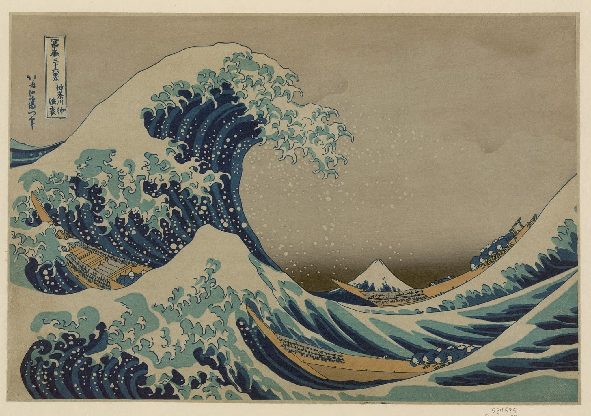
The decisive difference lies in how each builds the picture’s authority. Hokusai constructs clarity from the outside in. Line, framing, and calibrated perspective stabilize experience so distance and scale are legible. In The Great Wave off Kanagawa, low horizon, measured scale shifts, and Western‑inflected optics let us look through the arch of water toward a tiny, anchoring Fuji. In Ejiri in Suruga Province (Sudden Gust of Wind), a single instant of weather sweeps across a deep, ordered space; papers and hats arc along readable vectors. The print medium underwrites this stability: blocks and inks can reproduce effects, enabling comparison across a series, and teaching the eye to parse variation with confidence.
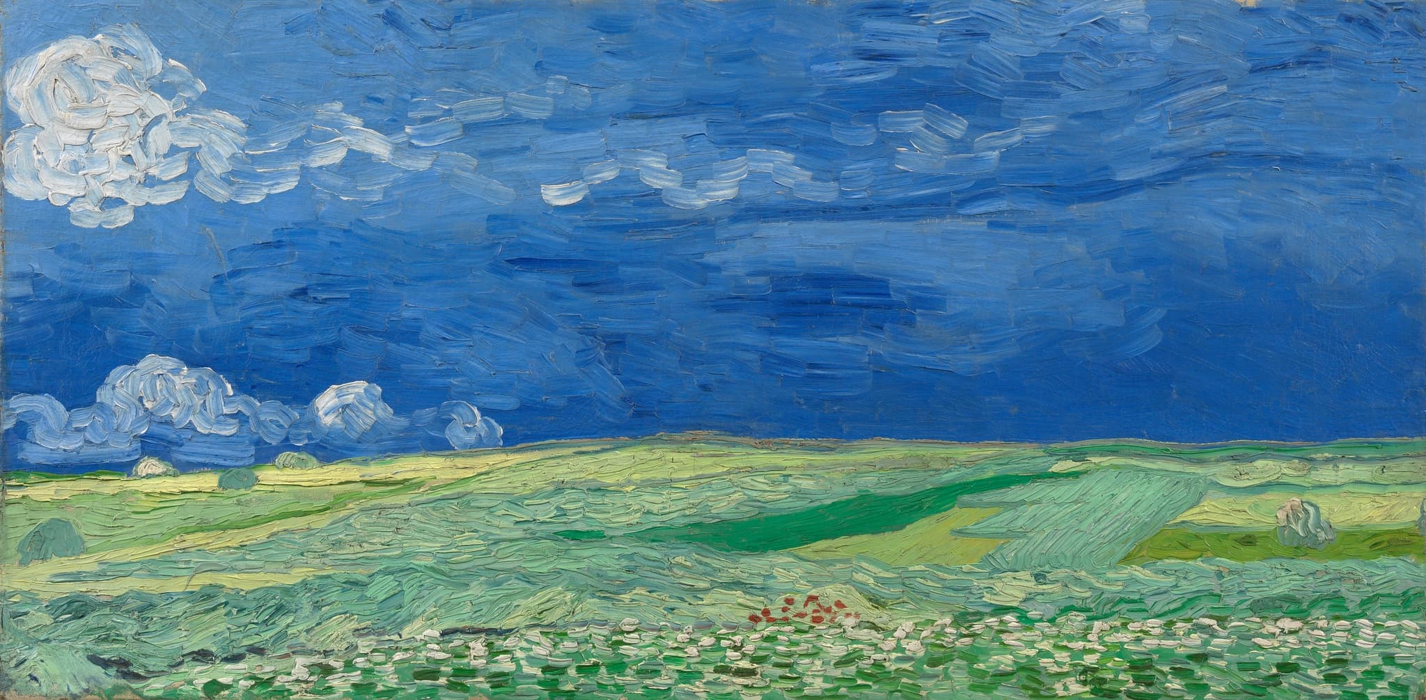
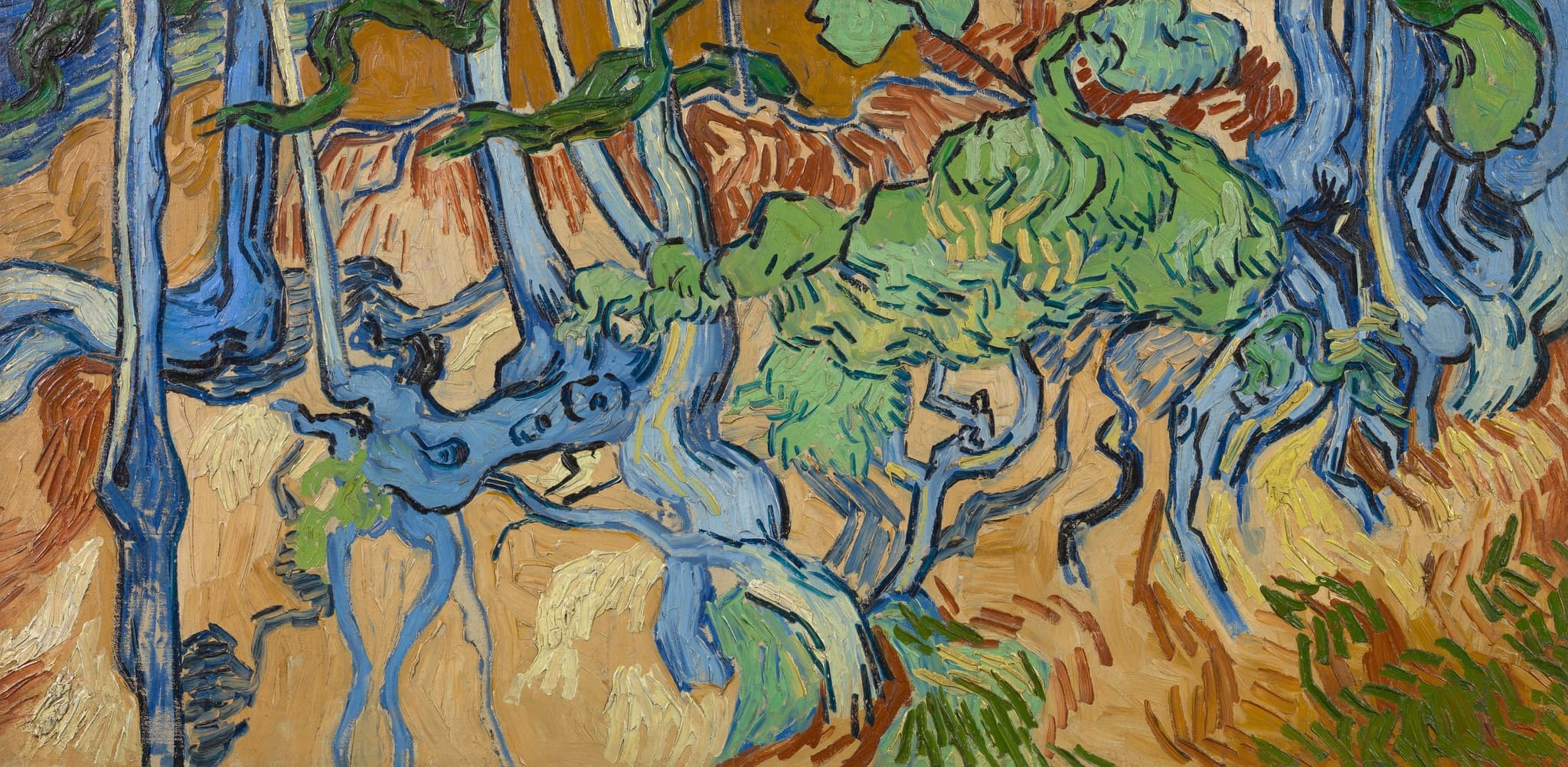
Van Gogh, by contrast, builds intensity from the inside out. Color and touch are structural, so the surface carries weather, speed, and mood. In Wheatfield under Thunderclouds, a two‑band architecture compresses depth so the storm sits on the paint; directional impasto turns the wheat’s resilience into tactile fact. In Tree Roots, horizon and sky vanish; interlaced contours and saturated complements create an all‑over pressure where paint behaves like the event. Format choices—especially the elongated double‑squares—magnify these binaries (earth/sky; body/world) while letters declare the program (“night without black”). Where Hokusai systematizes the world so we can see through it, Van Gogh electrifies the surface so we can feel within it. Medium, space, and material all point to that split.
Paired Works
Storm, Built Two Ways
Focus question: Where does the storm live—in deep space you see through, or on the paint skin you feel?
The Great Wave off Kanagawa vs Wheatfield under Thunderclouds
Monochrome, Two Philosophies of Time
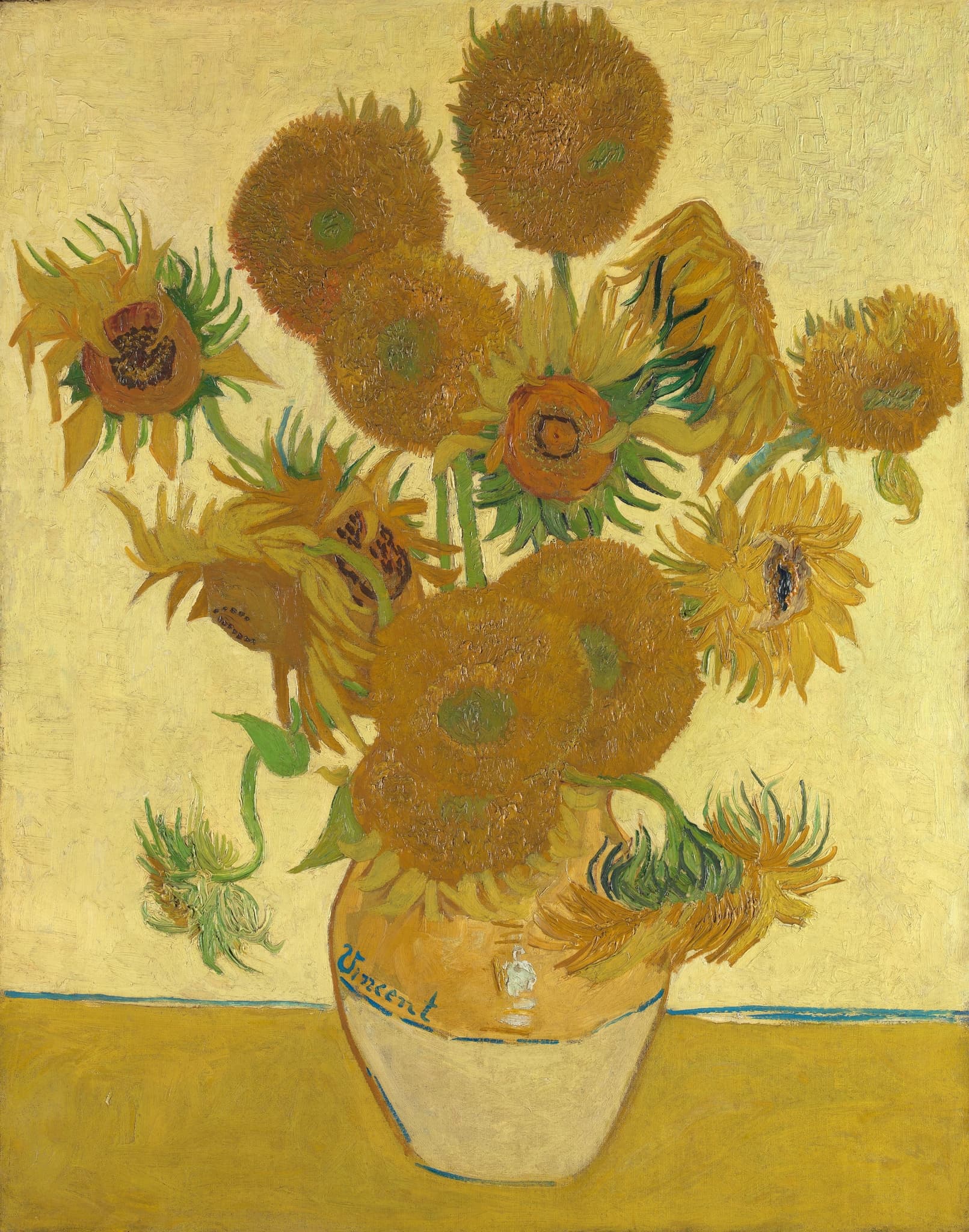
Focus question: How does near‑monochrome argue permanence in one case and transience in the other?
Fine Wind, Clear Weather (Red Fuji) vs Sunflowers
What Counts as Weather
Focus question: Is weather an external gust across distance, or pressure welded into a close‑up surface?
Ejiri in Suruga Province (Sudden Gust of Wind) vs Tree Roots
Why This Comparison Matters
Seeing Hokusai next to Van Gogh clarifies two durable models for modern looking. One engineers clarity so the world’s forces become comparable across conditions; the other concentrates feeling so the surface itself bears speed, pressure, and mood. Those models map onto medium and audience: editioned woodblock prints circulate a system of views and teach comparative seeing; singular canvases and letters stage experiments in intensity that must be met at the surface. The comparison also traces a material lineage—from Prussian blue in Edo printshops to gas‑lit nocturnes and high‑chroma fields in France—showing how technology changes what we think night, storm, and distance can look like.
This matters beyond art history. Hokusai’s method underwrites a habit of reading the world for structure; Van Gogh’s underwrites a habit of registering the world through affective charge. Screens, photographs, and data visualizations still oscillate between those poles. Learning to name the difference—engineered clarity versus chromatic intensity—helps viewers decide what kind of truth an image is claiming, and why it moves them.
Related Links
Sources
- The Met, Anatomy of an Icon: Hokusai’s Great Wave (materials, printing, Prussian blue/indigo strategy)
- British Museum, The Great Wave off Kanagawa (object entry; perspective, impressions)
- The Met, Ejiri in Suruga Province (Sudden Gust of Wind) (object entry)
- Princeton University Art Museum, Fine Wind, Clear Weather (Red Fuji) (object entry)
- Van Gogh Letters, 678: “Night without black” (program for nocturnes)
- Van Gogh Letters, 898: Wheatfields under turbulent skies; sadness and fortification
- Van Gogh Letters, 686: “I envy the Japanese the extreme clarity…” (Japonisme)
- Musée d’Orsay, Van Gogh in Auvers‑sur‑Oise (double‑square formats; late landscapes)
- Van Gogh Museum, press release: Discovery of Tree Roots site (last masterpiece)
- Analytical Chemistry (ACS): Discoloration of chrome yellow in Van Gogh’s works
- Van Gogh Museum, Conservation treatment of Sunflowers