Two ways to redesign looking
Klimt and Matisse both flatten space and turn painting into a designed way of seeing. Their shared ground is a controlled surface that reorganizes attention—Klimt through ornamental systems and precious matter, Matisse through autonomous, structural color. The decisive split is what that surface persuades you of: Klimt gives vision an aura, Matisse gives it a lucid present.
Comparison frame: How do Klimt’s ornamental icons and Matisse’s chromatic fields each redesign what looking feels like?
Quick Comparison
| Topic | Gustav Klimt | Henri Matisse |
|---|---|---|
| What the surface is for | To confer aura—ornament and precious matter make conviction visible | To construct sensation—color itself builds space and mood |
| Primary building block | Motifs and materials: gold leaf, spirals, eyes, rect/oval sets | High‑key color and reserves; contour as an economical armature |
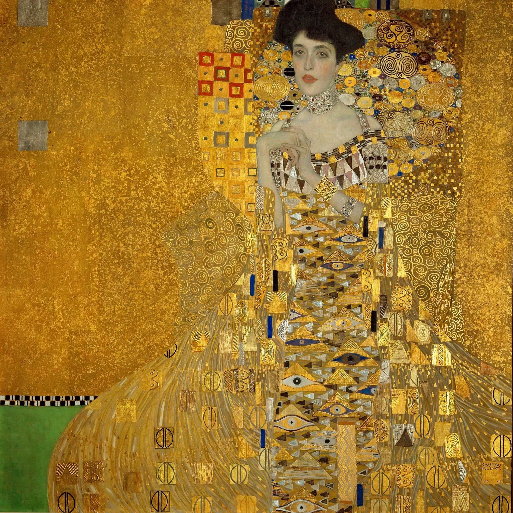
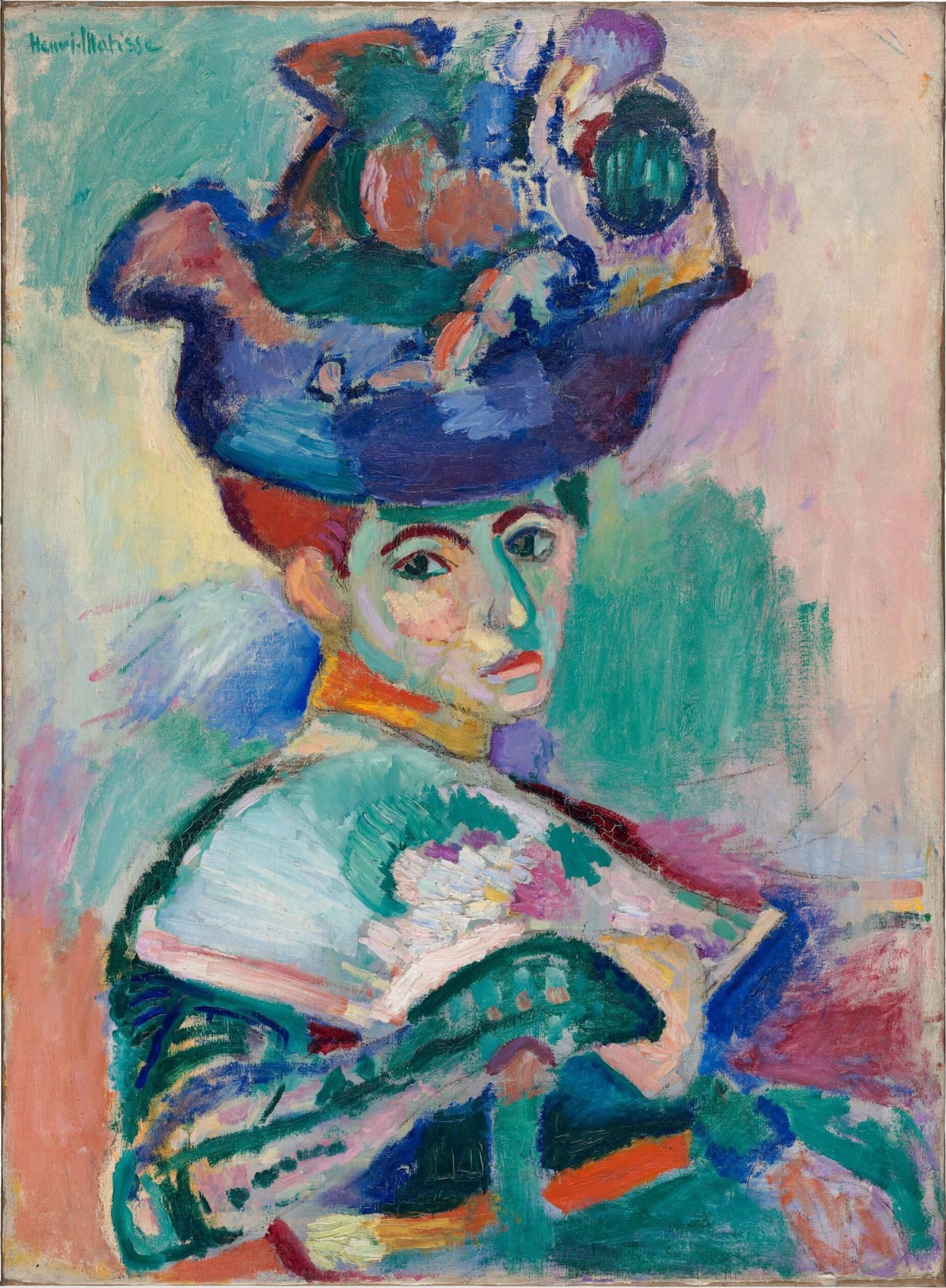
| Portrait logic | Real flesh staged in a reliquary of signs (Adele Bloch‑Bauer I) | Face modeled by invented color; identity as performance (Woman with a Hat) |
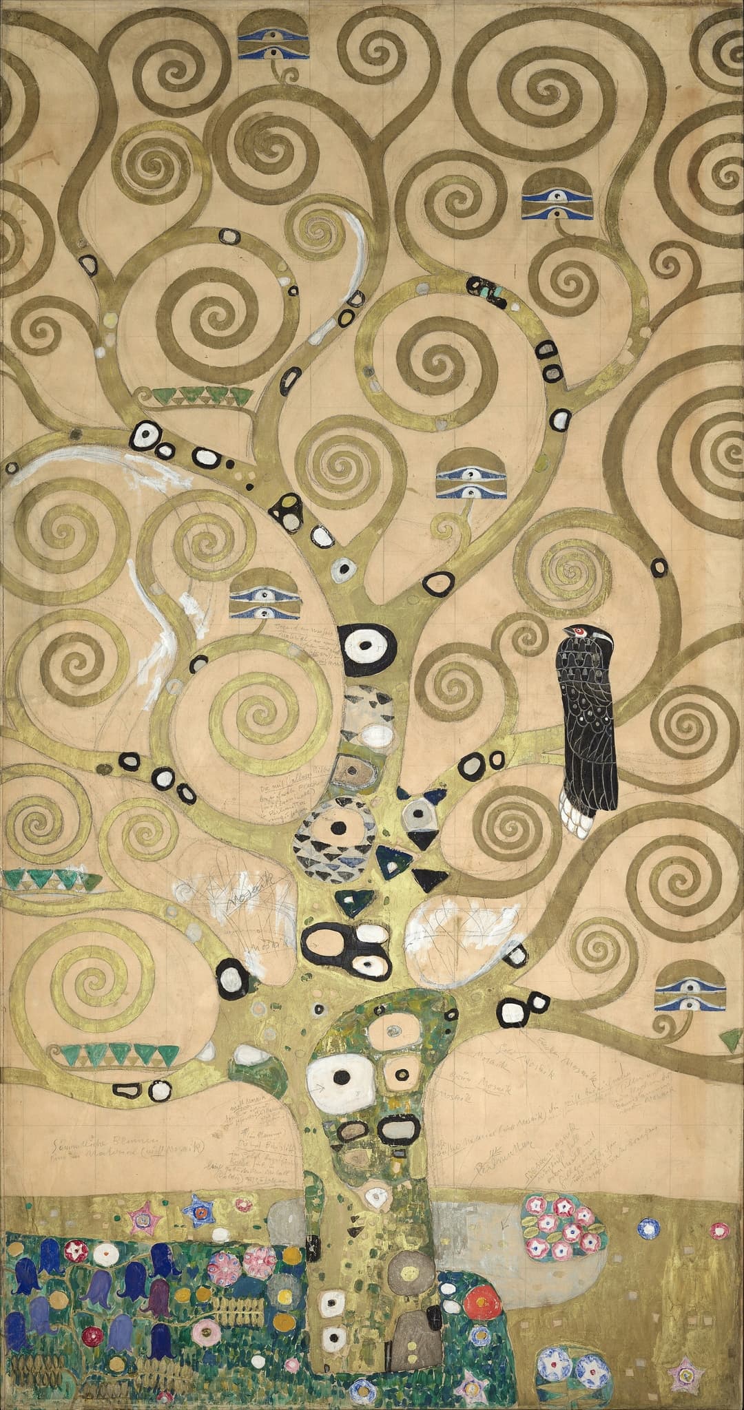
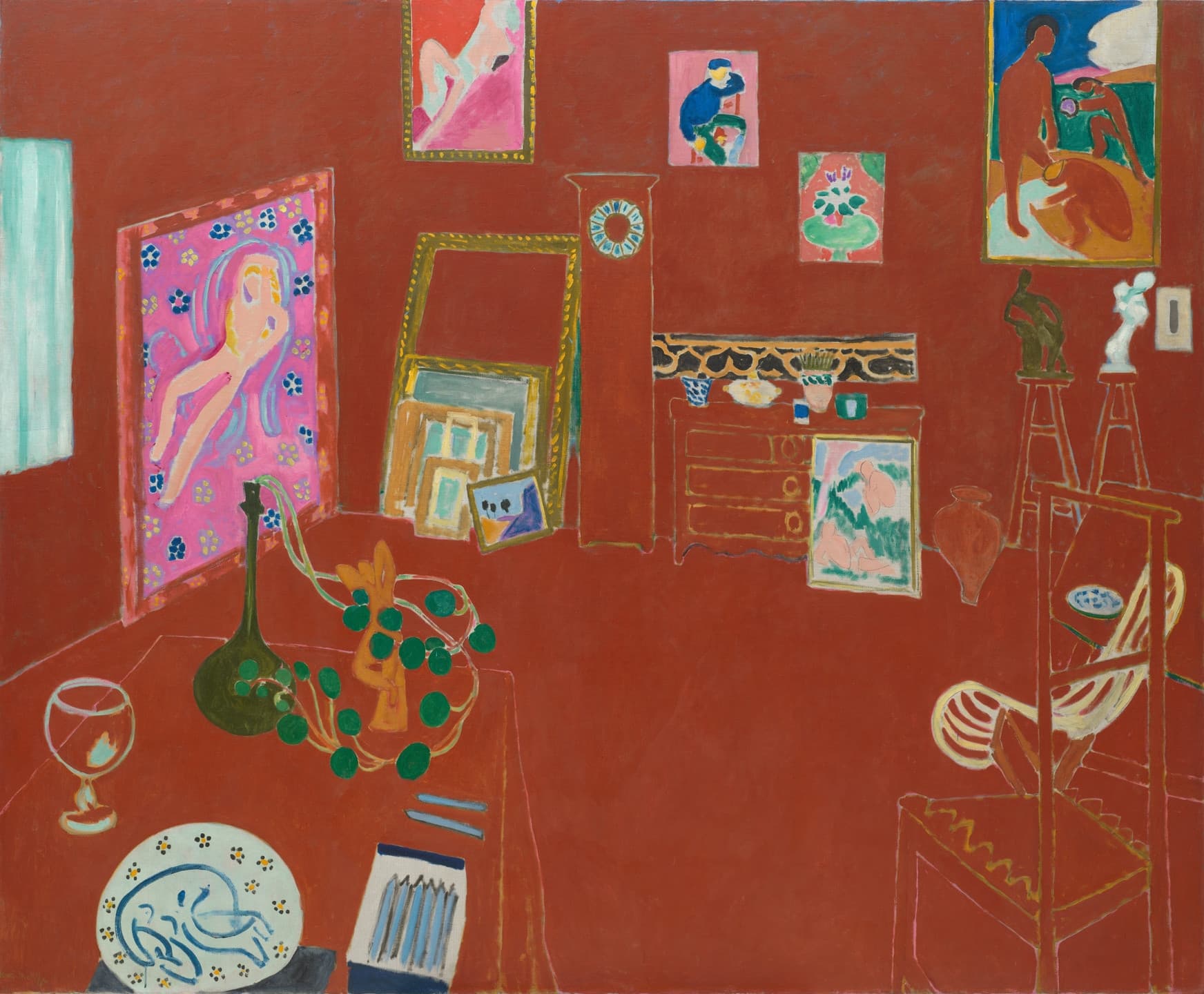
| Interior strategy | Gesamtkunstwerk; frieze + architecture = ritual environment (Stoclet) | Chromatic room; furniture as “gaps,” artworks keep color (The Red Studio) |
| Sense of time | Timeless, iconic present; images that abide | Studio time in the present; clock without hands |
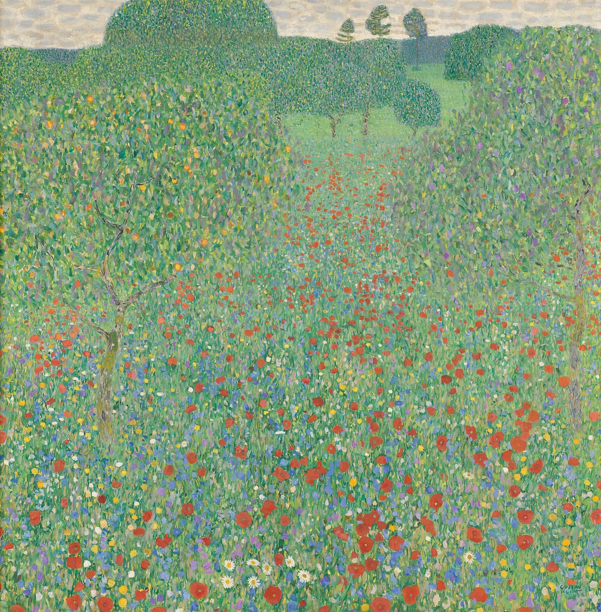
| Landscape method | Square, tessellated fields; tapestry‑like enclosure (Attersee, Poppies) | Color contrasts hinge interior/exterior (Open Window, Collioure) |
| Material rhetoric | Luxury as argument: gold, enamel, mother‑of‑pearl | Paint as pure color; facture kept economical and legible |
Shared Ground
Both Klimt and Matisse treat painting less as description and more as a designed way of seeing. They flatten deep space into frontally organized fields that train the eye to read laterally across the surface. Klimt’s gold grounds and tessellated strokes convert backgrounds into active, ordinance‑bearing planes; Matisse’s chromatic expanses do the same through invented color and strategic reserves. In practice, this turns pictures into environments for perception. Klimt integrates image with room—most spectacularly in the Stoclet dining‑room frieze—so that ornament, material, and architecture act together. Matisse recasts the studio as a mental map: in The Red Studio the furniture becomes drawn “gaps” while artworks punctuate the red field with full color, reordering what matters inside the room.
Portraiture and domestic space are where the kinship is clearest. Klimt’s Portrait of Adele Bloch‑Bauer I suspends a sitter inside a system of signs—eyes, spirals, triangles—so that identity is built from surface as much as from flesh. Matisse’s Woman with a Hat likewise makes identity out of visible artifice: greens, violets, and oranges model a face without conventional shadow, while hat and fan become devices that construct public appearance. Landscapes, too, converge: Klimt’s square Attersee pictures and Flowering Poppies compress nature into shimmering, tapestry‑like fields; Matisse’s Open Window, Collioure fuses interior and view through pure, high‑key tones. Across media and subjects, each artist proposes that modern vision is made credible not by illusionistic depth, but by a coherent surface system the eye can inhabit.
Decisive Difference
Their decisive split lies in what convinces you that the image is true. Klimt persuades through aura—ornament plus precious matter that carry symbolic weight. Gold leaf, enamel, and mother‑of‑pearl are not embellishments but arguments: their sanctified sheen installs a timeless register in which images claim ethical or cosmological authority. In the Stoclet Frieze and The Kiss, mosaic syntax and canonical motifs (spirals, eyes) stabilize the picture as a modern icon; in Adele Bloch‑Bauer I, only head and hands stay naturalistic while gold and pattern elevate the person into a reliquary of modern status and devotion.
Matisse persuades through color as structure—sensation made legible now. In The Red Studio, Venetian red collapses architecture into a chromatic plane; furniture survives as drawn reserves, while the artworks keep full color and thus set the room’s hierarchy. In Woman with a Hat and Open Window, Collioure, non‑naturalistic hues do the shaping: green cleaves a face; pinks and blues open the sea and shutters. His declared aim—balance, purity, serenity—rests on color’s ability to build space and clarity without recourse to illusionistic modeling or luxury materials. Summed up: both flatten and redesign vision, but Klimt makes seeing feel ritual and mythic, whereas Matisse makes it feel immediate, lucid, and present‑tense.
Paired Works
Portraits as constructed presence
Focus question: What does each portrait ask you to believe about how a self is made?
Portrait of Adele Bloch-Bauer I vs Woman with a Hat
Room-as-world
Focus question: How does each artist turn an interior into a model of perception?
The Tree of Life vs The Red Studio
Landscape as a surface system
Focus question: How do their landscapes recruit pattern or color to rebuild depth?
Flowering Poppies vs Open Window, Collioure
Why This Comparison Matters
The comparison isolates two credible modern contracts for painting. If you sense that images can persuade by surface, the next question is: persuade you of what? Klimt wagers that ornament and matter can carry conviction—an image gains authority when its surface behaves like a shrine. Matisse wagers that color can carry clarity—an image gains truth when sensation is organized and legible in the present tense. Seeing those options together sharpens how we read modern pictures that seem “flat” or “decorative.”
It also clarifies later art. The Red Studio’s all‑over chroma anticipates color‑field painting; Klimt’s material rhetoric forecasts installation‑scale environments where substance is argument. For portraits and interiors we live with today—fashion imagery, designed rooms, screens—this pairing offers a practical lens: are we being asked to believe through aura or through sensation? That question helps decode not only Klimt and Matisse but much of the 20th century’s visual world.
Related Links
Sources
- Smarthistory: Gustav Klimt, The Kiss
- MoMA: Henri Matisse, The Red Studio
- SFMOMA: Henri Matisse, Woman with a Hat
- National Gallery of Art: Matisse, Open Window, Collioure
- Secession Vienna: Mission and Motto
- Smarthistory: Wiener Werkstätte and Stoclet context
- MoMA Research/Catalogue: Klimt (materials and symbolism)
- Neue Galerie: Adele Bloch‑Bauer I (Woman in Gold)
- Met Museum: Henri Matisse (overview and aims)
- Wikipedia: Vienna Secession (context overview)