Modern light, two aims
Both artists ask how painting can make the present tense mean something. They translate cafés, gardens, churches, and flowers into atmospheres where color and touch do the narrative work. The decisive split: Renoir harmonizes seeing into social grace; Van Gogh intensifies seeing into conviction.
Comparison frame: How do Renoir and Van Gogh use color and touch to change what “seeing” delivers—Renoir toward social harmony, Van Gogh toward felt conviction?
Quick Comparison
| Topic | Pierre-Auguste Renoir | Vincent van Gogh |
|---|---|---|
| Core aim | Seeing as social attunement; make bonds visible | Seeing as inner tenor; make feeling visible |
| Color as structure | High‑key harmonies within a warm envelope; line tightened after 1881–82 | Complementary chords (yellow/blue, red/green); “night without black” |
| Brushwork | Soft, dappled touch; edges breathe; faces/hands crispen to secure presence | Directional, tactile strokes as energy and form; impasto carries force |
| Space | Atmospheric fusion of figure and ground; decorum organizes proximity | Tilted planes, compressed horizons; space charged to heighten mood |
| Social stage | Public leisure as choreography of touch and etiquette (dances, cafés) | Cafés, streets, fields as sites of welcome, solitude, or urgency |
| Serial method | Variants calibrated for patrons/state (e.g., Piano versions) | Programmed series with declared aims (Sunflowers, wheatfields) |
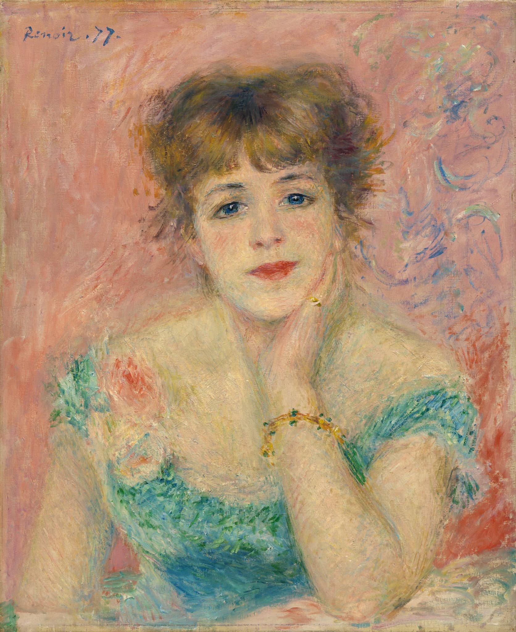
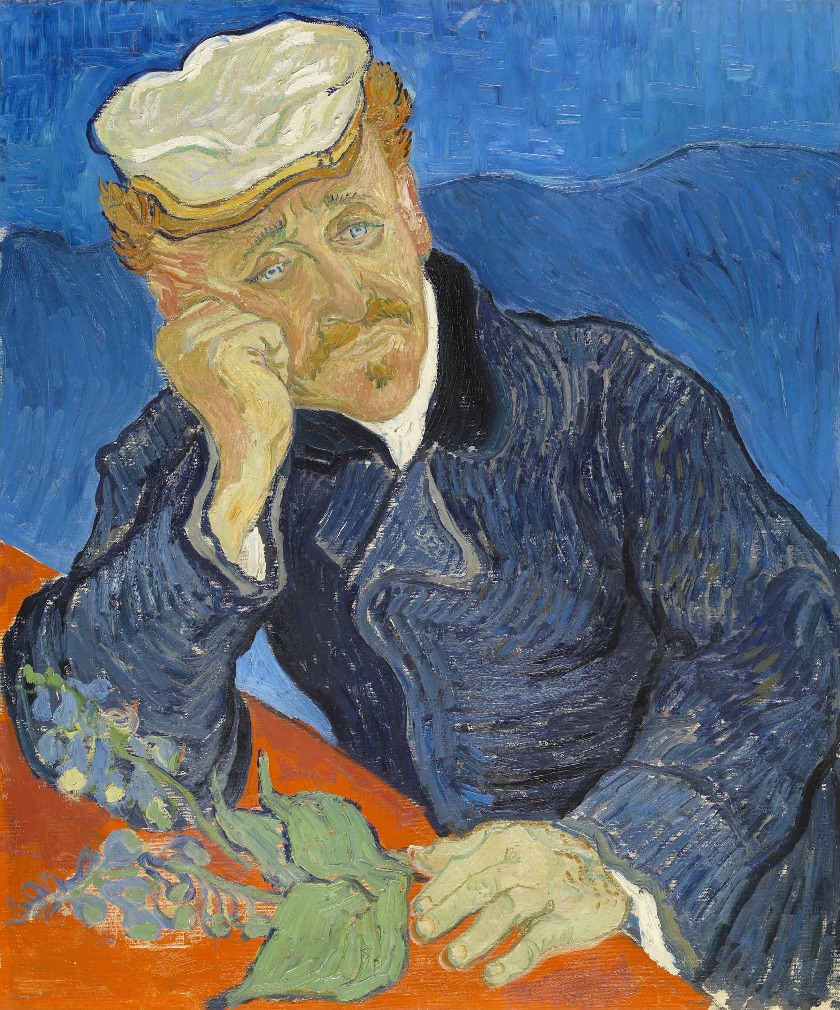
| Portrait stance | Grace and presence within a luminous “envelope” | Psychological weather; emblematic props (foxglove, books) |
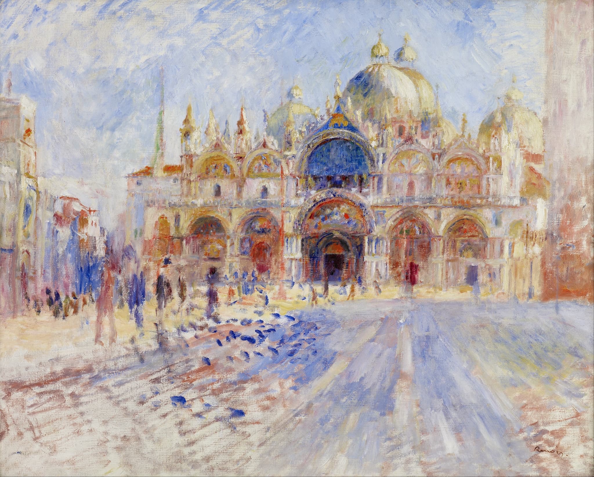
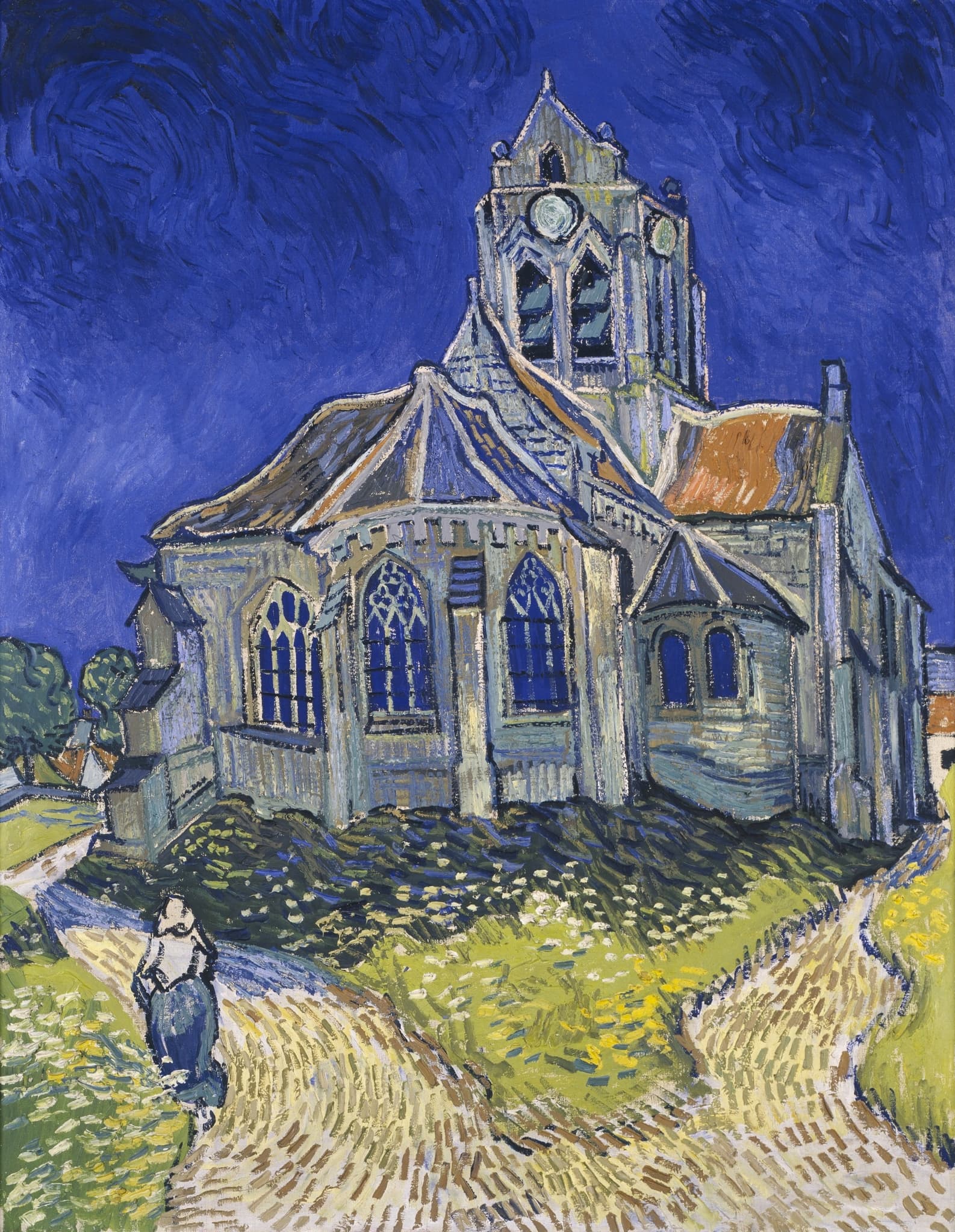
| Architecture | Dissolved into light events (Venice as atmosphere) | Animated, unsettled form (Auvers church under cobalt sky) |
Shared Ground
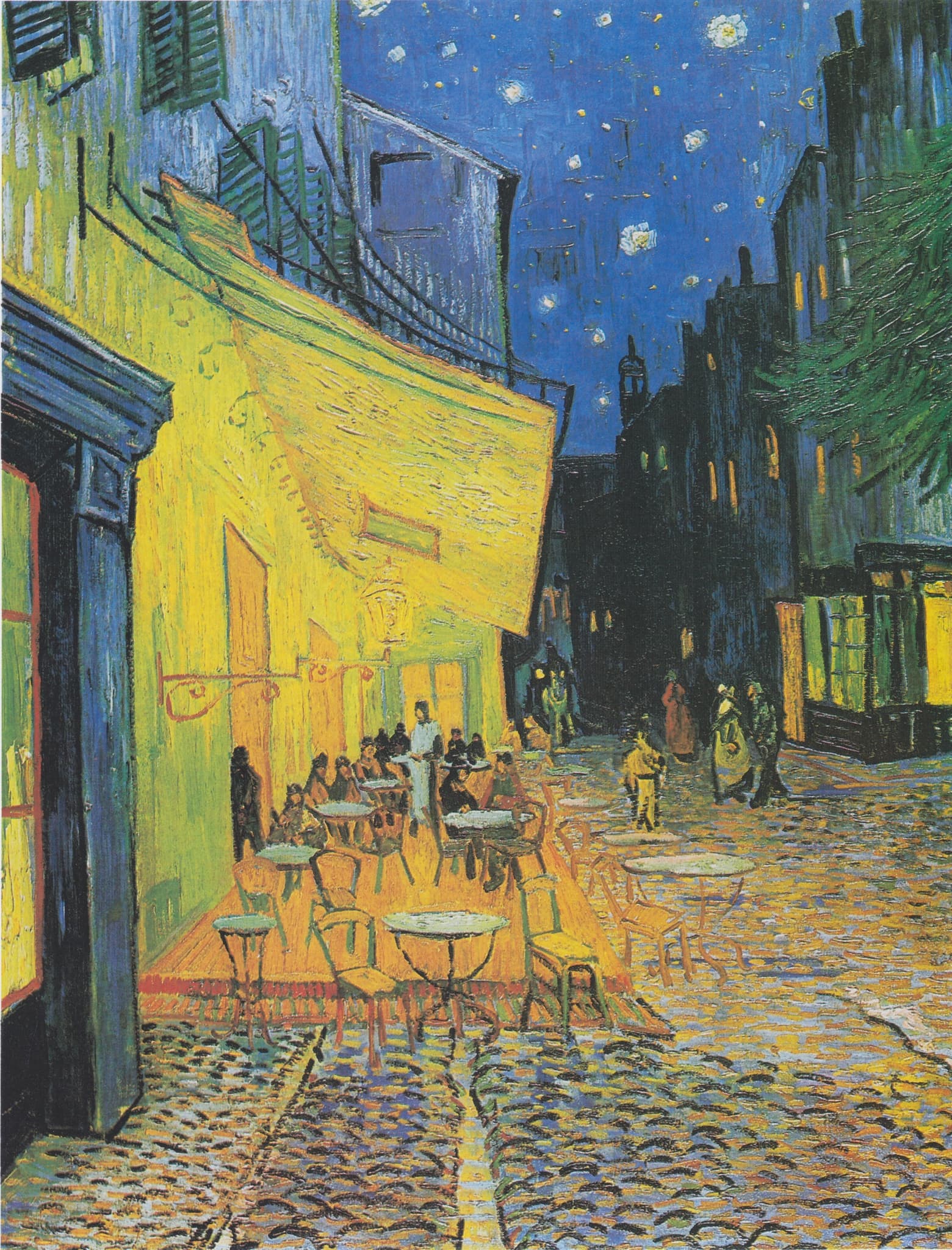
Renoir and Van Gogh meet on a hard problem: how to let immediate perception carry meaning without leaning on traditional storytelling. Each makes the present tense the subject. In Renoir’s domestic “Young Girls at the Piano,” harmony is built from attuned posture and a soft envelope of color; in Van Gogh’s “Café Terrace at Night,” a gas‑lit square becomes a nocturne constructed “without black,” where yellows and blues organize the scene. In both, atmosphere is not backdrop—it is the medium of sense.
Everyday modern life is their stage. Renoir monumentalizes leisure—dances, cafés, interiors—while preserving tact and touch as modern virtues. Van Gogh paints streets, churches, cafés, and fields on site to register conviviality, isolation, or hope. Color is structural for both: Renoir fuses figure and setting with high‑key harmonies strengthened by a post‑Italy return to clear drawing; Van Gogh composes with declared complementary pairs (yellow/blue, red/green) that fix mood and space at once.
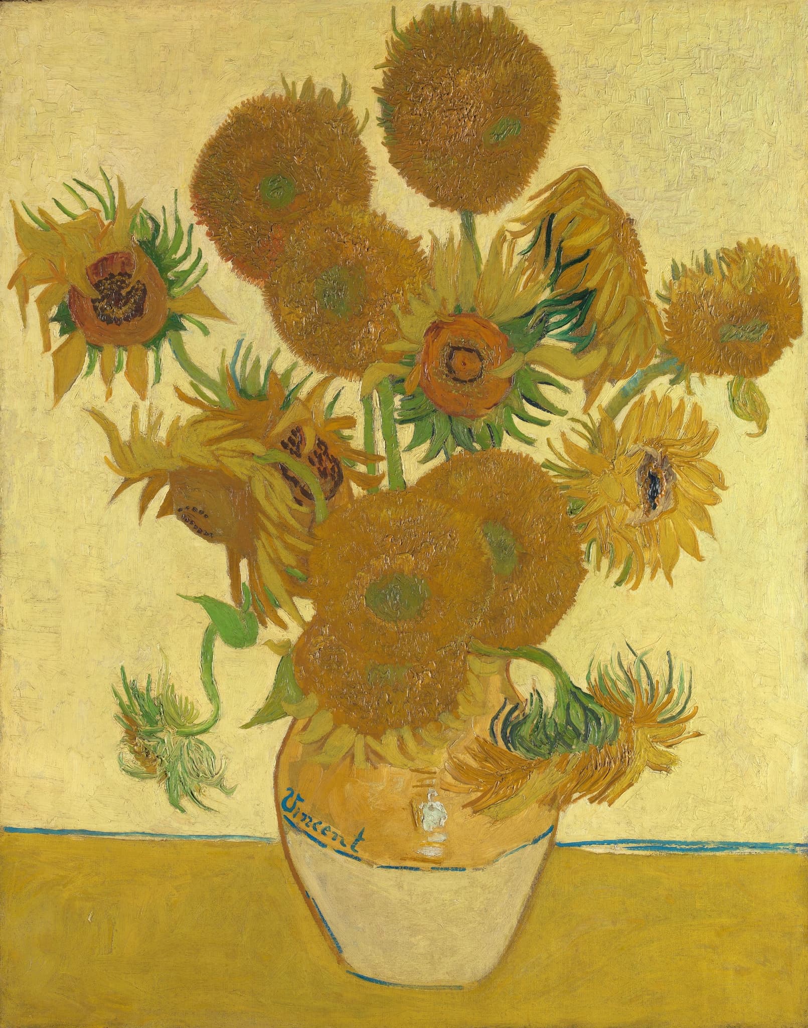
Both work in purposeful sequences. Renoir develops multiple “Piano” canvases to secure a state purchase, turning a private motif into a public claim. Van Gogh serializes “Sunflowers” to decorate the Yellow House for Gauguin—his “light on light” plan—and later sets out panoramic wheatfields to test how landscape can bear sadness and strength together. The shared ground, then, is method: color and touch are not ornament but engines that convert lived moments—gardens, boulevards, basilicas—into images that mean in the present.
Decisive Difference
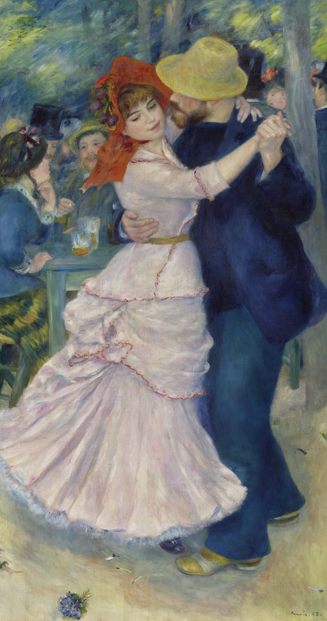
Renoir’s project is to make social harmony visible. He treats modern life as “the art of the bond”: bodies, manners, and light tuned to each other. His figures sit inside a warm, harmonized envelope; edges breathe rather than cut; and after 1881–82 he adds firmer drawing without losing luminosity. In “Dance at Bougival,” rose and ultramarine seal a couple into a turning duet, while dappled foliage and small café props make public intimacy feel plausible. In “Young Girls at the Piano,” finish and balance elevate practice into grace. Even his Venice scenes dissolve hard architecture into shared atmosphere, as if light were a kind of etiquette that integrates crowd, stone, and sun.
Van Gogh’s project is to make inner tenor visible. He externalizes feeling through directional brushwork and complementary clashes, charging space itself—tilted planes, compressed horizons—to register conviction. “Café Terrace at Night” proves that night can be built from chroma alone; sociability becomes a field of yellow against ultramarine. In “The Church at Auvers,” the violet building heaves under a cobalt dome, windows sunk in ultramarine “patches”: color discloses unease more surely than description. His wheatfields push this further, declaring in letters a wish to express “sadness, extreme loneliness” alongside the fortifying force of nature. Summed up: Renoir harmonizes seeing—painting as social attunement in light; Van Gogh intensifies seeing—painting as felt belief in color.
Paired Works
Public leisure as a color engine
Focus question: How does each artist use color to build sociability in public space?
Dance at Bougival vs Café Terrace at Night
Still life as thesis
Focus question: When the subject is flowers, is color a principle of order or a statement of belief?
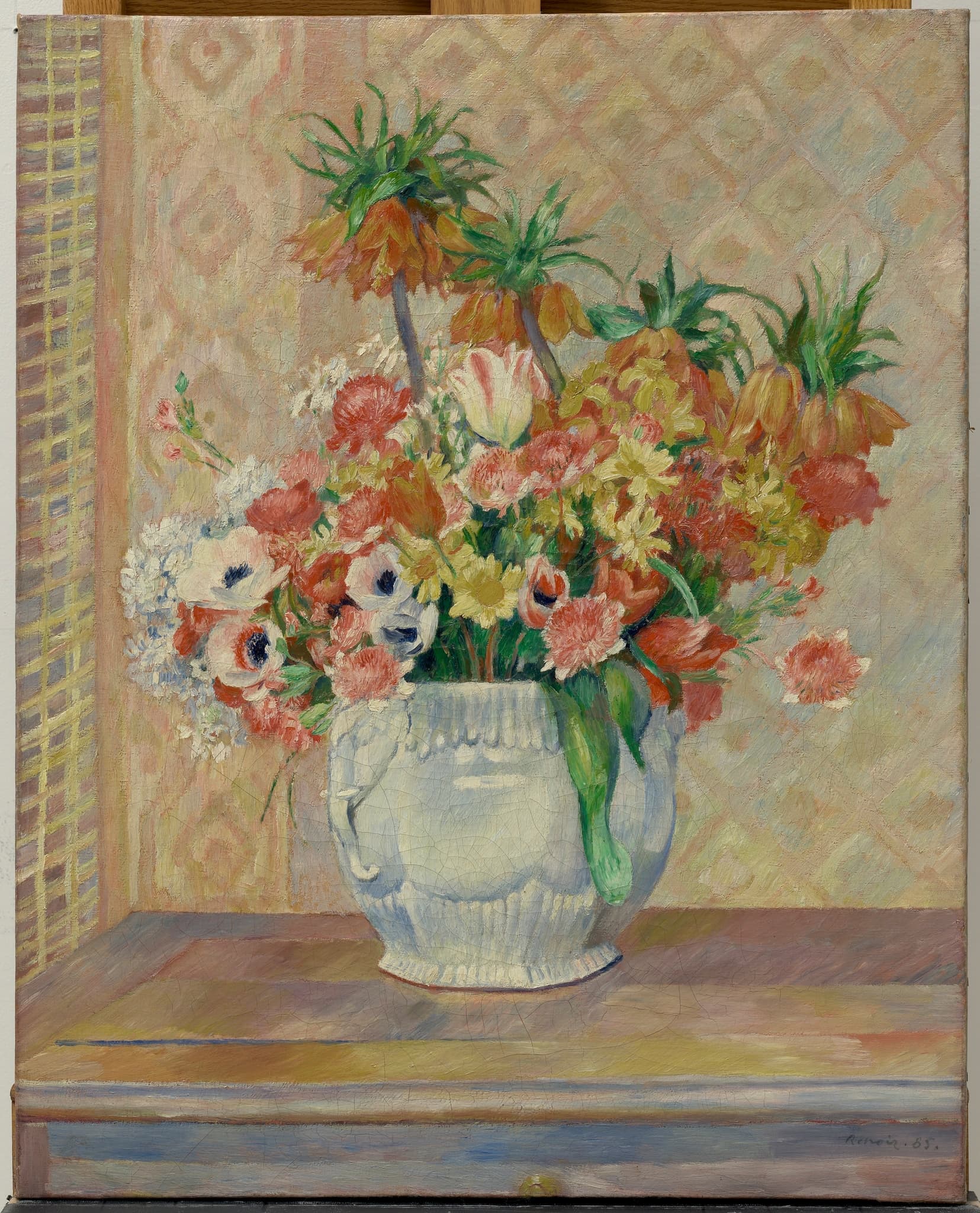
Still Life with Flowers vs Sunflowers
Architecture as perception
Focus question: What happens to buildings when ‘seeing’ is the real subject?
The Piazza San Marco, Venice vs The Church at Auvers
Portraiture as stance
Focus question: What kind of truth does a portrait owe—social poise or inner weather?
Portrait of Jeanne Samary vs Portrait of Dr. Gachet
Why This Comparison Matters
Pairing Renoir with Van Gogh shows two credible answers to the same modern question: if painting is about the present, what should seeing deliver? Renoir argues for social harmony made visible—touch, etiquette, and shared attention cohering inside a warm envelope of light. Van Gogh argues for conviction made visible—color as belief and brushwork as the carrier of inward weather. This frame clarifies why the same motifs (a café, flowers, a church) can read so differently and why both matter: one secures the dignity of sociability; the other secures the urgency of feeling.
The comparison also maps later art. Matisse’s harmonies descend from Renoir’s fusions; Expressionism’s voltage runs through Van Gogh’s complements and directional stroke. For a general viewer, the gain is practical: look for Renoir’s integrating envelope and choreographed bonds; look for Van Gogh’s complementary engines and charged space. The works stop being “pretty” or “intense” and become two distinct, intelligible proposals for what painting can do.
Related Links
Sources
- Musée d’Orsay – Renoir, Young Girls at the Piano (state purchase, variants, late style)
- National Gallery, London – Renoir, The Umbrellas (Ingres turn, firmer drawing)
- MFA Boston – Renoir, Dance at Bougival (composition, scale, detail)
- Van Gogh letter, 16 Sept 1888 – Café Terrace: “night without black”
- Van Gogh letter, 21 Aug 1888 – Sunflowers “light on light” plan
- Van Gogh Museum – The Church at Auvers (cobalt sky, violet church, ultramarine windows)
- Wheatfields under turbulent skies letter (c. 10 July 1890) – “sadness, extreme loneliness”
- Musée d’Orsay – Renoir, Dance in the City (context for the dance trio)
- Google Arts & Culture – Renoir, The Piazza San Marco, Venice
- Van Gogh letter, 3 June 1890 – Portrait of Dr. Gachet (palette and foxglove)
- The Met – Van Gogh: Irises and Roses (fading pinks, conservation context)
- Van Gogh Museum – Tree Roots identified as probable last painting