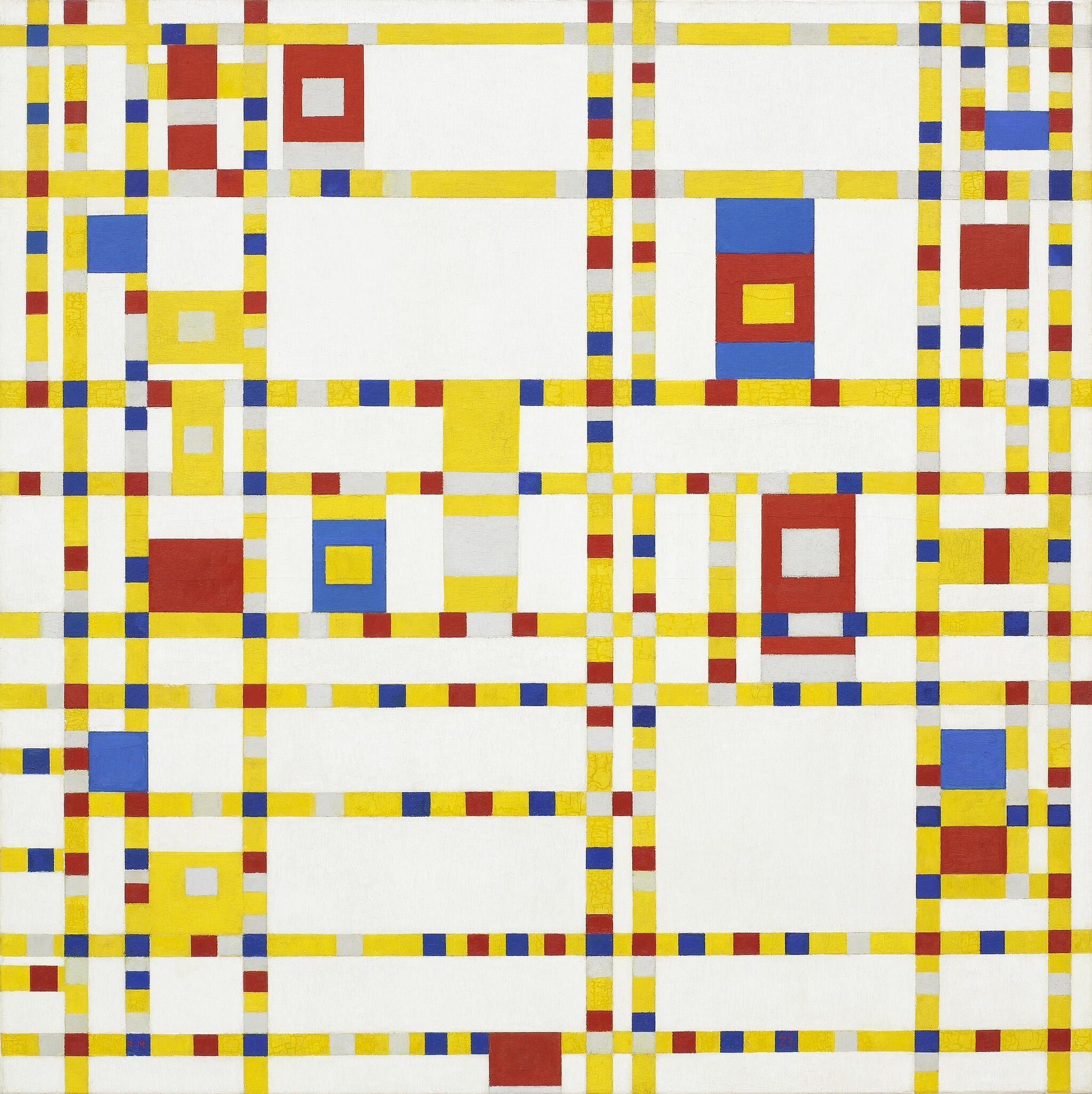
Composition with Red, Blue and Yellow
Mondrian’s Composition with Red, Blue and Yellow crystallizes Neo‑Plasticism into a taut field of verticals/horizontals and primary planes, rejecting depth for pure relational balance. A dominant red at upper right is held in check by smaller blue and yellow blocks and by black bars that function as active planes rather than outlines. The result is a concise proposal for universal order achieved through asymmetry and reduction [1][2].
Study Print Studio
Create a personal study print
Build a companion study sheet around the part of this painting that speaks to you most. Choose a detail, shape an interpretation, and walk away with something personal and display-worthy.
Fast Facts
- Year
- 1930
- Medium
- Oil on canvas
- Dimensions
- 45 × 45 cm
- Location
- Kunsthaus Zürich, Zurich

Click on any numbered symbol to learn more about its meaning
Meaning & Symbolism
Mondrian organizes the canvas around a decisive asymmetry: a large red rectangle occupies the upper right, countered diagonally by a compact blue block at the lower left and a small yellow square tucked against the bottom edge near the right corner. The black vertical and horizontal bars, slightly displaced from the center and varied in interval, are not neutral outlines; they are painted planes that assert their own weight and rhythm. This refusal of contour in favor of planar structure is central to his project, because it keeps all elements—color fields, black bars, and white grounds—on the same ontological footing, each contributing to the achieved balance 2. The white zones are not empty; they act as active intervals, expanding and breathing between the colored and black planes, intensifying the felt pressure of the red while giving the blue and yellow their precise countervailing leverage 2.
The painting’s equilibrium arises from carefully tuned inequalities rather than symmetry. The long black horizontal that runs from the left edge and stops short of the right—terminating just before the corner where a short vertical locks it—creates a decisive pause that checks the red field’s spread. At the lower left, the blue square is small but optically dense, reinforced by the crossing of a thick vertical and horizontal, so that its area wields more counterforce than its size suggests. The yellow unit, near the bottom‑right corner, completes a triadic circuit across the surface, but Mondrian refuses any triangular or perspectival reading; the composition declares its flatness and the co‑present authority of vertical and horizontal, what he theorized as the basic oppositional armature of the modern picture 23. In this sense, the painting is not an arrangement of pretty blocks but a demonstration of how opposition, held in delicate tension, can produce harmony—what Mondrian elsewhere described as the ethical and spiritual ambition of “pure plastic” relations 23.
Context underscores the work’s precision. Painted in Paris and inscribed to Alfred Roth, the canvas participates in Mondrian’s late‑1920s/1930 serial method: he repeated certain layouts, enlarging them incrementally by about five centimeters while keeping the bar widths constant, a procedure that let him study how scale alone recalibrates balance and interval 1. This disciplined iteration reveals that the composition’s meaning is inseparable from its method; Neo‑Plasticism is a system that tests how little is needed to achieve the most order. Comparing later variants, such as MoMA’s Composition in Red, Blue, and Yellow (1937–42), shows that Mondrian continued to adjust line weight, spacing, and the arrest of lines at edges to re‑tune harmony, confirming that these choices were problems to be solved, not formulas to be applied 4.
Why Composition with Red, Blue and Yellow is important thus follows directly from what it does. The canvas offers a model of modern picturing grounded in clarity, flatness, and relational exactitude—an alternative to illusion and expressionism that seeks universality without iconography. By limiting himself to primaries, non‑color (white), and black bars, Mondrian eliminates anecdote and local color to reveal structure itself as content. The viewer perceives meaning in the way the red presses and is checked, in the way whites open space and blacks consolidate it, in the way small units can counter large ones without resorting to symmetry. That program aligns with De Stijl’s ambition to fuse art and design into a new, constructive order for life, and with Mondrian’s own Neo‑Plastic aim to manifest equilibrium out of dynamic opposites 23. The painting’s power endures because its harmony is not static; it is a balance we feel being actively maintained across the surface—modernity, distilled and held in poised suspension.
Explore Deeper with AI
Ask questions about Composition with Red, Blue and Yellow
Popular questions:
Powered by AI • Get instant insights about this artwork
💬 Ask questions about this artwork!
Interpretations
Design Utopia: From Painting to Social Order
The painting’s calibrated grid embodies De Stijl’s aspiration to integrate art and design into a rationalized environment. Its standardized bars, right angles, and restricted palette echo principles of modular architecture and industrial design, proposing an image of harmony that might scale into objects, interiors, or cities. Rather than decorating modern life, Mondrian models how visual systems can organize it: neutrality of means, universality of form, and ethical clarity in relations. This links the work to a broader interwar project that opposed historical ornament with constructive order—an aesthetic with social ambition, seeking a transpersonal language adequate to modernity’s collective spaces 13.
Source: Kunsthaus Zürich; Britannica (De Stijl)
Comparative Tuning: Variants and Reception
Later works like MoMA’s Composition in Red, Blue, and Yellow (1937–42) show Mondrian retuning line weight, spacing, and edge arrests to re‑balance the same grammar. Comparing these canvases clarifies that Neo‑Plasticism was never a fixed template; it remained a set of problems—how far a line runs, how thick it is, how a white interval breathes—solved anew in each iteration. This ongoing recalibration has shaped institutional reception: museums present the series not as duplicates but as a trajectory of experiments in balance and flatness, underscoring that the meaning of any one canvas is inseparable from the corpus that tests its variables over time 24.
Source: MoMA; Smarthistory
Process and Seriality as Research
Mondrian’s 1930 canvas functions like a studio laboratory: he repeated the layout and enlarged it by roughly five centimeters while keeping bar widths constant, a constraint that isolates the perceptual effects of scale on interval and weight. This is not aesthetic habit but methodological testing—an empirical approach to relational exactitude. The dedication to Alfred Roth and the Paris date root the work in a network of architect‑design interlocutors who shared a belief in prototyping and standardization. By showing how a fixed grammar (line weight) behaves across changing formats, Mondrian demonstrates that Neo‑Plasticism is less a style than a procedure, where meaning emerges from iterative calibration rather than iconography 12.
Source: Kunsthaus Zürich; Stephanie Chadwick (Smarthistory)
Medium Reflexivity and Edge Logic
Mondrian’s edge decisions—a long horizontal that stops short, a locking vertical that arrests spread—stage painting as a self‑reflexive medium. The black elements are painted planes whose thickness and termination create pauses, syncopations, and accents; the white grounds operate as active intervals, not voids. These maneuvers announce the canvas as a constructed flat surface where meaning arises from planar relationships rather than illusionistic depth. The refusal of contour in favor of plane collapses figure/ground hierarchies and situates every element—color, black, white—on the same ontological footing, a move central to Neo‑Plasticism’s redefinition of pictorial space as flat, rhythmic, and absolute 2.
Source: Smarthistory (Stephanie Chadwick)
Anti‑Symbolist Color: Force Without Allegory
Although primaries invite symbolic readings, scholarship on this work emphasizes color as structural force rather than code. The red is not a sign for passion; it is an optically dominant plane whose expansion is checked by line arrests and counter‑weights. Blue and yellow act as calibrated pressures within a flat field where black bars are themselves planes, not outlines. This anti‑allegorical stance underwrites Mondrian’s claim that abstraction can carry meaning without narrative: the content is the dynamic of opposition—large/small, vertical/horizontal, chromatic/achromatic—resolved into equilibrium. In short, color here is relational energy, not symbol; its significance lies in how fields interact to produce ethical balance, not in any fixed iconography 23.
Source: Smarthistory; Britannica (De Stijl/Neo‑Plasticism overview)
Seen in Comparisons
Related Themes
About Piet Mondrian
Piet Mondrian (1872–1944), co‑founder of De Stijl, pursued a universal visual language of verticals/horizontals, rectangles, and primary colors plus neutrals. After fleeing Europe during World War II, he settled in New York in 1940, where jazz and the city’s grid animated his late style, culminating in Broadway Boogie Woogie and the unfinished Victory Boogie Woogie [1][6].
View all works by Piet Mondrian →