Blue–orange complement Symbolism
Blue–orange complement is the pairing of blue and orange, opposite hues on the color wheel whose contrast heightens saturation, clarity, and optical vibration. Since the 19th century, artists drawing on color theory have used this opposition to model space, sharpen contours, and charge otherwise calm subjects with visual energy.
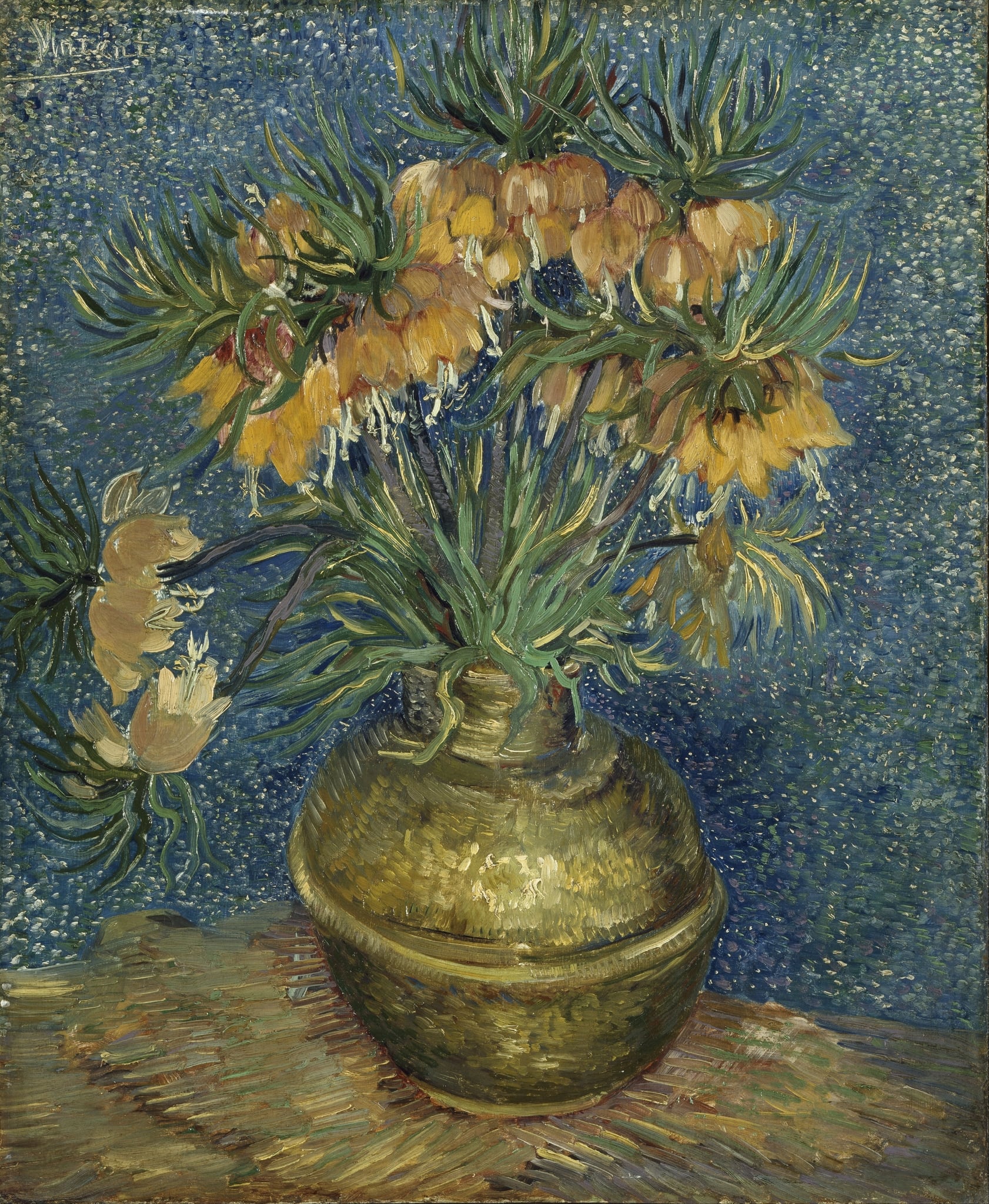
Blue–orange complement in Imperial Fritillaries in a Copper Vase
In Imperial Fritillaries in a Copper Vase (1887) by Vincent van Gogh, a blaze of orange crown‑imperials surges against a stippled, breathing blue ground. The complementary contrast makes the flowers advance with intensity while the cool field recedes, clarifying figure and ground and animating the still life. The warm copper vase mediates between the oranges of the blooms and the surrounding blues, so that metal reads as glowing and the background as airy. Through this blue–orange counterpoint, van Gogh turns a tabletop arrangement into a dynamic study of warmth versus coolness, curvature versus field, and stillness made vivid by color.