Imperial Fritillaries in a Copper Vase
Study Print Studio
Create a personal study print
Build a companion study sheet around the part of this painting that speaks to you most. Choose a detail, shape an interpretation, and walk away with something personal and display-worthy.
Fast Facts
- Year
- 1887
- Medium
- Oil on canvas
- Dimensions
- 73.3 × 60.0 cm

Click on any numbered symbol to learn more about its meaning
Meaning & Symbolism
Explore Deeper with AI
Ask questions about Imperial Fritillaries in a Copper Vase
Popular questions:
Powered by AI • Get instant insights about this artwork
Interpretations
Historical Context
Source: Musée d’Orsay; The Met; Van Gogh Museum Journal 2002
Formal Analysis
Source: Musée d’Orsay; Van Gogh Museum Journal 2002; Van Gogh Museum
Symbolic Reading
Source: Musée d’Orsay; Futura Sciences (botanical reference)
Psychological Interpretation
Source: Musée d’Orsay
Authorship and Method
Source: Musée d’Orsay; Van Gogh Museum; Van Gogh Museum Journal 2002
Related Themes
About Vincent van Gogh
More by Vincent van Gogh
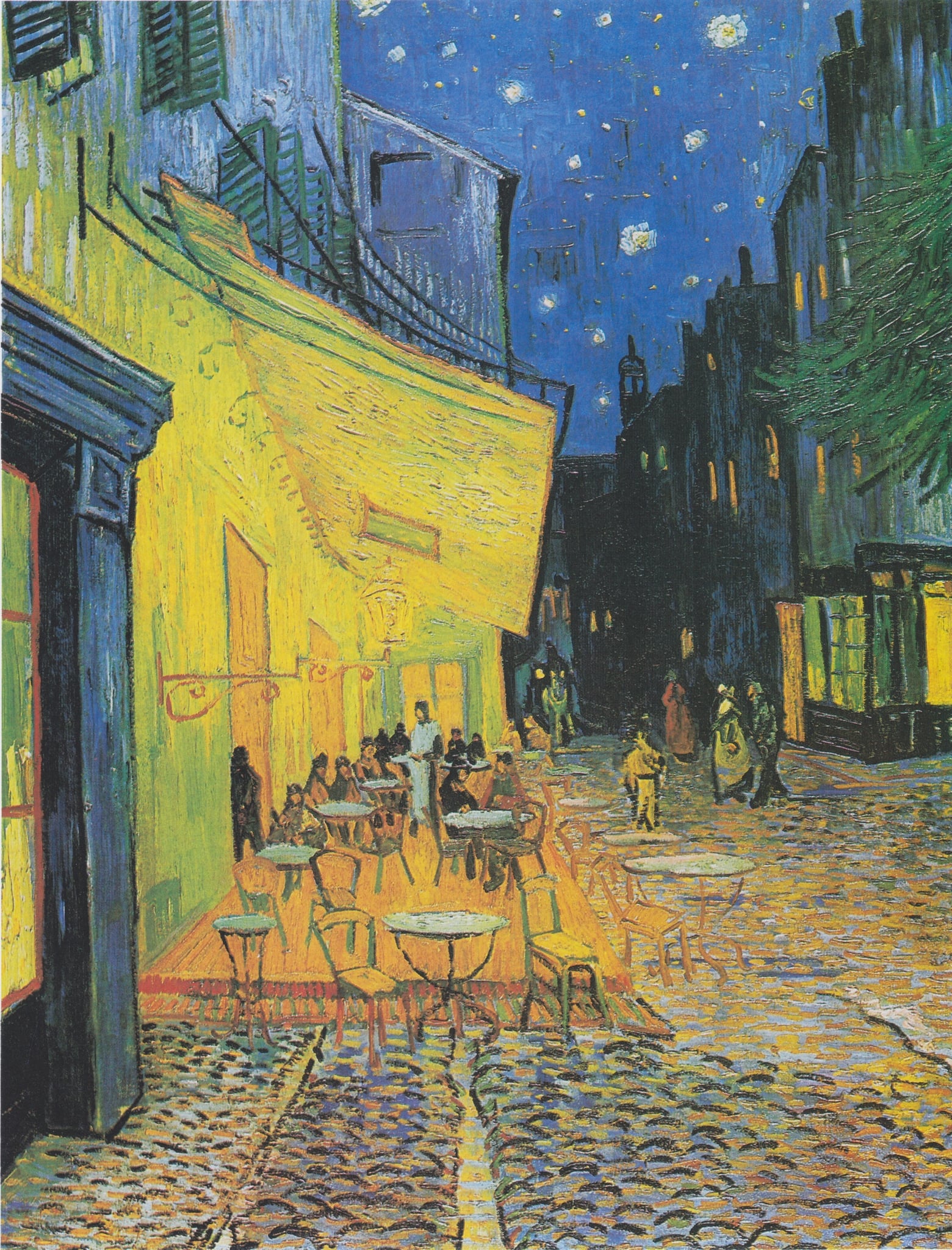
Café Terrace at Night
Vincent van Gogh (1888)
In Café Terrace at Night, Vincent van Gogh turns nocturne into <strong>luminous color</strong>: a gas‑lit terrace glows in yellows and oranges against a deep <strong>ultramarine sky</strong> pricked with stars. By building night “<strong>without black</strong>,” he stages a vivid encounter between human sociability and the vastness overhead <sup>[1]</sup><sup>[2]</sup>.
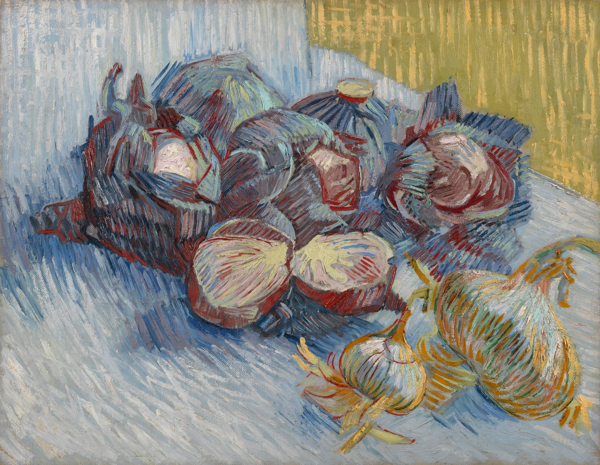
Red Cabbages and Onions
Vincent van Gogh (1887)
In Red Cabbages and Onions, Vincent van Gogh turns everyday produce into a drama of <strong>complementary color</strong> and <strong>restless brushwork</strong>. Hot red contours cinch violet cabbages and pale yellow bulbs against a cool, striated blue table, while a mustard‑yellow patch in the upper right tilts the space and sharpens the chromatic clash. The result asserts ordinary food as a locus of <strong>resilience</strong> and <strong>experimentation</strong> <sup>[1]</sup><sup>[2]</sup>.
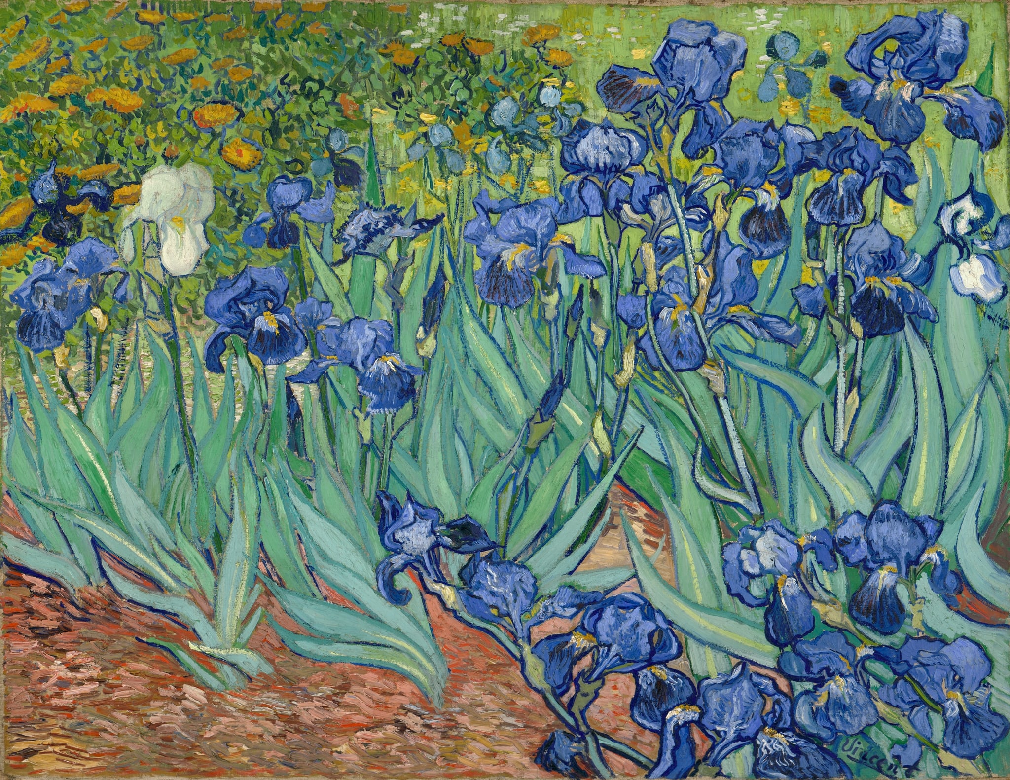
Irises
Vincent van Gogh (1889)
Painted in May 1889 at the Saint-Rémy asylum garden, Vincent van Gogh’s <strong>Irises</strong> turns close observation into an act of repair. Dark contours, a cropped, print-like vantage, and vibrating complements—violet/blue blossoms against <strong>yellow-green</strong> ground—stage a living frieze whose lone <strong>white iris</strong> punctuates the field with arresting clarity <sup>[1]</sup><sup>[2]</sup>.
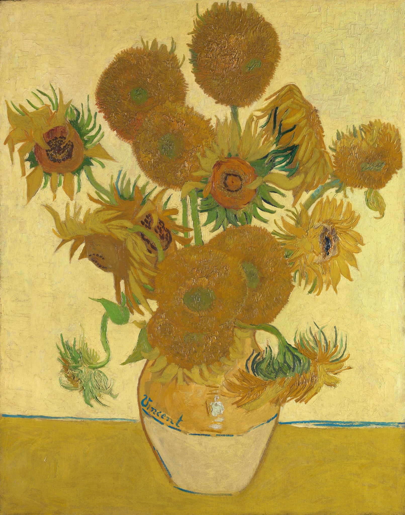
Sunflowers
Vincent van Gogh (1888)
Vincent van Gogh’s Sunflowers (1888) is a <strong>yellow-on-yellow</strong> still life that stages a full <strong>cycle of life</strong> in fifteen blooms, from fresh buds to brittle seed heads. The thick impasto, green shocks of stem and bract, and the vase signed <strong>“Vincent”</strong> turn a humble bouquet into an emblem of endurance and fellowship <sup>[1]</sup><sup>[2]</sup>.
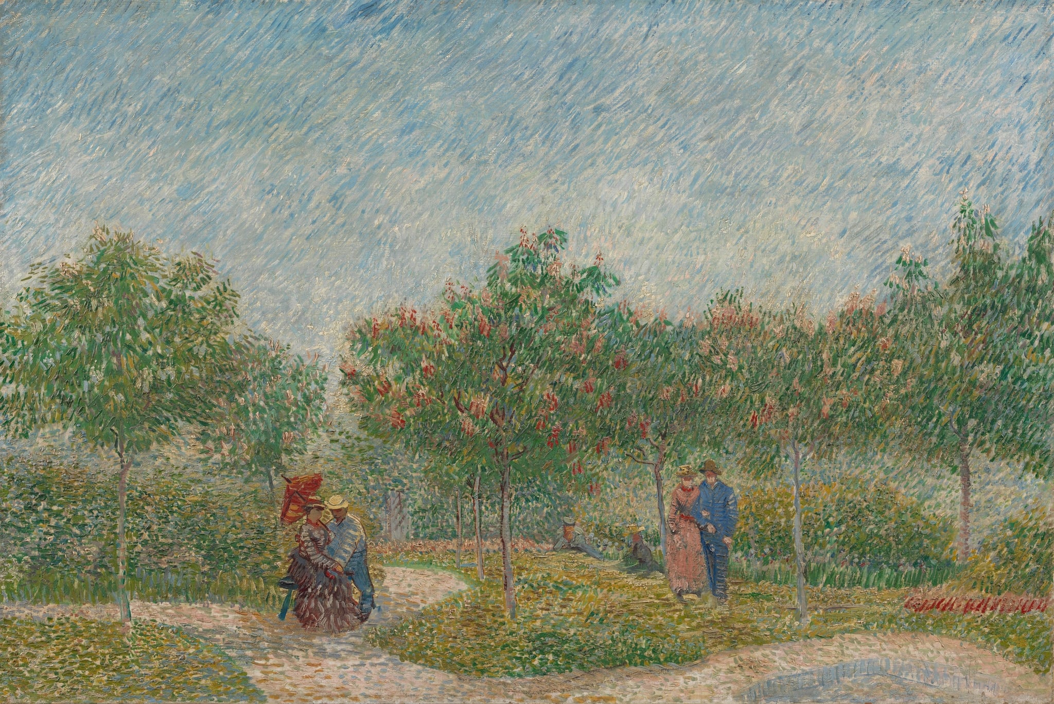
Garden with Courting Couples: Square Saint-Pierre
Vincent van Gogh (1887)
In Garden with Courting Couples: Square Saint-Pierre, Vincent van Gogh turns a small Montmartre park into a stage where <strong>spring</strong>, <strong>intimacy</strong>, and <strong>urban leisure</strong> converge. Short, shimmering strokes fuse pink chestnut blossoms, curving paths, and paired figures into one pulse of <strong>renewal</strong> and <strong>togetherness</strong> <sup>[1]</sup><sup>[2]</sup>.

In the Café: Agostina Segatori in Le Tambourin
Vincent van Gogh (1887 (Jan–Mar))
Van Gogh casts Agostina Segatori at a tiny, tambourine‑like café table, turning Le Tambourin into a <strong>stage of modern life</strong>. Cool greens and greys make the red <strong>flame‑plume hat</strong> and the foaming <strong>beer</strong> flare, while folded arms and a set‑aside <strong>parasol</strong> register private fatigue amid public display <sup>[1]</sup><sup>[2]</sup><sup>[3]</sup>.