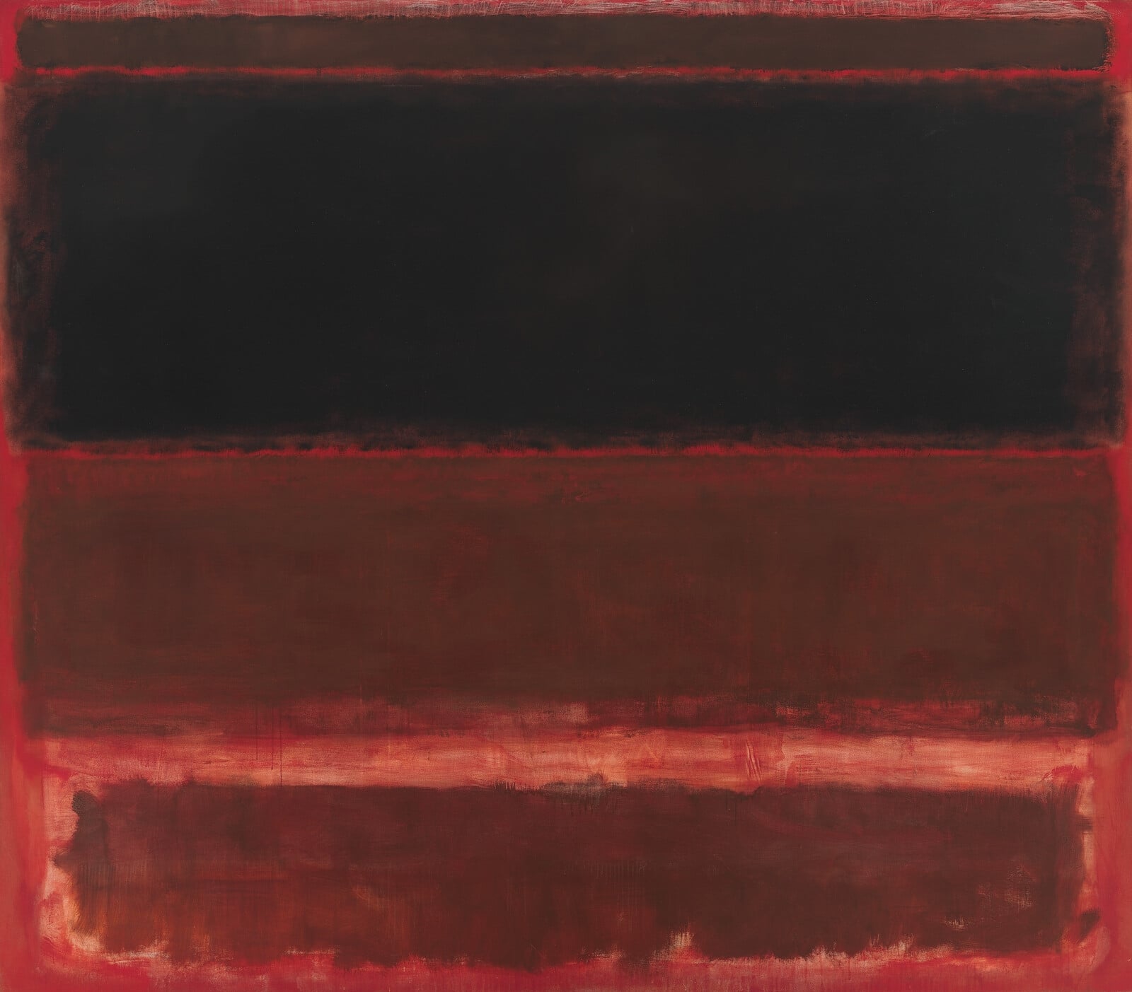
No. 14
by Mark Rothko
Study Print Studio
Create a personal study print
Build a companion study sheet around the part of this painting that speaks to you most. Choose a detail, shape an interpretation, and walk away with something personal and display-worthy.
Fast Facts
- Year
- 1960
- Medium
- Oil on canvas
- Dimensions
- 290.8 × 268.2 cm (114 1/2 × 105 5/8 in.)
- Location
- San Francisco Museum of Modern Art (SFMOMA), San Francisco

Click on any numbered symbol to learn more about its meaning
Meaning & Symbolism
Explore Deeper with AI
Ask questions about No. 14
Popular questions:
Powered by AI • Get instant insights about this artwork
Interpretations
Historical Context: Postwar Universals, 1960 Pivot
Source: The Metropolitan Museum of Art; National Gallery of Art; David Anfam
Phenomenology of Viewing: Distance, Light, and Duration
Source: SFMOMA; The Phillips Collection
Material Intelligence: Layers, Edges, and Optical Weight
Source: SFMOMA; David Anfam
Anti-Landscape: Borrowed Horizon, Emptied Icon
Source: MoMA (Peter Selz); The Metropolitan Museum of Art
Medium Reflexivity: Color as Actor, Painting as Event
Source: MoMA (Peter Selz); National Gallery of Art
Reception & Institution: Civic Icon, Market Signal
Source: SFMOMA; SFGate
Related Themes
About Mark Rothko
More by Mark Rothko
Four Darks in Red
Mark Rothko (1958)
Four Darks in Red stages four hovering bands within a smoldering red field to generate an <strong>immersive, solemn atmosphere</strong>. Thinly layered washes and feathered edges make the dark zones <strong>throb like thresholds</strong>, suspending viewers between weight and glow <sup>[1]</sup><sup>[4]</sup>. Painted in 1958 at monumental scale, it aligns with Rothko’s late‑’50s turn to wine‑dark, enclosing spaces <sup>[1]</sup><sup>[2]</sup>.
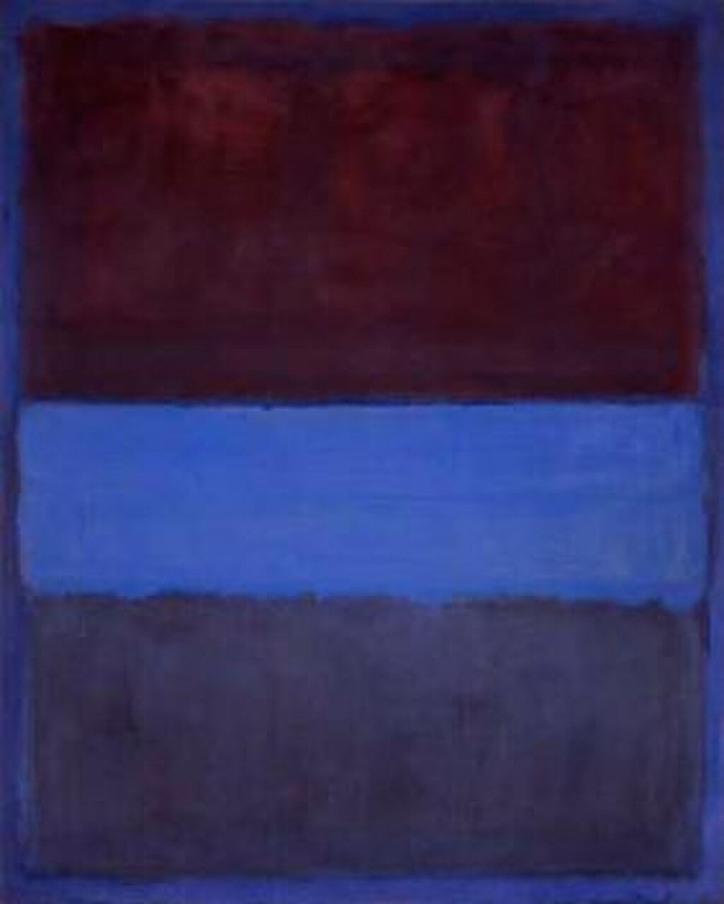
No. 61 (Rust and Blue)
Mark Rothko (1953)
<strong>No. 61 (Rust and Blue)</strong> (1953) stages three hovering color fields—rust, saturated blue, and indigo—within a deep blue perimeter. Through thin, layered oil and feathered borders, Mark Rothko turns color into a felt space where warmth and dusk meet, inviting a contemplative, immersive encounter <sup>[1]</sup><sup>[5]</sup>.
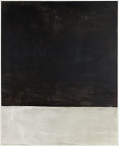
Untitled (Black on Grey)
Mark Rothko (1969–1970)
Mark Rothko’s Untitled (Black on Grey) compresses feeling into two stacked fields: a vast, softly modulated <strong>black</strong> pressing down upon a lower band of <strong>chalky grey</strong>, both ringed by a narrow white border. The blurred seam between them holds a charged <strong>threshold</strong> where descent and persistence meet <sup>[1]</sup><sup>[3]</sup><sup>[4]</sup>.