Drowning Girl
Study Print Studio
Create a personal study print
Build a companion study sheet around the part of this painting that speaks to you most. Choose a detail, shape an interpretation, and walk away with something personal and display-worthy.
Fast Facts
- Year
- 1963
- Medium
- Oil and acrylic on canvas
- Dimensions
- 171.6 × 169.5 cm
- Location
- The Museum of Modern Art (MoMA), New York

Click on any numbered symbol to learn more about its meaning
Meaning & Symbolism
Explore Deeper with AI
Ask questions about Drowning Girl
Popular questions:
Powered by AI • Get instant insights about this artwork
Interpretations
Formal/Technical Analysis: Hand-Made Mechanization
Source: MoMA (collection record; audio guide); MoMA catalogue essay
Cross-Cultural Art History: After Hokusai
Source: Museum of Fine Arts, Boston (Hokusai: Inspiration and Influence); MoMA
Gender & Romance Rhetoric: Crisis Without a Savior
Source: Bradford R. Collins (American Art, 2003); MoMA Magazine
Authorship & Appropriation: Editing as Creation
Source: Roy Lichtenstein Foundation (Catalogue Raisonné); The New Yorker (Adam Gopnik); MoMA Magazine
Media Theory & Affect: Manufactured Feeling
Source: MoMA (audio guide); Bradford R. Collins (American Art, 2003)
Related Themes
About Roy Lichtenstein
More by Roy Lichtenstein
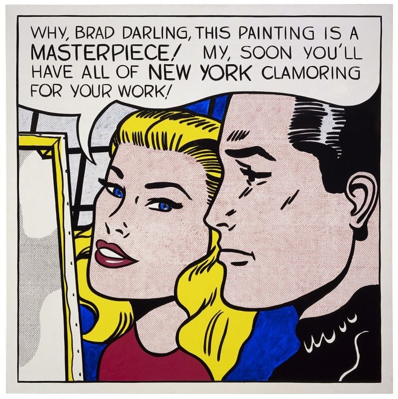
Masterpiece
Roy Lichtenstein (1962)
<strong>Masterpiece</strong> (1962) turns a romance‑comic close‑up into a cool exposé of how praise is manufactured. With a buoyant speech balloon and hand‑made Ben‑Day dots, Roy Lichtenstein converts private flattery into public <strong>promotion</strong>—an image about the image economy itself <sup>[1]</sup><sup>[2]</sup>.
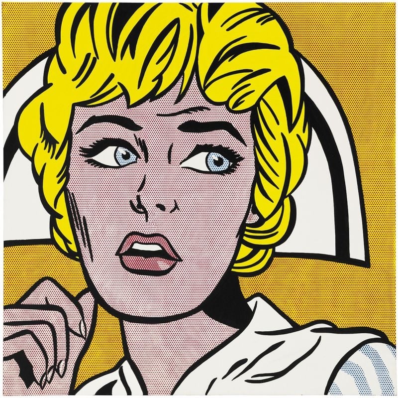
Nurse
Roy Lichtenstein (1964)
Nurse crystallizes Roy Lichtenstein’s 1964 turn to comic-derived icons, amplifying emotion through <strong>Ben‑Day dots</strong>, <strong>thick black contours</strong>, and a <strong>high‑contrast palette</strong>. The cropped close‑up—blond hair, white cap, parted lips, averted gaze—freezes suspense while stripping away speech bubbles. Lichtenstein converts pulp melodrama into a monumental emblem, making style itself the engine of feeling <sup>[1]</sup><sup>[2]</sup>.