Roy Lichtenstein
Biography
Themes in Their Work
Most Expensive Roy Lichtenstein Paintings
Explore ranked valuations of Roy Lichtenstein's most valuable works →
Featured Artworks
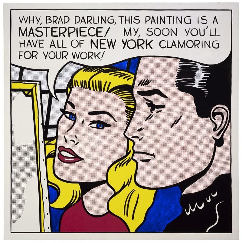
Masterpiece
Roy Lichtenstein (1962)
<strong>Masterpiece</strong> (1962) turns a romance‑comic close‑up into a cool exposé of how praise is manufactured. With a buoyant speech balloon and hand‑made Ben‑Day dots, Roy Lichtenstein converts private flattery into public <strong>promotion</strong>—an image about the image economy itself <sup>[1]</sup><sup>[2]</sup>.
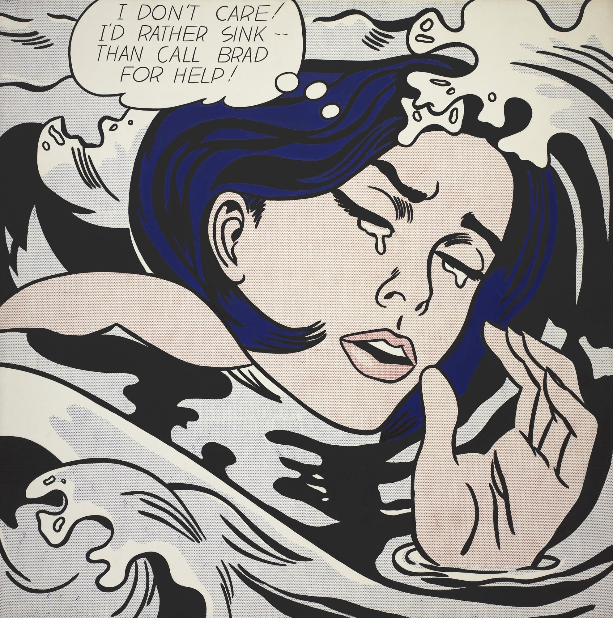
Drowning Girl
Roy Lichtenstein (1963)
<strong>Drowning Girl</strong> converts a romance-comic crisis into a monumental icon of cool, stylized emotion. With tight cropping, <strong>Ben-Day dots</strong>, and heavy black contours, <strong>Roy Lichtenstein</strong> isolates a heroine who declares, "I DON’T CARE! I’D RATHER SINK—THAN CALL BRAD FOR HELP!" The painting turns mass-media melodrama into a distilled language of signs that oscillates between parody and pathos <sup>[1]</sup><sup>[4]</sup>.
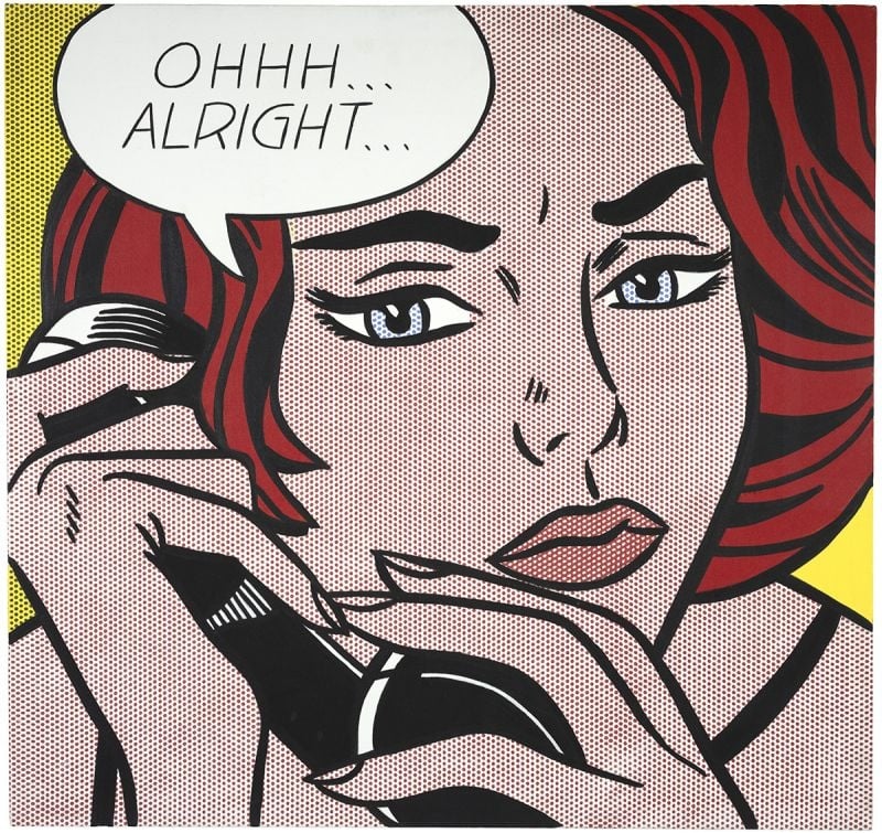
Ohhh...Alright...
Roy Lichtenstein (1964)
Roy Lichtenstein’s Ohhh...Alright... captures a suspended beat of romance‑comic melodrama in the cool idiom of <strong>Pop Art</strong>. A tightly cropped red‑haired woman grips a telephone as a speech balloon—“<strong>OHHH… ALRIGHT…</strong>”—signals reluctant acquiescence, while the hand‑painted <strong>Ben‑Day dots</strong> mimic mass printing to stage emotion as a commodity sign <sup>[1]</sup><sup>[2]</sup>.
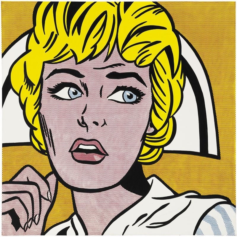
Nurse
Roy Lichtenstein (1964)
Nurse crystallizes Roy Lichtenstein’s 1964 turn to comic-derived icons, amplifying emotion through <strong>Ben‑Day dots</strong>, <strong>thick black contours</strong>, and a <strong>high‑contrast palette</strong>. The cropped close‑up—blond hair, white cap, parted lips, averted gaze—freezes suspense while stripping away speech bubbles. Lichtenstein converts pulp melodrama into a monumental emblem, making style itself the engine of feeling <sup>[1]</sup><sup>[2]</sup>.
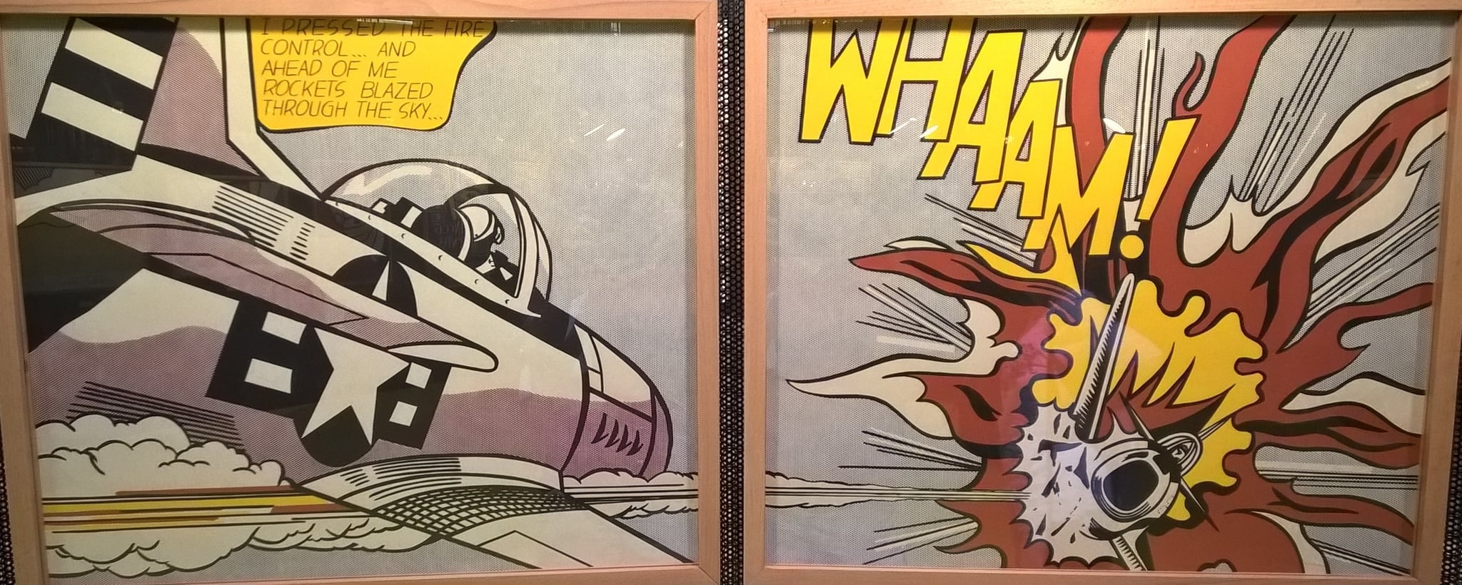
Whaam!
Roy Lichtenstein (1963)
Whaam! stages a split-second airstrike as a two-panel, comic-derived spectacle where <strong>cool control</strong> meets <strong>hot impact</strong>. Lichtenstein converts lethal action into <strong>graphic codes</strong>—Ben-Day dots, speech balloon, and the yellow onomatopoeia “WHAAM!”—to expose how mass media packages warfare as crisp design <sup>[1]</sup><sup>[3]</sup><sup>[5]</sup>.