Nurse
Study Print Studio
Create a personal study print
Build a companion study sheet around the part of this painting that speaks to you most. Choose a detail, shape an interpretation, and walk away with something personal and display-worthy.
Fast Facts
- Year
- 1964
- Medium
- Acrylic, oil, and graphite on canvas
- Dimensions
- 122.1 x 122.2 cm (48 1/16 x 48 1/8 in.)
- Location
- Private collection

Click on any numbered symbol to learn more about its meaning
Meaning & Symbolism
Explore Deeper with AI
Ask questions about Nurse
Popular questions:
Powered by AI • Get instant insights about this artwork
Interpretations
Formal/Material Analysis: The Hand Behind the Machine
Source: Roy Lichtenstein Foundation (Catalogue Raisonné RLCR 931); Art Institute of Chicago
Gendered Labor Melodrama: The Nurse as Cultural Script
Source: Modern American History (Cambridge University Press); Romance Scholarship Database; Art Institute of Chicago
Theory of Surface: From Expression to Code
Source: Hal Foster (London Review of Books); MoMA (Pop Art term); Art Institute of Chicago
Spectatorship & Montage: Completing the Missing Story
Source: MoMA Magazine (on comics conventions); Art Institute of Chicago
Scale, Market, and Myth: From Cheap Print to Blue‑Chip Icon
Source: MoMA (Pop Art term); Christie’s Press Release (2015); Bloomberg
Related Themes
About Roy Lichtenstein
More by Roy Lichtenstein
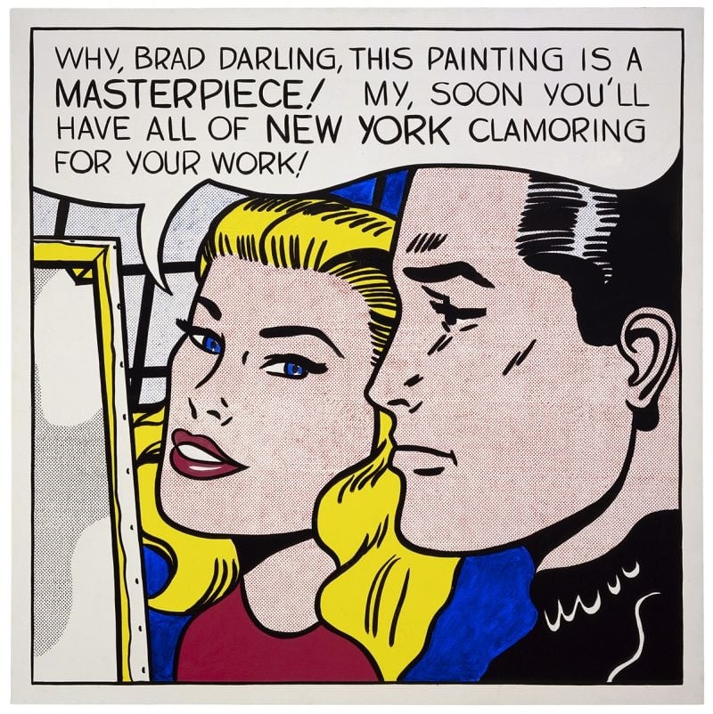
Masterpiece
Roy Lichtenstein (1962)
<strong>Masterpiece</strong> (1962) turns a romance‑comic close‑up into a cool exposé of how praise is manufactured. With a buoyant speech balloon and hand‑made Ben‑Day dots, Roy Lichtenstein converts private flattery into public <strong>promotion</strong>—an image about the image economy itself <sup>[1]</sup><sup>[2]</sup>.
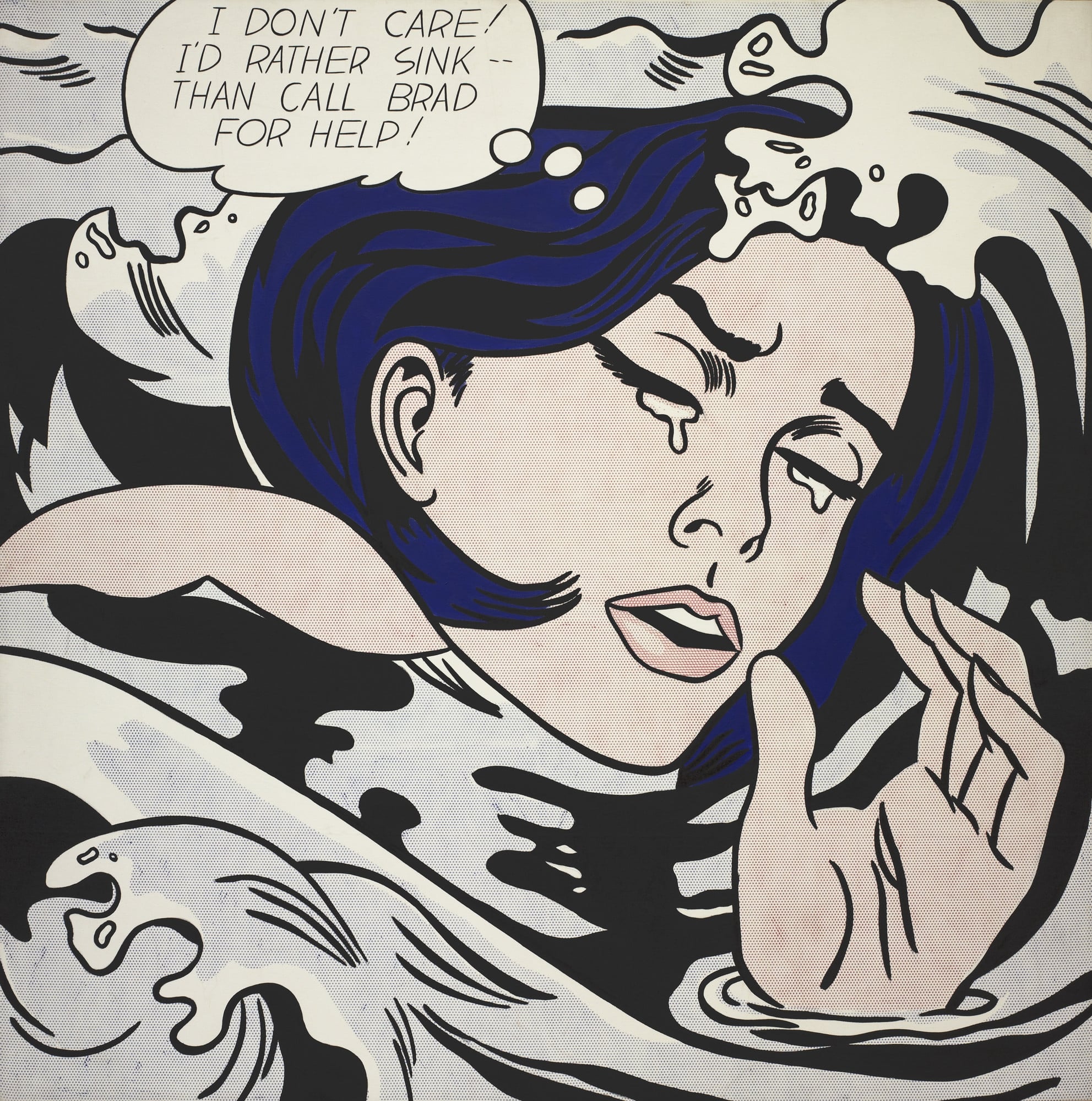
Drowning Girl
Roy Lichtenstein (1963)
<strong>Drowning Girl</strong> converts a romance-comic crisis into a monumental icon of cool, stylized emotion. With tight cropping, <strong>Ben-Day dots</strong>, and heavy black contours, <strong>Roy Lichtenstein</strong> isolates a heroine who declares, "I DON’T CARE! I’D RATHER SINK—THAN CALL BRAD FOR HELP!" The painting turns mass-media melodrama into a distilled language of signs that oscillates between parody and pathos <sup>[1]</sup><sup>[4]</sup>.