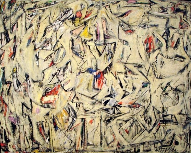
Police Gazette
Study Print Studio
Create a personal study print
Build a companion study sheet around the part of this painting that speaks to you most. Choose a detail, shape an interpretation, and walk away with something personal and display-worthy.
Fast Facts
- Year
- 1955
- Medium
- Oil, enamel, and charcoal on canvas
- Dimensions
- 109.9 x 127.6 cm (43 1/4 x 50 1/4 in.)
- Location
- Private collection

Click on any numbered symbol to learn more about its meaning
Meaning & Symbolism
Explore Deeper with AI
Ask questions about Police Gazette
Popular questions:
Powered by AI • Get instant insights about this artwork
Interpretations
Urban Spatial Logic
Source: MoMA (John Elderfield); The New Yorker
Law, Order, and the Image of Control
Source: Kemper Art Museum
Historical Context
Source: Kemper Art Museum; National Gallery of Art
Process/Technique as Time
Source: Harold Rosenberg; National Gallery of Art; The Willem de Kooning Foundation
Media Culture & Tabloid Semantics
Source: Kemper Art Museum; Buffalo AKG; The Met
Figure/Ground Oscillation After the Woman Series
Source: National Gallery of Art; The New Yorker
Related Themes
About Willem de Kooning
More by Willem de Kooning
Excavation
Willem de Kooning (1950)
<strong>Excavation</strong> is a 1950 oil-on-canvas by <strong>Willem de Kooning</strong> whose all-over mesh of black, hooked lines rides a chalky, bone-colored ground, flaring with cadmium reds, yellows, and blues. Forms surface—beaklike profiles, teeth, fish, limbs, tool-shapes—then sink back into fragments, staging a <strong>simultaneous making and unmaking</strong> that turns the whole canvas into an active field. The work crystallizes de Kooning’s late-1940s abstractions and foreshadows the Women paintings, marking a pivot in postwar American art <sup>[1]</sup><sup>[3]</sup><sup>[4]</sup>.
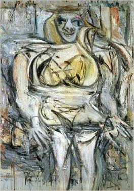
Woman III
Willem de Kooning (1952–53 (often dated 1953))
Woman III stages a face‑off between <strong>figuration and abstraction</strong>: a looming, front‑facing body whose breasts and hips jut forward even as limbs smear into eddies of paint. The mask‑like eyes and toothy grin toggle between <strong>seduction and menace</strong>, while the scraped, turbulent surface asserts painting as a <strong>combat zone</strong> rather than calm depiction <sup>[1]</sup>.
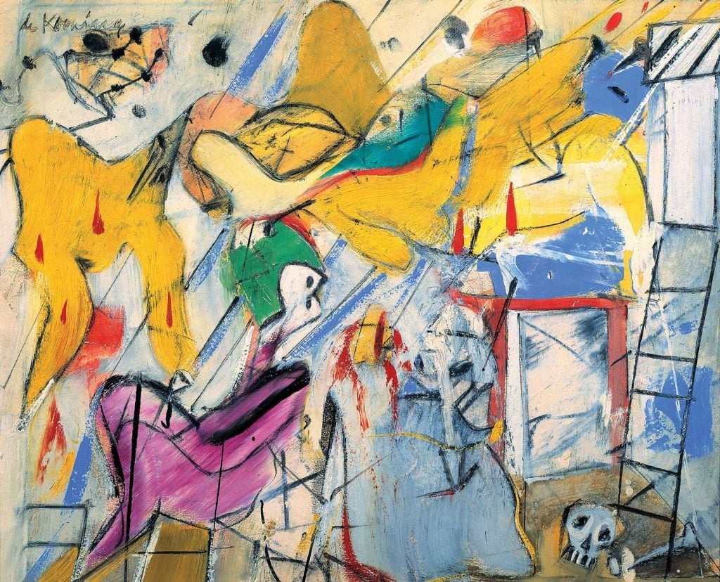
Interchange
Willem de Kooning (1955)
Interchange condenses the city’s churn into an arena of <strong>figure–ground flux</strong>, where mustard yellows, lilac, and sea‑blue collide and are corralled by black, calligraphic lines. De Kooning turns scraping, repainting, and slashing gestures into a living map of <strong>exchange</strong> between flesh and architecture, motion and arrest <sup>[2]</sup><sup>[3]</sup>.