Ohhh...Alright...

by Roy Lichtenstein

Roy Lichtenstein’s Ohhh...Alright... captures a suspended beat of romance‑comic melodrama in the cool idiom of Pop Art. A tightly cropped red‑haired woman grips a telephone as a speech balloon—“OHHH… ALRIGHT…”—signals reluctant acquiescence, while the hand‑painted Ben‑Day dots mimic mass printing to stage emotion as a commodity sign [1][2].

Study Print Studio

Create a personal study print

Build a companion study sheet around the part of this painting that speaks to you most. Choose a detail, shape an interpretation, and walk away with something personal and display-worthy.

Fast Facts

Year
1964
Medium
Acrylic, oil, and graphite pencil on canvas
Dimensions
93 × 95.3 cm (36 5/8 × 37 1/2 in.)
Location
Private collection
Ohhh...Alright... by Roy Lichtenstein (1964) featuring Speech balloon with “OHHH… ALRIGHT…”, Telephone handset, Ben-Day dots, Heavy black contour lines and tight crop

Click on any numbered symbol to learn more about its meaning

Meaning & Symbolism

Ohhh...Alright... fixes the viewer in a sharpened moment of capitulation. The woman’s narrowed eyes, pinched brows, and taut lips are locked against the handset she grips; the speech balloon floats above like a command performance—“OHHH… ALRIGHT…”—its ellipses stretching time and marking reluctance rather than consent. Lichtenstein crops so tightly that the head and hands fill the square, severing narrative context and amplifying melodrama into a single beat, a strategy central to his early‑1960s “girls” paintings 12. The red arcs of hair, the yellow field flickering at the edge, and the heavy black contours render the figure as type rather than person—an icon of romance‑comic femininity rather than a portrait. By isolating this template of female hesitation, the canvas reveals the script: desire is negotiated offstage (on the phone), emotion is delivered as text, and the viewer consumes the scene like an ad. The telephone, rendered as a glossy black prop near the mouth, literalizes mediated intimacy; it is both conduit and barrier, dramatizing how communication technologies shape feeling in the modern image world 4. The painting’s force lies in how form carries argument. Lichtenstein’s Ben‑Day dots—evenly spaced pinks shaping the skin and darker halftones shading the lips—simulate mechanical reproduction, yet in 1964 he painstakingly plotted and stenciled them by hand, often in oil over acrylic flats, with graphite lines intentionally evident 1. This paradox—the handmade readymade—animates the work’s critique: a picture that looks printed is, in fact, meticulously authored, turning surface style into a meditation on reproduction and originality 35. The clean vectors of black line and billboard‑scale cropping operate like visual amplifiers, converting a disposable comics panel from Secret Hearts no. 88 (drawn by Tony Abruzzo) into a museum‑scale emblem that scrutinizes its own source language 1. Within this frame, the ellipses do crucial semiotic work: they defer closure, convert speech into design, and make hesitation legible as punctuation. As comics theory reminds us, the balloon makes the panel a unit of narration; here, Lichtenstein keeps the balloon but strips away sequential context, exposing how a single utterance can steer meaning and cue empathy without backstory 2. That exposure explains why Ohhh...Alright... is important within Pop Art’s assault on postwar visual culture. Against Abstract Expressionism’s personalized gesture, Lichtenstein proposes a cool, industrial skin where emotion is standardized and gendered clichés circulate as readymade signs 24. The painting neither simply mocks nor endorses these clichés; instead, it performs a double operation—reflecting the allure of crisp, consumable romance while critiquing the very mechanisms that package it. The woman’s blue irises, clipped by the frame, resist our search for interiority; what we get instead is system: dots, lines, balloon, handset. In Michael Lobel’s terms, the image is a study of duplication—how technologies of seeing and printing mediate authorship and desire—while Graham Bader’s analysis helps us read the work’s serial surfaces as meaning, not mere style 36. Even the painting’s later market history, achieving a record price at auction decades after its making, underscores the point: emotion, image, and commodity are inseparable in the Pop era’s economy of attention 78.

Explore Deeper with AI

Ask questions about Ohhh...Alright...

Popular questions:

Powered by AI • Get instant insights about this artwork

💬 Ask questions about this artwork!

Interpretations

Formal Analysis: The Handmade/Mechanical Paradox

Ohhh… Alright… operationalizes a key Pop dialectic: painting that looks printed. Lichtenstein’s flat acrylic fields are punctuated by oil‑applied, hand‑stenciled Ben‑Day dots, with visible graphite scaffolding—an artisanal simulation of mechanical halftone. The result is a handmade readymade that converts process into argument: authorship persists even when style impersonates industry 134. The billboard crop and emphatic contour act like optical amplifiers, turning a throwaway panel into a calibrated study of surface, registration, and legibility. As Bader argues, Lichtenstein’s serial surfaces aren’t neutral effects; they’re meaning‑bearing structures that teach us how to read the picture’s skin as content. The painting thus stages mimesis as critique—proving that the “machine look” can be a conceptual instrument rather than mere pastiche 14.

Source: Roy Lichtenstein Foundation; Michael Lobel; Graham Bader

Historical Context: From Secret Hearts to the Studio

The image derives from Tony Abruzzo’s panel in Secret Hearts no. 88 (1963), a DC romance comic Lichtenstein mined in 1963–64 for his “girls” series. The catalogue raisonné documents his translation pipeline—photostat, projection, redrawing, re‑lettering—before the final canvas in acrylic, oil, and graphite 1. Within the 1960s New York Pop milieu, this move counters Abstract Expressionism’s heroic touch with a cool, industrial skin. The 2012–13 AIC/Tate retrospective frames these works as deliberately extracting melodramatic “beats” from sequential narrative, then scaling them to gallery terms to interrogate postwar visual culture. Appropriation debates persist, but the archival sourcing clarifies Lichtenstein’s method: transformation via cropping, palette control, and punctuation design, not mere duplication 15.

Source: Roy Lichtenstein Foundation; Art Institute of Chicago/Tate

Symbolic Reading: Phone, Balloon, Ellipses

The glossy handset pressed near the mouth and the hovering balloon render intimacy as a mediated transaction. Comics theory helps parse this: the speech balloon “makes” a panel narratively, while Lichtenstein’s ellipses defer closure, converting reluctance into typography 2. By isolating one utterance—“Ohhh… Alright…”—and excising sequence, the painting freezes time into a graphic tremor, making hesitation legible as punctuation and design. MoMA’s readings of related works underscore how extreme cropping suppresses backstory to heighten affect; here that tactic fuses with print conventions to show how technology scripts emotion 28. The phone is both conduit and barrier, a prop that literalizes distance even in apparent consent, tightening the work’s critique of modern communication.

Source: MoMA Magazine; MoMA (Drowning Girl entry for series logic)

Gender Lens: Typecasting the ‘Girl’

Sleek hair arcs, blue irises, and unmodulated skin dots fashion a heroine as type, not portrait—what the retrospective literature describes as Pop’s reframing of feminized mass culture 59. The canvas stages gendered cliché without simple mockery: an alluring image that also anatomizes its own codes—lashes, lips, handset—so we witness how romance scripts produce and package female hesitation. The crop truncates agency (no full body, no interlocutor), leaving “system” in place of interiority. Institutional texts read these “girls” as both symptom and critique: they mirror mass‑media allure while exposing its mechanisms of emotional standardization and display. In this light, the painting becomes a lesson in how visual conventions construct femininity as a legible, marketable sign 59.

Source: Art Institute of Chicago/Tate; National Gallery of Art (retrospective materials)

Market/Commodity Lens: Image, Affect, and Price

Pop’s wager that art equals mass image finds confirmation in the work’s market life. Ohhh… Alright… achieved a record $42.6 million at Christie’s (2010), passing from celebrity and casino collections into blue‑chip trade 67. That trajectory is not incidental: the canvas already operates like an advertisement—crisp line, modular dots, slogan‑like text—so its later commodification mirrors its subject. As Bader notes, Lichtenstein’s surfaces make perception itself serial and fungible; the auction room simply re‑stages that logic as price 4. The work thus binds emotion, image, and commodity in a closed circuit: a stylized pause (“…”) that travels seamlessly from newsstand to museum wall to trading floor, each venue amplifying its consumability 467.

Source: Christie’s; Bloomberg; Graham Bader

Related Themes

About Roy Lichtenstein

Roy Lichtenstein (1923–1997) was a leading American Pop artist who adapted comic and advertising idioms into large, hand‑painted canvases that probe authorship, reproduction, and art‑historical conventions. After his 1961–62 breakthrough, he developed a sustained strand of reflexive “art about art,” including studio scenes and riffs on modern masters [2].
View all works by Roy Lichtenstein

More by Roy Lichtenstein
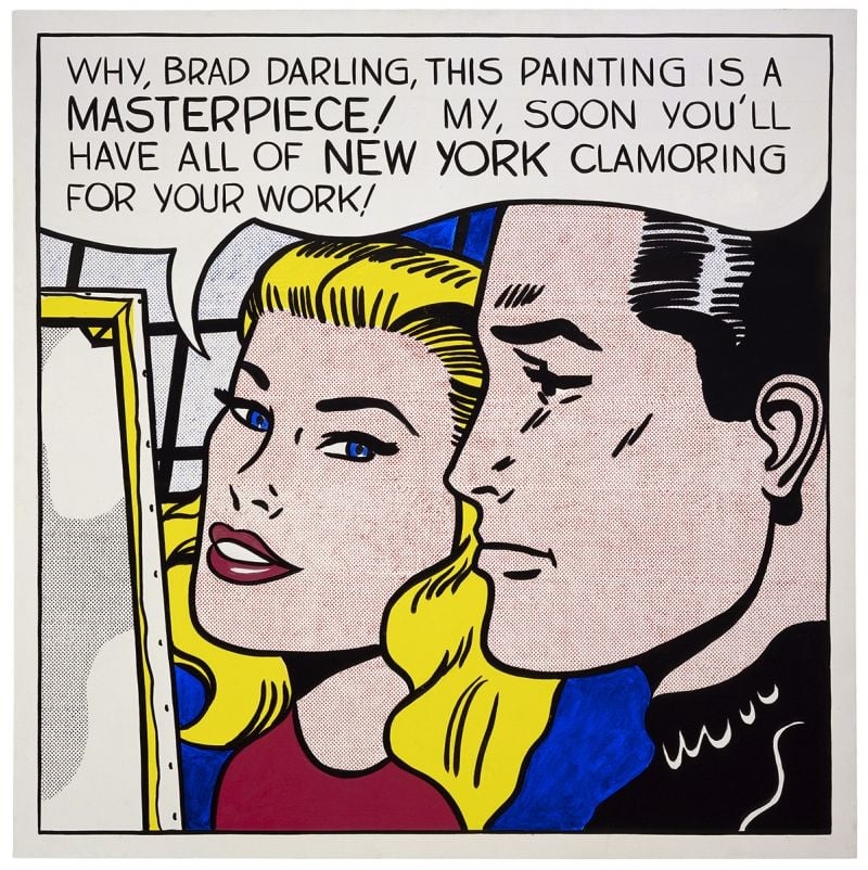
Masterpiece by Roy Lichtenstein

Masterpiece

Roy Lichtenstein (1962)

<strong>Masterpiece</strong> (1962) turns a romance‑comic close‑up into a cool exposé of how praise is manufactured. With a buoyant speech balloon and hand‑made Ben‑Day dots, Roy Lichtenstein converts private flattery into public <strong>promotion</strong>—an image about the image economy itself <sup>[1]</sup><sup>[2]</sup>.
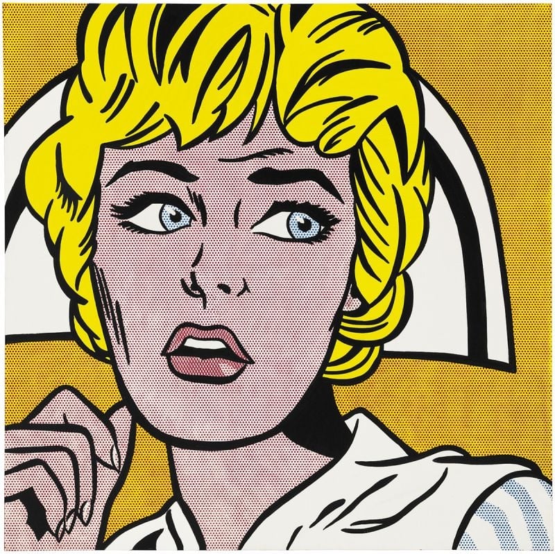
Nurse by Roy Lichtenstein

Nurse

Roy Lichtenstein (1964)

Nurse crystallizes Roy Lichtenstein’s 1964 turn to comic-derived icons, amplifying emotion through <strong>Ben‑Day dots</strong>, <strong>thick black contours</strong>, and a <strong>high‑contrast palette</strong>. The cropped close‑up—blond hair, white cap, parted lips, averted gaze—freezes suspense while stripping away speech bubbles. Lichtenstein converts pulp melodrama into a monumental emblem, making style itself the engine of feeling <sup>[1]</sup><sup>[2]</sup>.
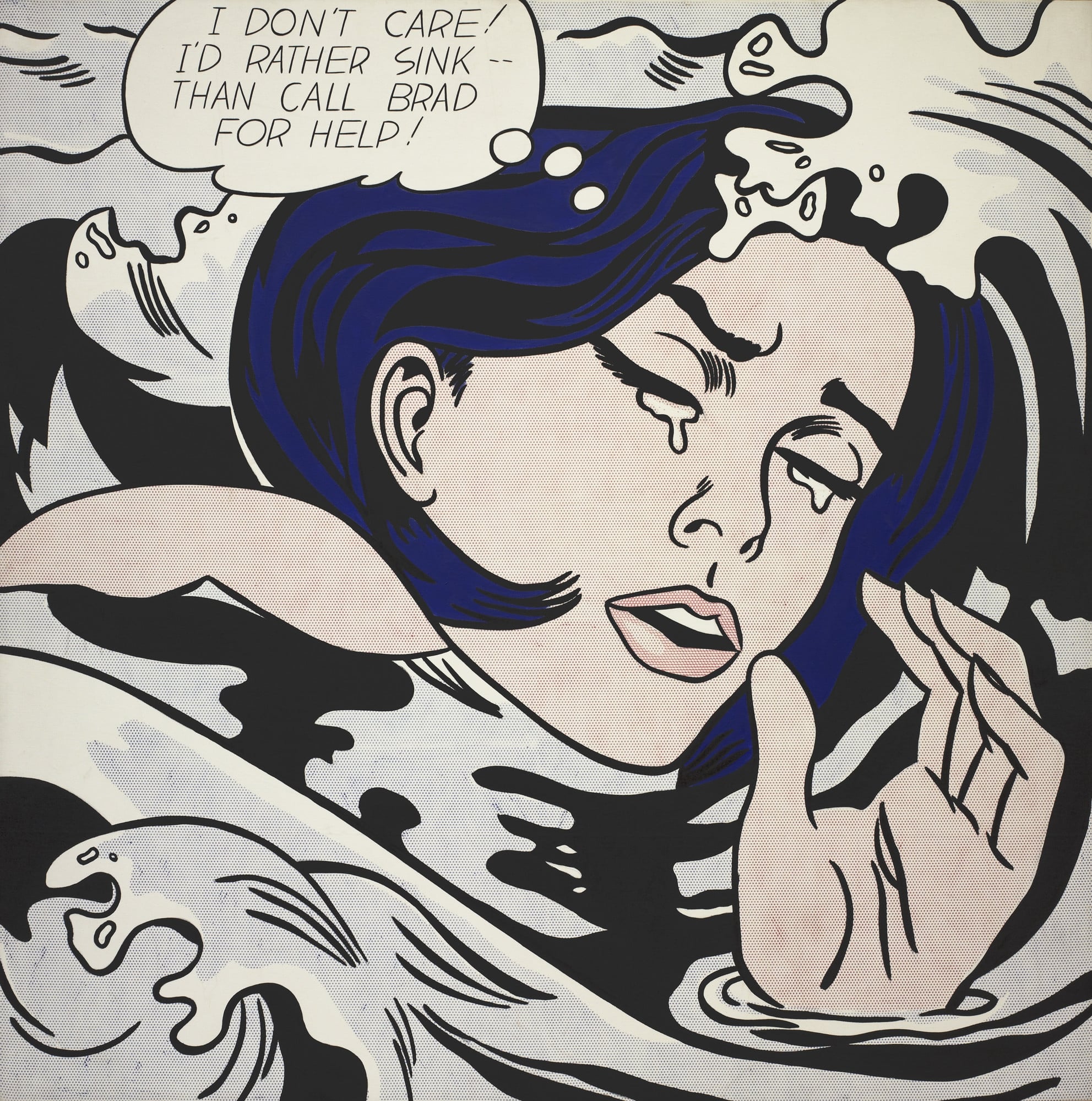
Drowning Girl by Roy Lichtenstein

Drowning Girl

Roy Lichtenstein (1963)

<strong>Drowning Girl</strong> converts a romance-comic crisis into a monumental icon of cool, stylized emotion. With tight cropping, <strong>Ben-Day dots</strong>, and heavy black contours, <strong>Roy Lichtenstein</strong> isolates a heroine who declares, "I DON’T CARE! I’D RATHER SINK—THAN CALL BRAD FOR HELP!" The painting turns mass-media melodrama into a distilled language of signs that oscillates between parody and pathos <sup>[1]</sup><sup>[4]</sup>.
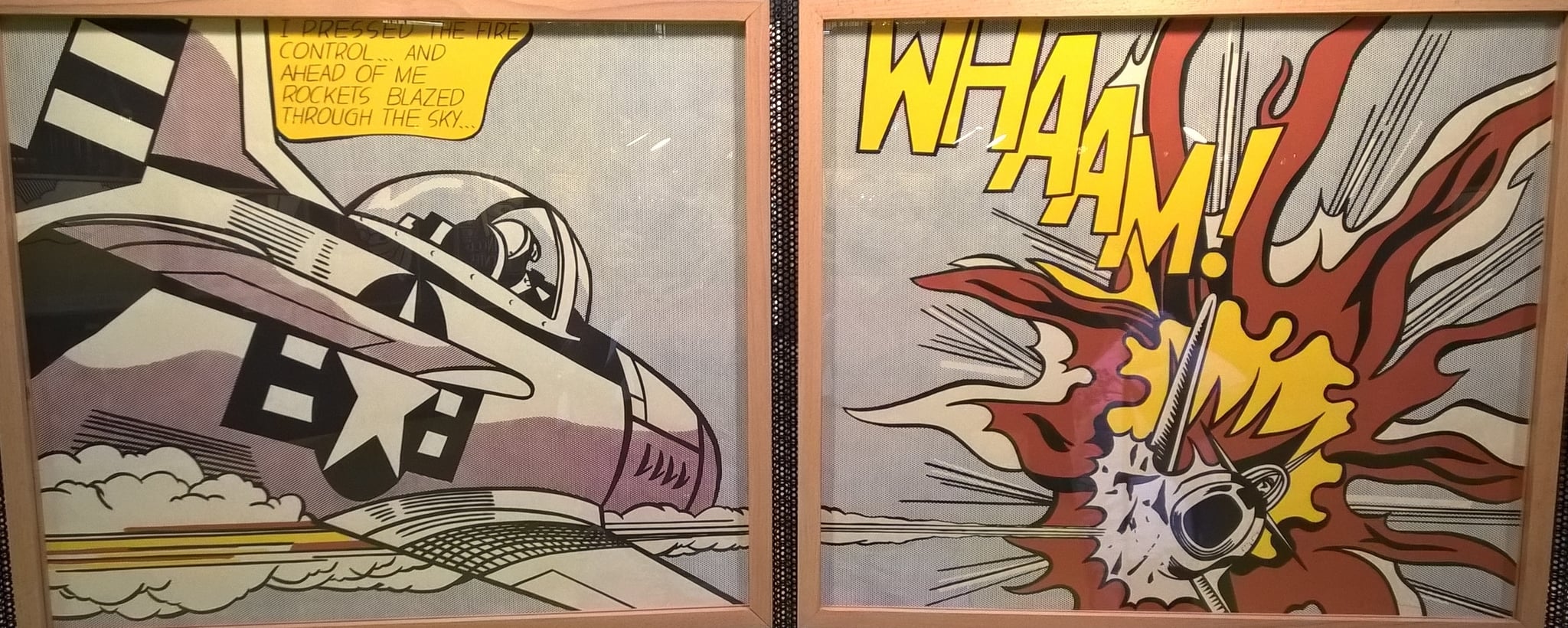
Whaam! by Roy Lichtenstein

Whaam!

Roy Lichtenstein (1963)

Whaam! stages a split-second airstrike as a two-panel, comic-derived spectacle where <strong>cool control</strong> meets <strong>hot impact</strong>. Lichtenstein converts lethal action into <strong>graphic codes</strong>—Ben-Day dots, speech balloon, and the yellow onomatopoeia “WHAAM!”—to expose how mass media packages warfare as crisp design <sup>[1]</sup><sup>[3]</sup><sup>[5]</sup>.