Whaam!

by Roy Lichtenstein

Whaam! stages a split-second airstrike as a two-panel, comic-derived spectacle where cool control meets hot impact. Lichtenstein converts lethal action into graphic codes—Ben-Day dots, speech balloon, and the yellow onomatopoeia “WHAAM!”—to expose how mass media packages warfare as crisp design [1][3][5].

Study Print Studio

Create a personal study print

Build a companion study sheet around the part of this painting that speaks to you most. Choose a detail, shape an interpretation, and walk away with something personal and display-worthy.

Fast Facts

Year
1963
Medium
Magna acrylic, oil, and graphite on two joined canvases (over oil‑modified alkyd ground)
Dimensions
173 × 405.9 cm (overall)
Location
Tate, London
Whaam! by Roy Lichtenstein (1963) featuring American jet fighter, Speech balloon (pilot’s caption), Rocket smoke/contrail vector, Explosion/fireball

Click on any numbered symbol to learn more about its meaning

Meaning & Symbolism

Lichtenstein engineers Whaam! as a cause‑and‑effect machine. The left panel aligns our sightline with a streamlined American jet, its canopy drawn as a precise oval and its fuselage sliced by hard black contours and violet Ben‑Day fields. A yellow speech balloon delivers the pilot’s report—“I pressed the fire control… and ahead of me rockets blazed through the sky…”—a voice that is cool, procedural, and emotionally evacuated. That balloon, like a command line, initiates the strike. The rocket’s smoke becomes the painting’s main vector, skimming low across the canvas seam and propelling us into the right panel’s fireball. Lichtenstein deliberately keeps the attacker’s world orderly and geometric—clean diagonals, clipped insignia, and machined dots—so the left reads as control system, not human impulse 15. In doing so he relocates the ‘action’ from brush to sign, substituting the high drama of Abstract Expressionist gesture with the disciplined syntax of printing and comics 35. The right panel detonates that discipline into spectacle. A jagged corona of red, orange, and yellow erupts around the stricken enemy cockpit, while the oversized yellow WHAAM! fuses sound and image, impact and advertisement. Lichtenstein even tethers text to blast chromatically—yellow balloon to yellow type—binding narrative to design so tightly that destruction reads like branding 5. This is not accidental; his materials and technique—hand‑painted Ben‑Day dots in oil over an alkyd ground, with Magna acrylic and oil elsewhere—simulate industrial reproduction while insisting on artisanal facture, a paradox that exposes the labor behind the ‘mechanical’ look 2. As a result, Whaam! does not simply depict war; it demonstrates how media make war legible and pleasurable. The pilot’s detached caption and the crisp typographic boom act as prosthetics for seeing, aligning with scholarship on Lichtenstein’s fascination with monocular, machine‑enhanced vision: targeting, sighting, and the camera‑gun’s logic migrate into painting 6. Whaam! thus functions as a mirror for a culture that consumes conflict as episodes and exclamations. By enlarging and refining an Irv Novick comic panel, Lichtenstein heightens the original’s clichés until they glitter with both seduction and critique: heroism becomes a clean vector; death, a colorway; memory, a caption ellipsis 5. The diptych’s seam is crucial. It is the comic ‘gutter’ scaled up, the place where viewers infer motion and morality; here, it becomes a launch rail that ties cause to effect while keeping them formally segregated—‘two almost separate paintings,’ as Lichtenstein put it, one that shoots the other 5. That architecture makes the viewer complicit: our reading stitches the cool left to the hot right, transforming spectatorship into the final trigger pull. In Pop’s broader story, Whaam! marks a decisive shift: history painting updated through mass-media idioms, where the sovereign subject is not the hero or the painter’s hand but the reproducible sign itself 1347.

Explore Deeper with AI

Ask questions about Whaam!

Popular questions:

Powered by AI • Get instant insights about this artwork

💬 Ask questions about this artwork!

Interpretations

Technical/Material Analysis

The painting’s supposedly impersonal surface is the product of intensely manual procedures. Conservation shows Lichtenstein laid Ben‑Day dots in oil over an alkyd ground, building zones with calibrated spacing and edge control; the dots’ slight curvature and micro-variations betray the hand within the mechanical look 2. This material paradox—industrial appearance achieved through artisanal craft—reframes Pop as a study in labor visibility: the work “performs” printing while staging its impossibility in paint. Notably, the yellow WHAAM! sits on distinct layers from the explosive corona, confirming that text and blast were engineered as separate but interlocking signals. The technical stratigraphy supports a reading of Whaam! as a constructed interface rather than a depiction, where facture itself becomes content 2.

Source: Tate/Heritage Science (Bartoletti et al., 2020)

History Painting Updated

Critics have read Whaam! as Pop’s audacious bid to revive history painting through mass-media idioms. Instead of emperors and allegories, Lichtenstein installs a split-second of aerial combat, amplifying it to mural scale and choreographing cause and effect across a diptych. The comic’s balloon and boom supplant classical rhetoric and Baroque diagonals, yet the work retains history painting’s ambition: to render public violence as culturally legible drama 35. Richard Morphet situates the painting at the hinge of high and low, staging the grand genre as a graphic event that a modern audience already “knows” from print circulation. In this view, Whaam! is less an illustration of war than a demonstration of how modern societies monumentalize conflict via reproducible signs 3.

Source: Art Institute of Chicago; Tate (Morphet, via reception histories)

Machine Vision and Detachment

Michael Lobel’s account of Lichtenstein’s monocularity clarifies the left panel’s ethos: the pilot’s clipped report and the targeting vector align with camera‑gun and sight optics, where hitting the mark supersedes empathy 4. Such machine-enhanced vision compresses the world into aim, trail, and impact—perception tuned for action. In Whaam!, that regime migrates into painting: the smoke line becomes a tracking path; the balloon functions as a procedural readout. The work thus models a culture in which devices mediate looking, and looking authorizes force. Lichtenstein doesn’t condemn or celebrate this; he formalizes it, letting the viewer feel the thrill and the chill of a vision that’s technically precise and morally evacuated at once 45.

Source: Michael Lobel, Oxford Art Journal (2001)

The Gutter as Engine of Causality

Lichtenstein wanted “two almost separate paintings”—“one panel shooting the other”—scaling up the comic gutter into a pictorial hinge where viewers infer time, motion, and blame 5. The seam’s engineered gap forces cognition to bridge procedures (left) to spectacle (right), making spectatorship the final actuator. Comics theory calls this closure; here, closure is weaponized. The yellow speech balloon primes the eye; the smoke vector crosses the seam; the typographic blast seals inference. By isolating these devices and enlarging them, Lichtenstein reveals how modern images manufacture causality as much as they depict it. The diptych’s architecture thus stages not only a strike but the very mental mechanism by which images persuade 35.

Source: Artist statement via reception histories; Art Institute of Chicago

Appropriation, Credit, and Transformation

Sourced from Irv Novick’s All-American Men of War, Whaam! turns a mid-tier comic into a canonical artwork through scale, chromatic recalibration (notably the yellow WHAAM!), and structural bifurcation 15. Rather than mere copying, the operation edits narrative redundancies, intensifies vectors, and re-times the caption to govern the blast. In doing so, Lichtenstein relocates value from original authorship to strategic mediation—a central Pop gambit that unsettled mid‑century norms of credit and creativity. The RL Catalogue Raisonné and curatorial research chart how this image participates in a cluster of “war” works, showing a sustained method, not a one-off quote. The result is a test case in Pop ethics: transformation is visible, but so is dependence on reproducible culture 135.

Source: Roy Lichtenstein Foundation Catalogue Raisonné; Art Institute of Chicago; Wikipedia (cross-checked)

Related Themes

About Roy Lichtenstein

Roy Lichtenstein (1923–1997) was a leading American Pop artist who adapted comic and advertising idioms into large, hand‑painted canvases that probe authorship, reproduction, and art‑historical conventions. After his 1961–62 breakthrough, he developed a sustained strand of reflexive “art about art,” including studio scenes and riffs on modern masters [2].
View all works by Roy Lichtenstein

More by Roy Lichtenstein
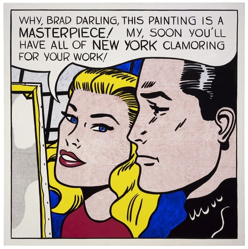
Masterpiece by Roy Lichtenstein

Masterpiece

Roy Lichtenstein (1962)

<strong>Masterpiece</strong> (1962) turns a romance‑comic close‑up into a cool exposé of how praise is manufactured. With a buoyant speech balloon and hand‑made Ben‑Day dots, Roy Lichtenstein converts private flattery into public <strong>promotion</strong>—an image about the image economy itself <sup>[1]</sup><sup>[2]</sup>.
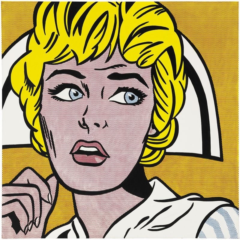
Nurse by Roy Lichtenstein

Nurse

Roy Lichtenstein (1964)

Nurse crystallizes Roy Lichtenstein’s 1964 turn to comic-derived icons, amplifying emotion through <strong>Ben‑Day dots</strong>, <strong>thick black contours</strong>, and a <strong>high‑contrast palette</strong>. The cropped close‑up—blond hair, white cap, parted lips, averted gaze—freezes suspense while stripping away speech bubbles. Lichtenstein converts pulp melodrama into a monumental emblem, making style itself the engine of feeling <sup>[1]</sup><sup>[2]</sup>.
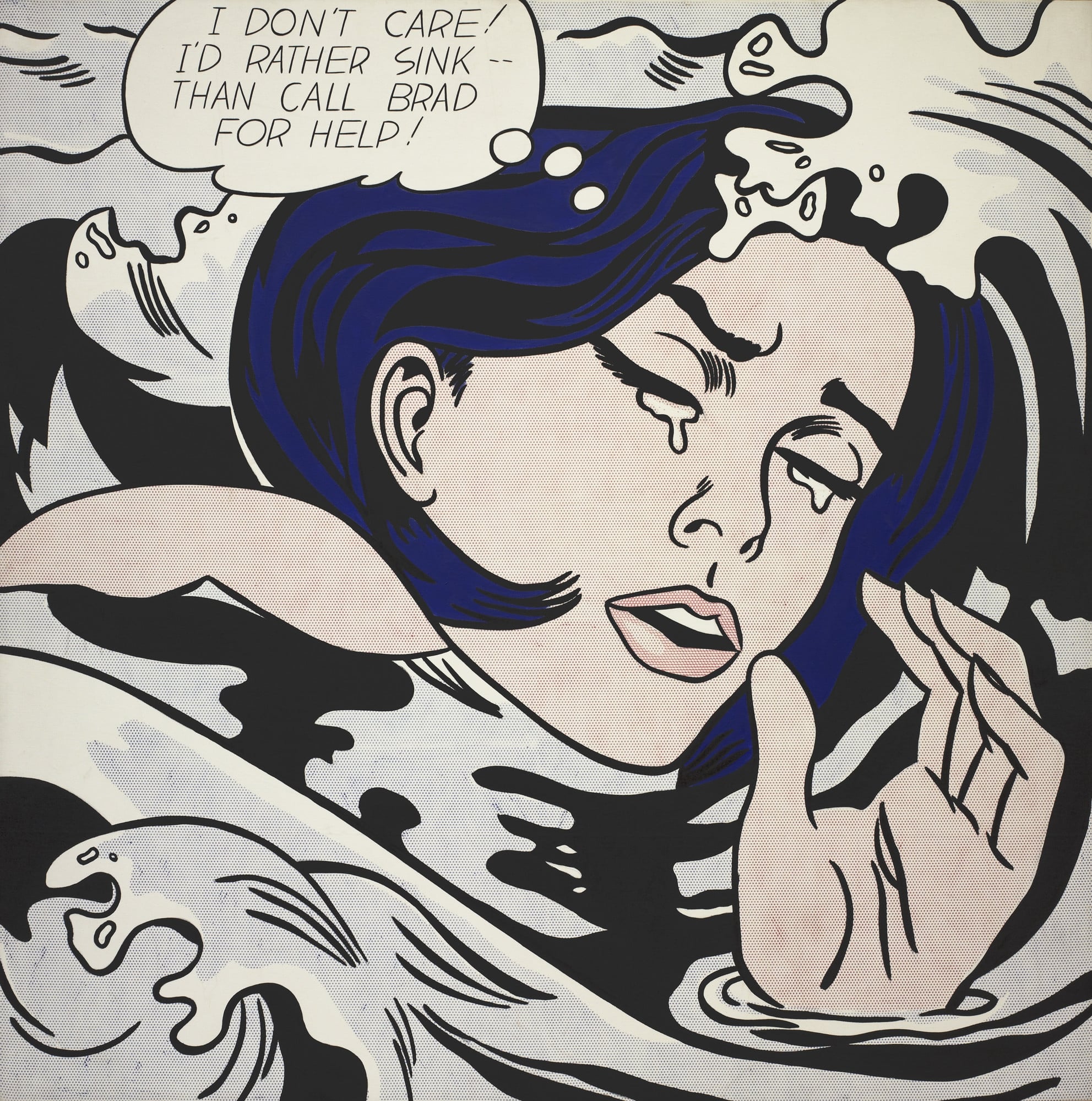
Drowning Girl by Roy Lichtenstein

Drowning Girl

Roy Lichtenstein (1963)

<strong>Drowning Girl</strong> converts a romance-comic crisis into a monumental icon of cool, stylized emotion. With tight cropping, <strong>Ben-Day dots</strong>, and heavy black contours, <strong>Roy Lichtenstein</strong> isolates a heroine who declares, "I DON’T CARE! I’D RATHER SINK—THAN CALL BRAD FOR HELP!" The painting turns mass-media melodrama into a distilled language of signs that oscillates between parody and pathos <sup>[1]</sup><sup>[4]</sup>.
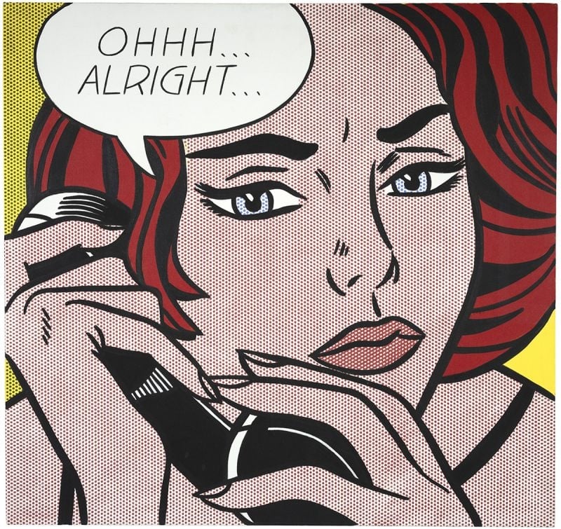
Ohhh...Alright... by Roy Lichtenstein

Ohhh...Alright...

Roy Lichtenstein (1964)

Roy Lichtenstein’s Ohhh...Alright... captures a suspended beat of romance‑comic melodrama in the cool idiom of <strong>Pop Art</strong>. A tightly cropped red‑haired woman grips a telephone as a speech balloon—“<strong>OHHH… ALRIGHT…</strong>”—signals reluctant acquiescence, while the hand‑painted <strong>Ben‑Day dots</strong> mimic mass printing to stage emotion as a commodity sign <sup>[1]</sup><sup>[2]</sup>.